fbpx
Title Image

Blog

Highlights. Trends. Insights. We’ve got the scoop on everything you need to know about interior design right here in one tidy space!

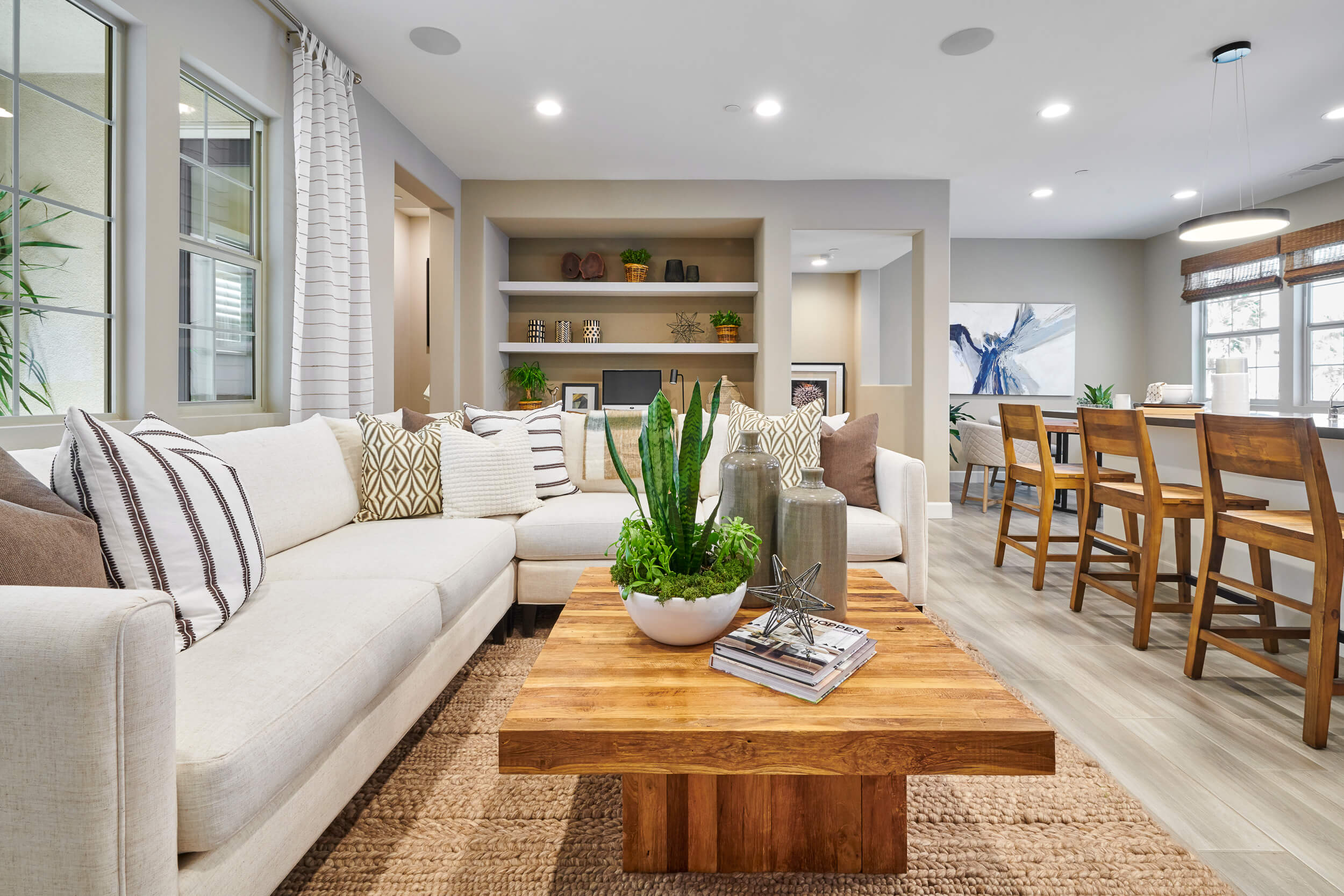
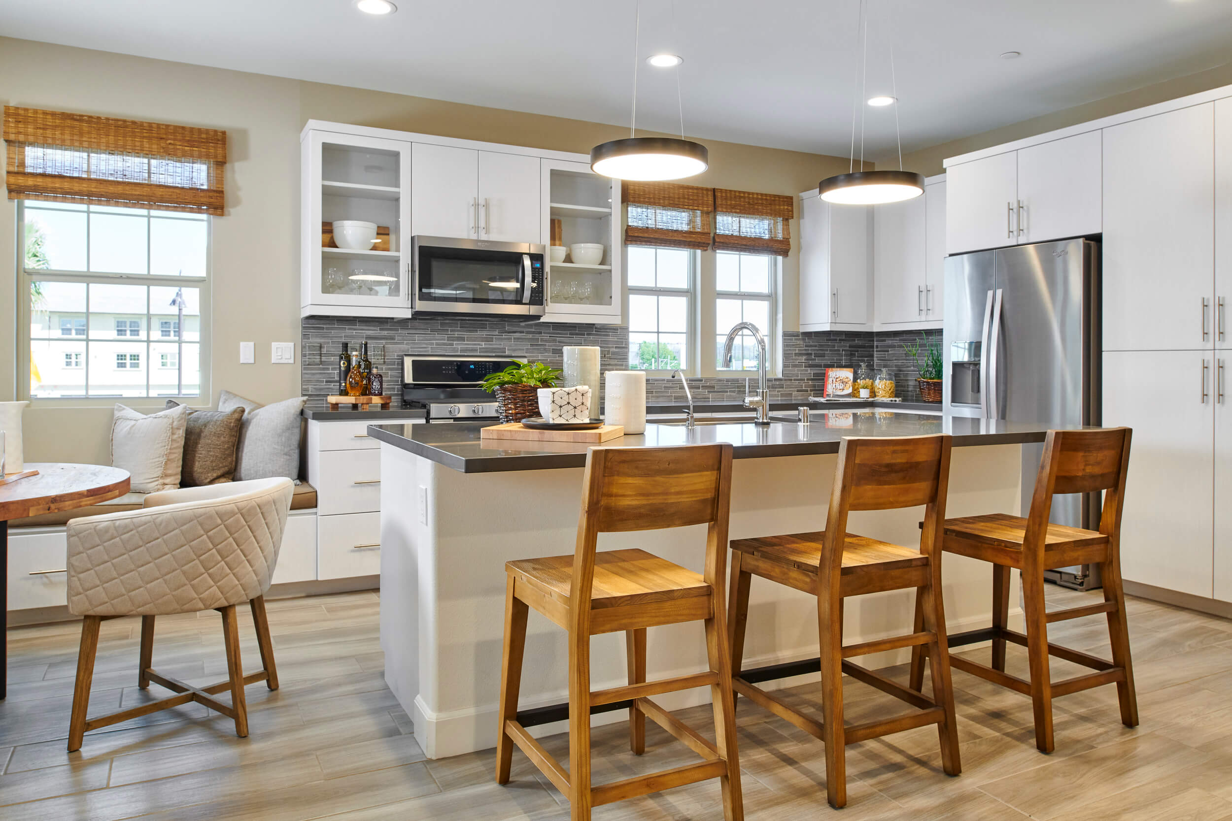
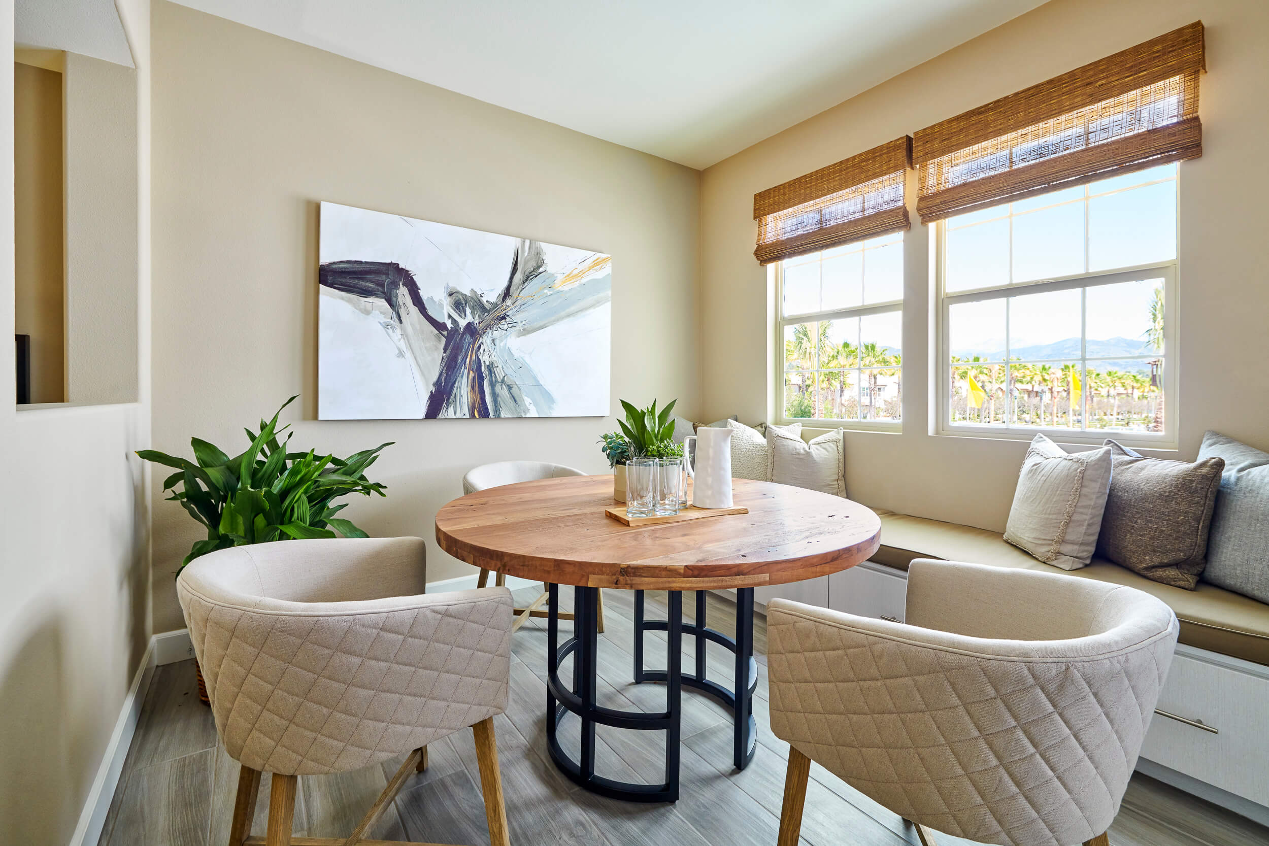
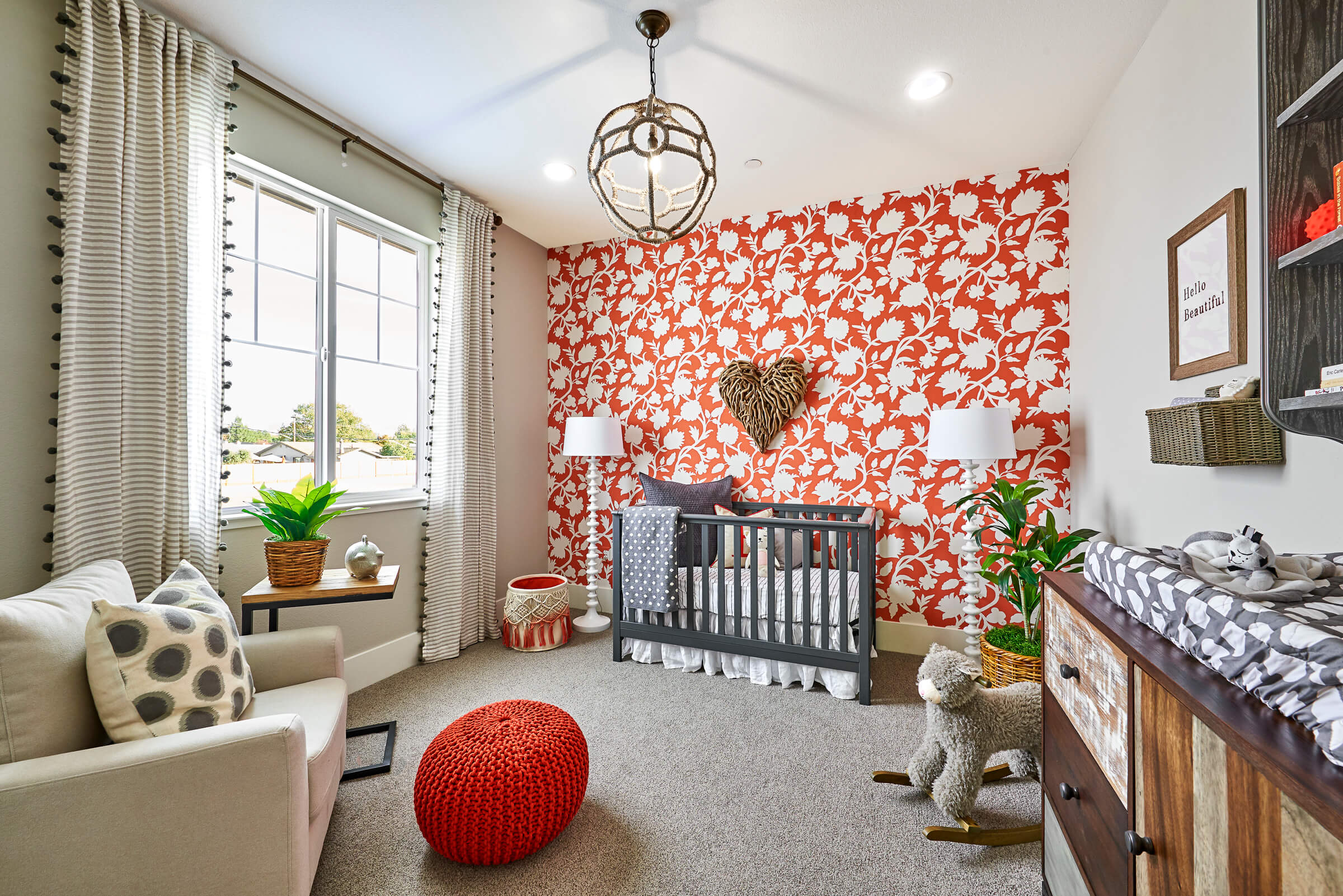
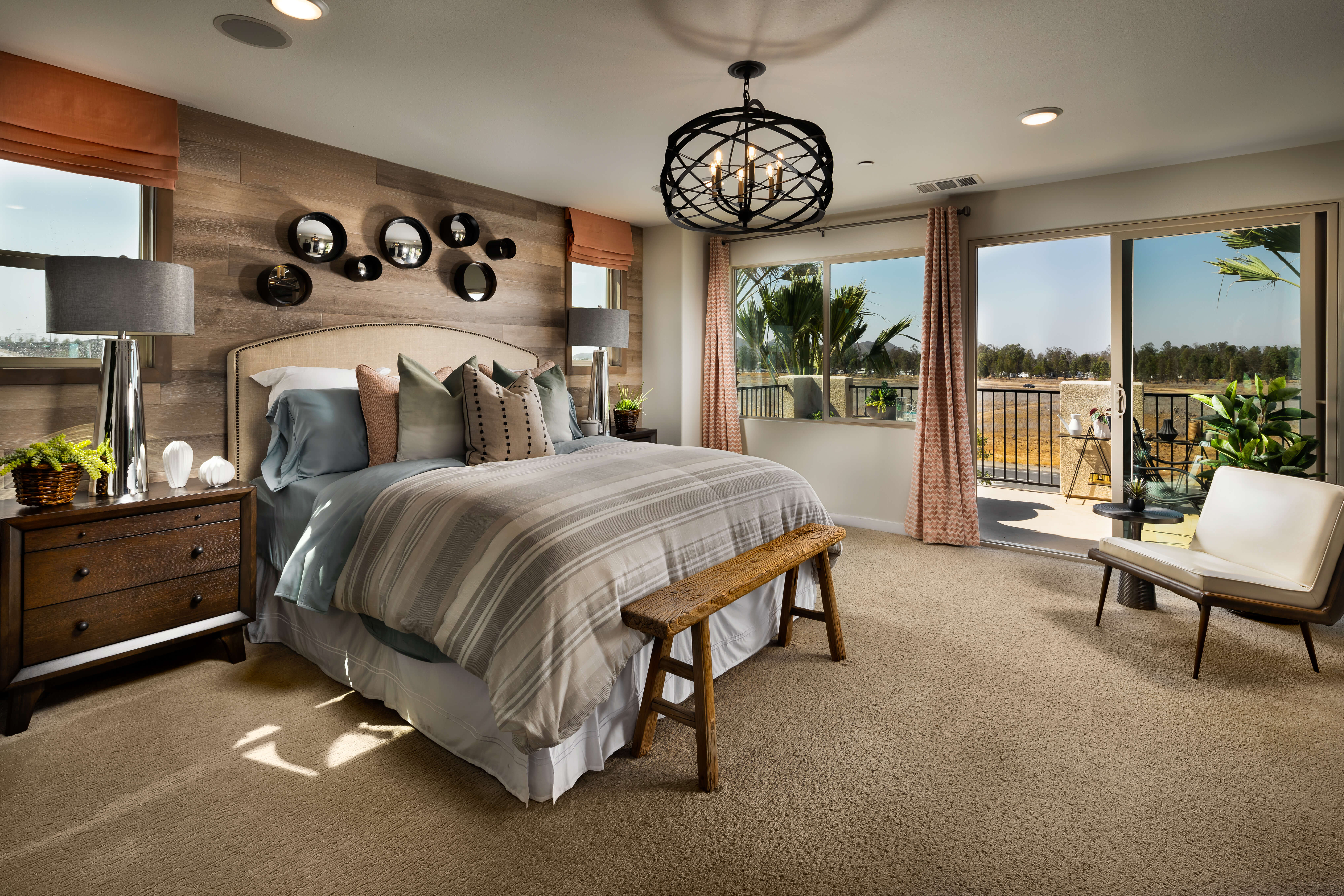
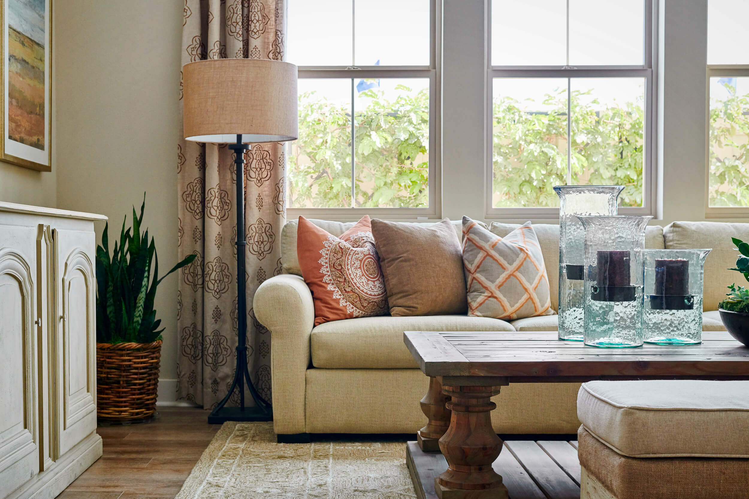
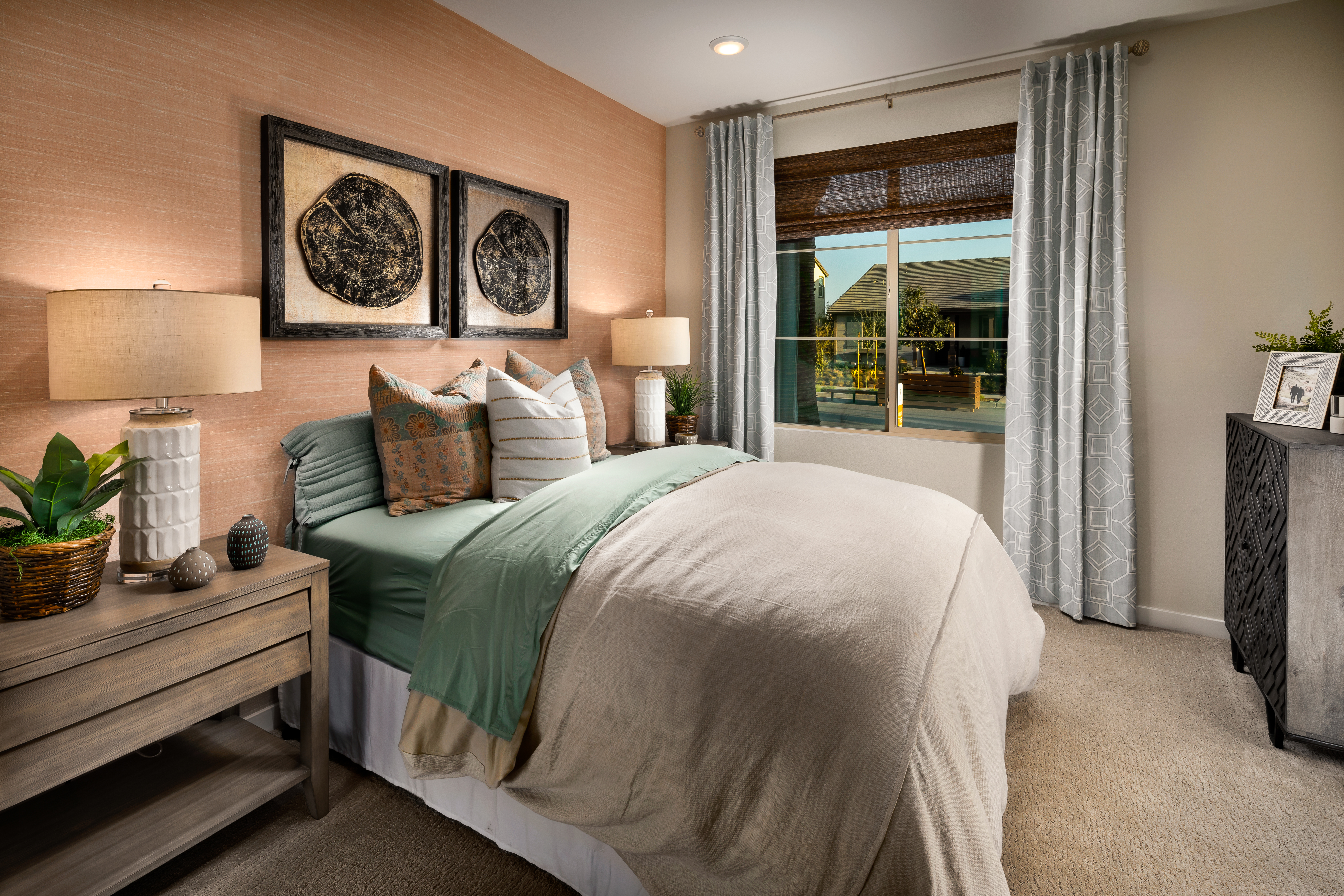
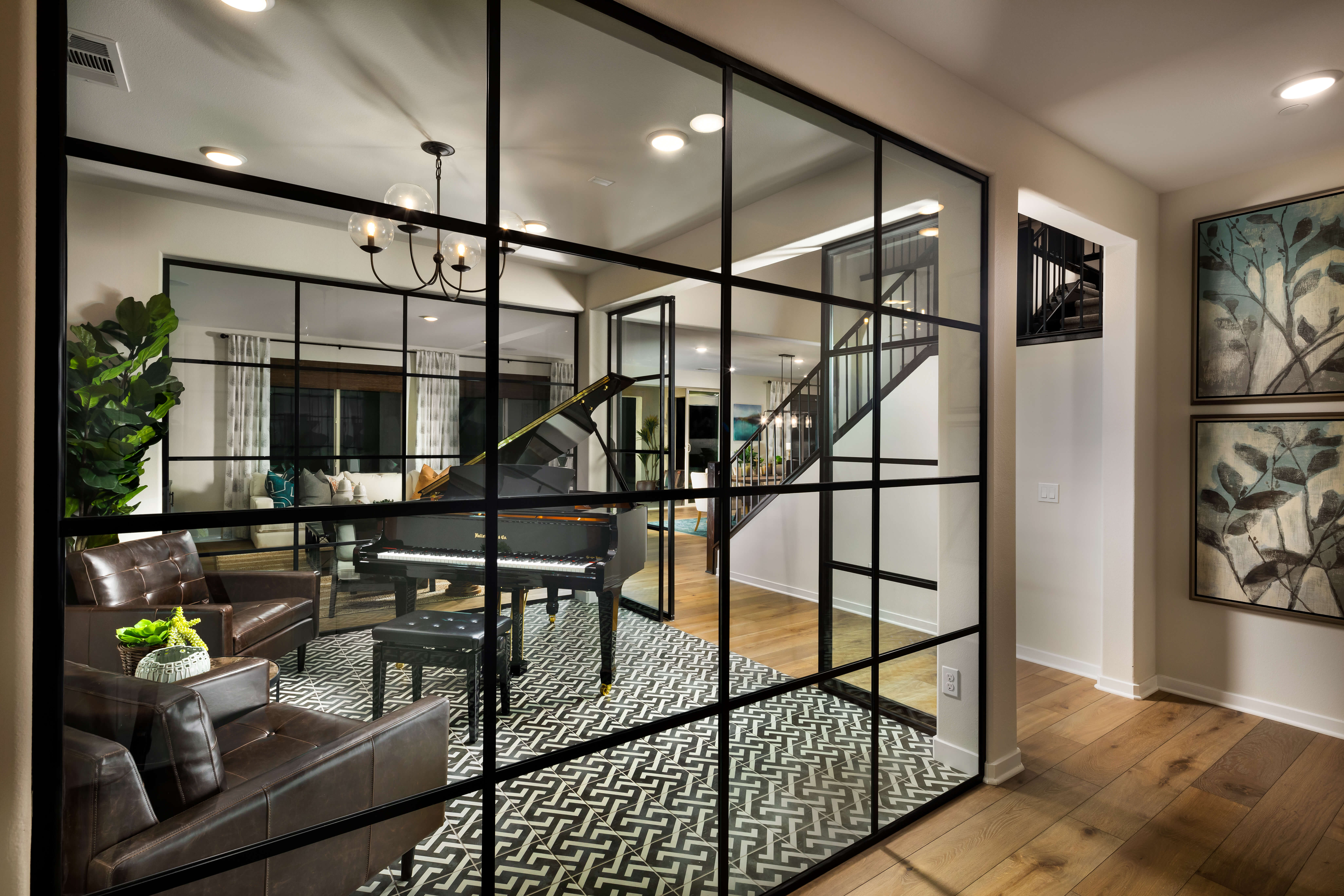
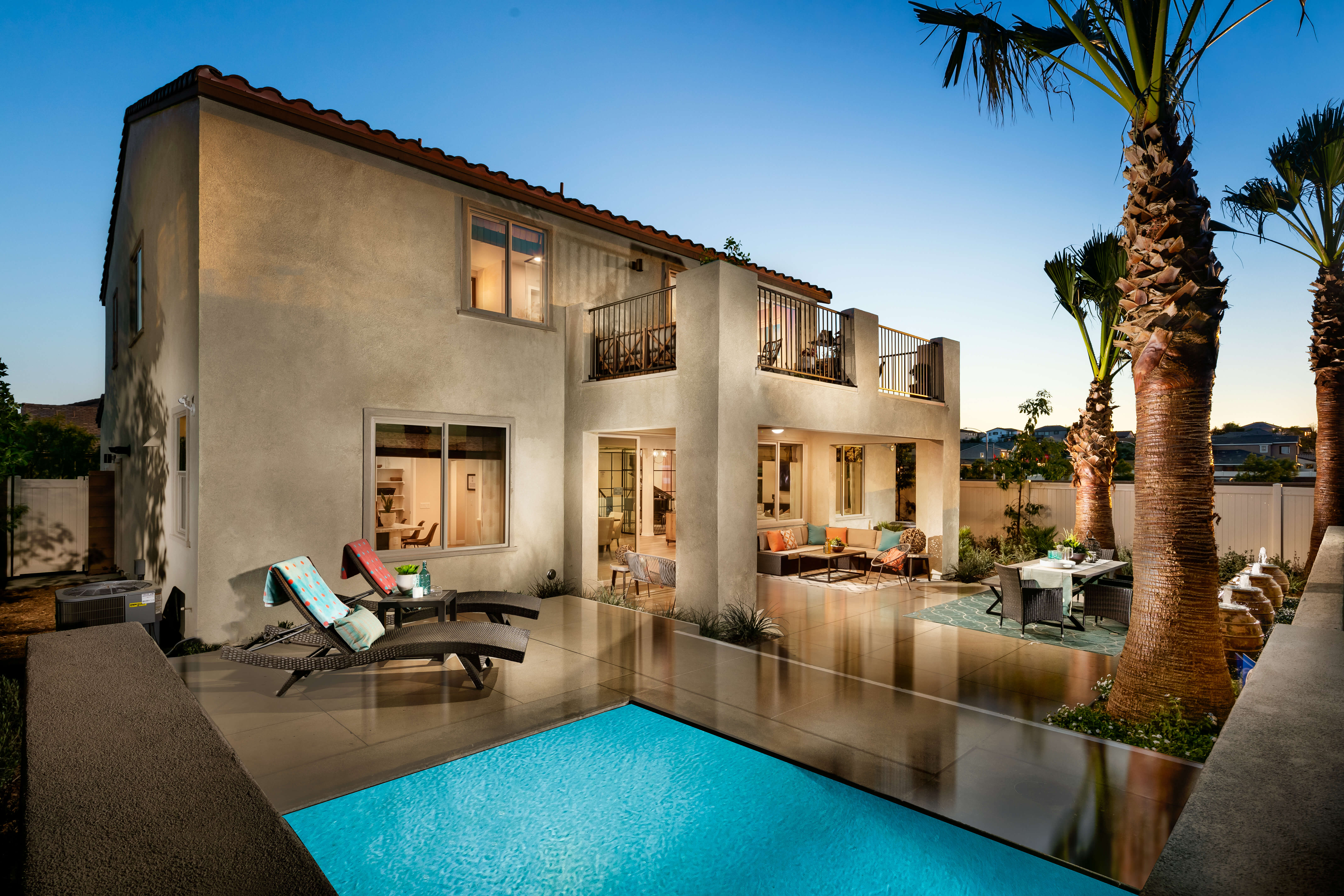
Home, Sweet, Modern Home

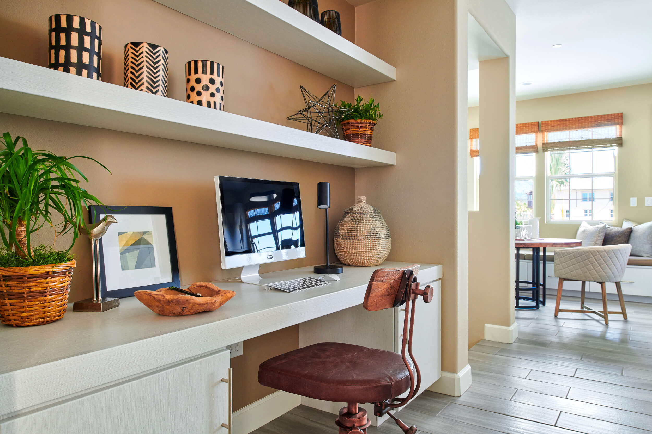
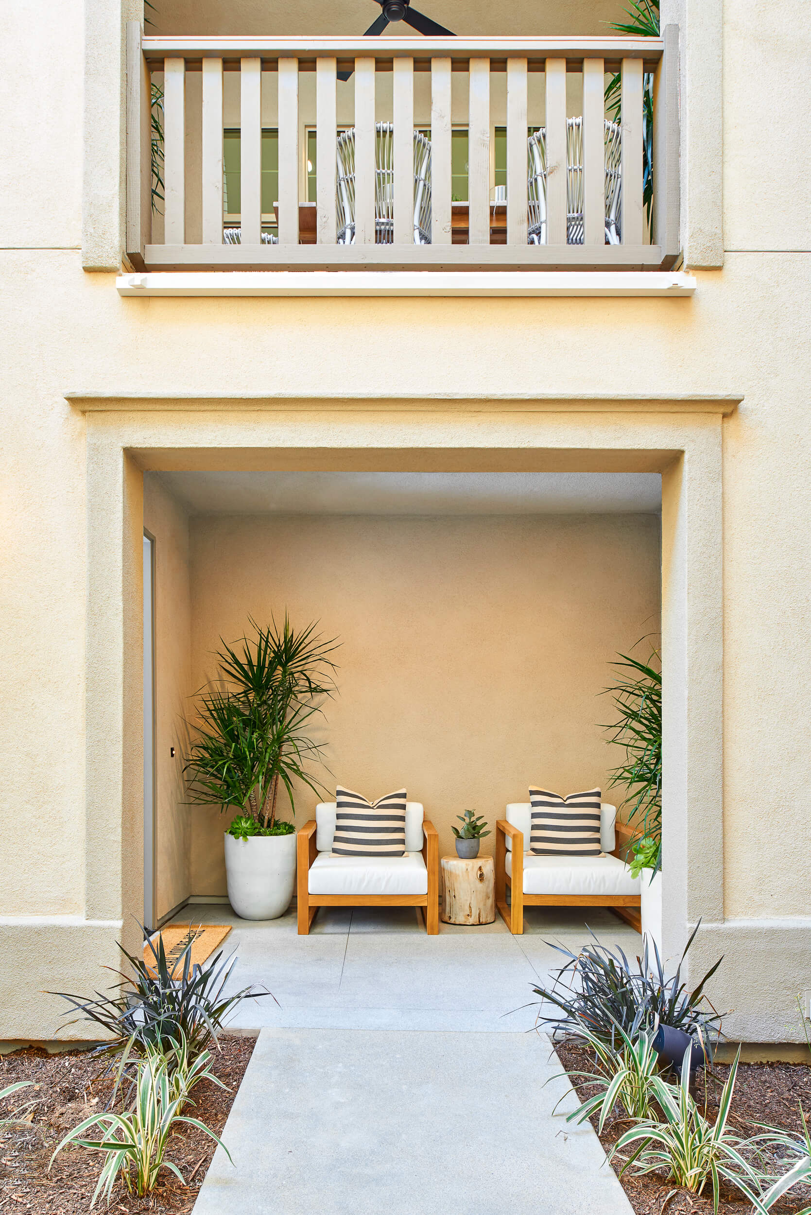
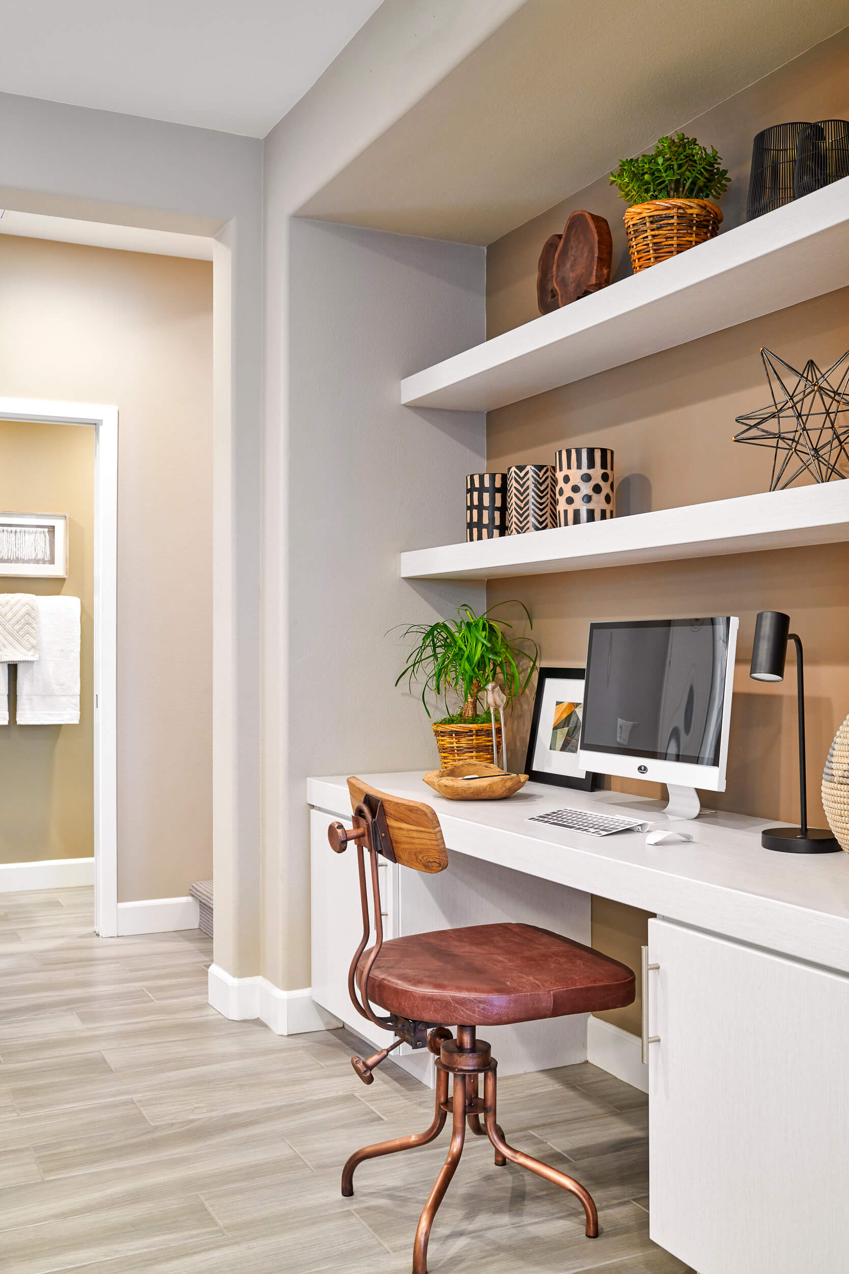
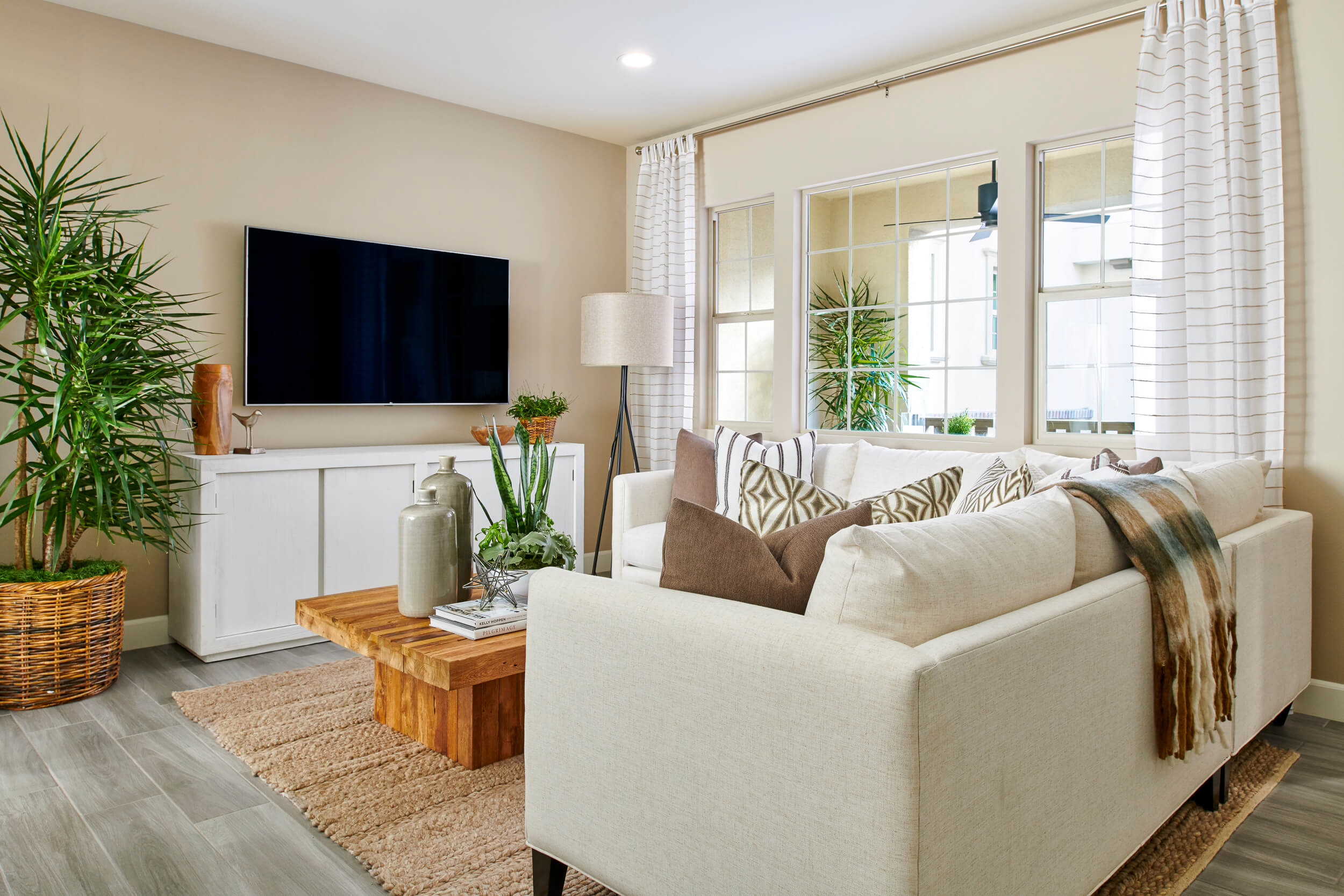
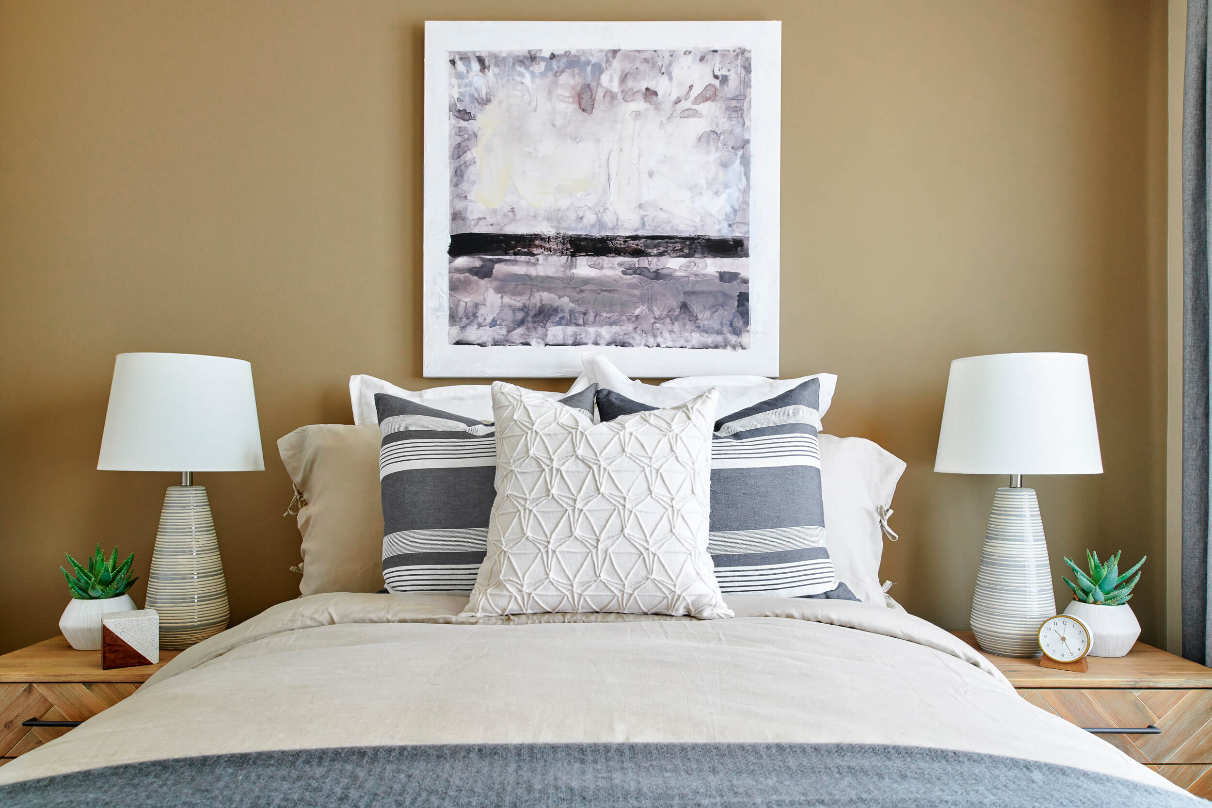
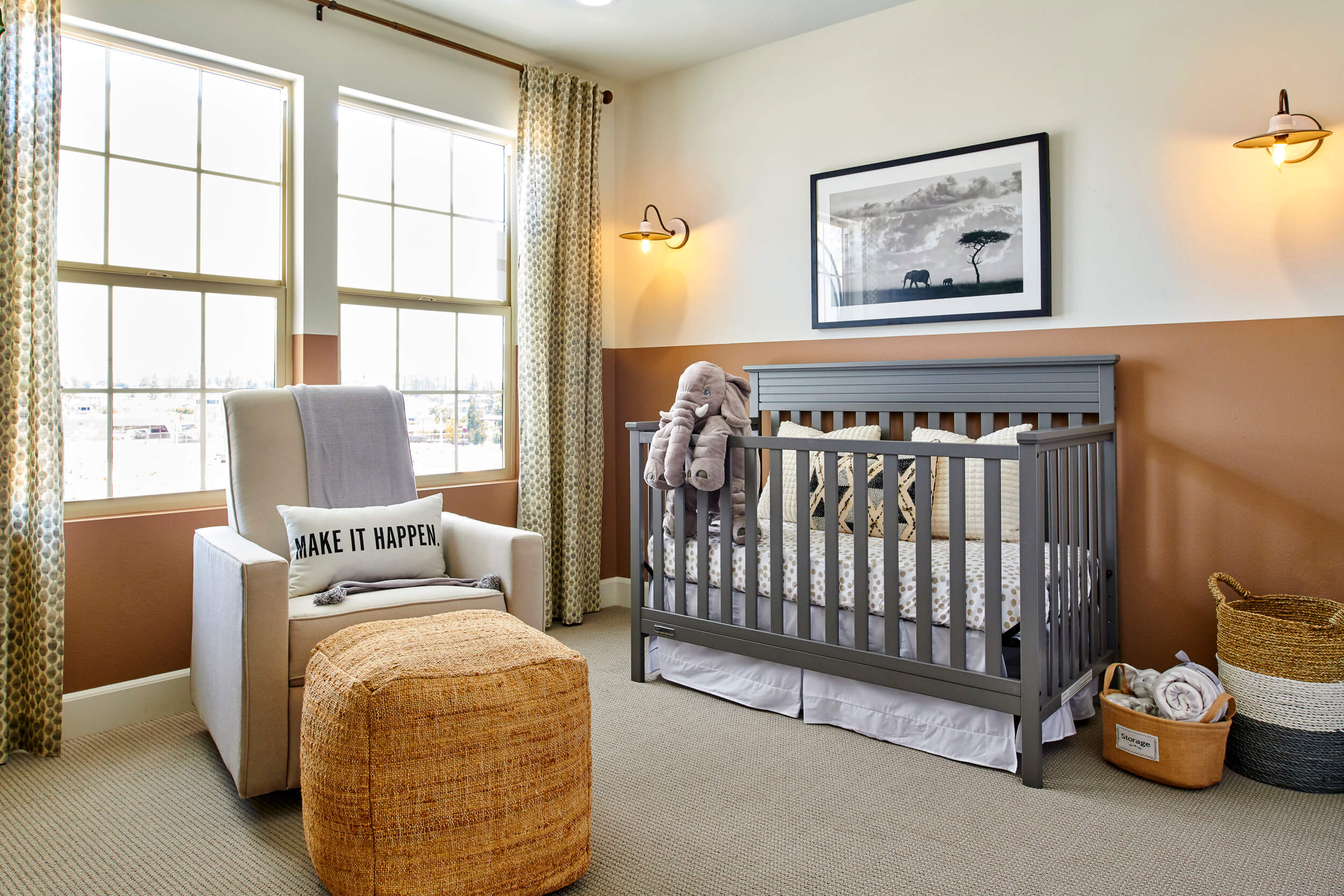
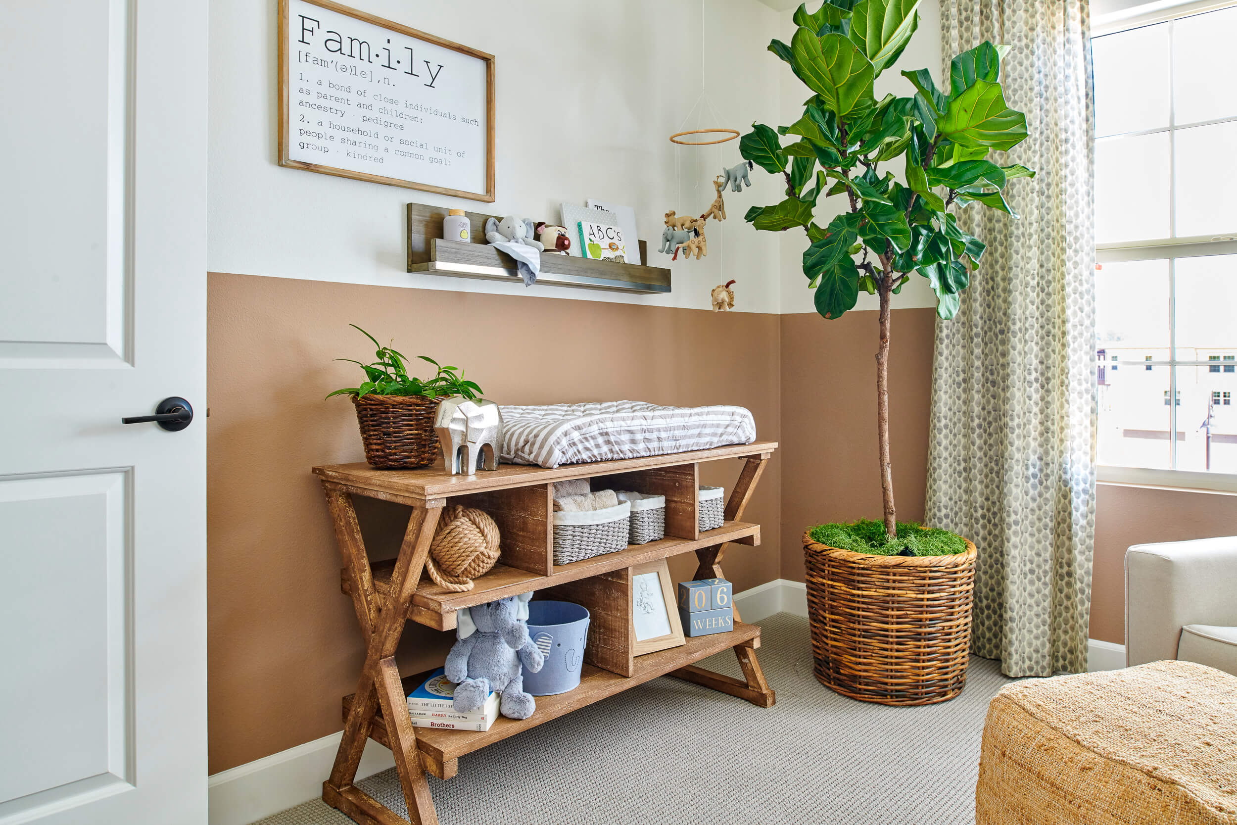
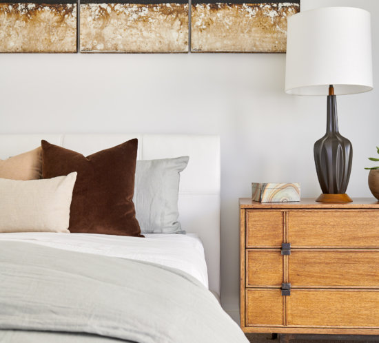
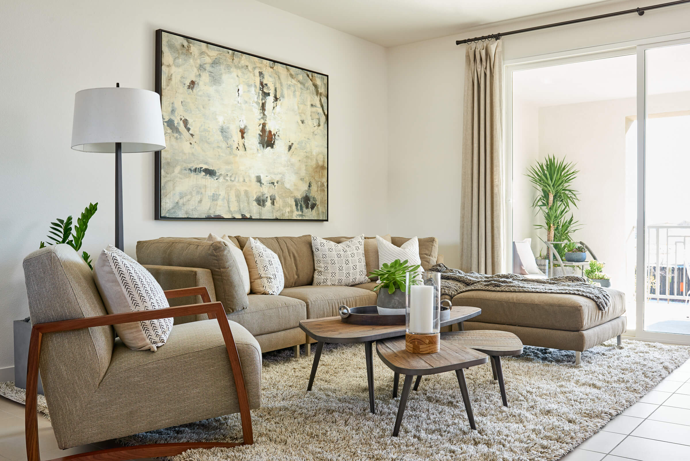
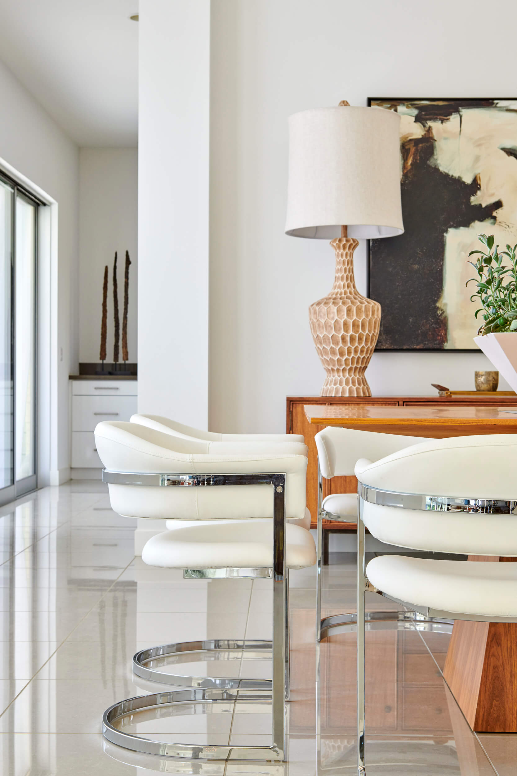
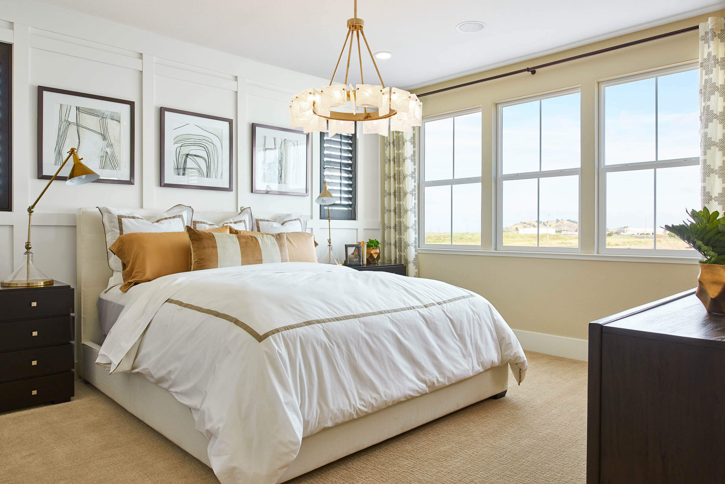
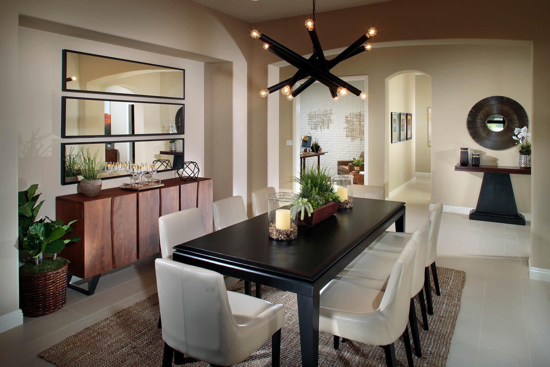
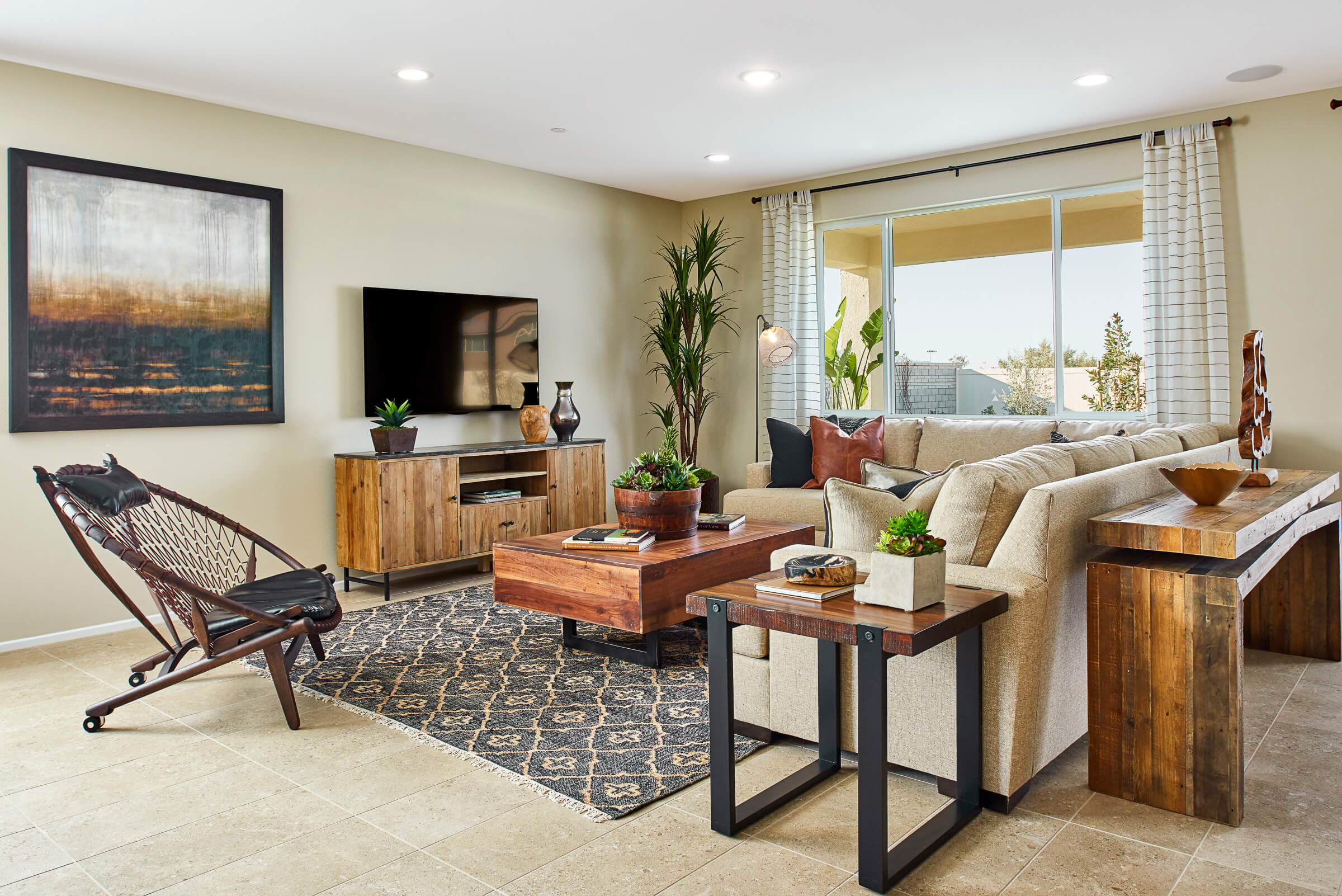
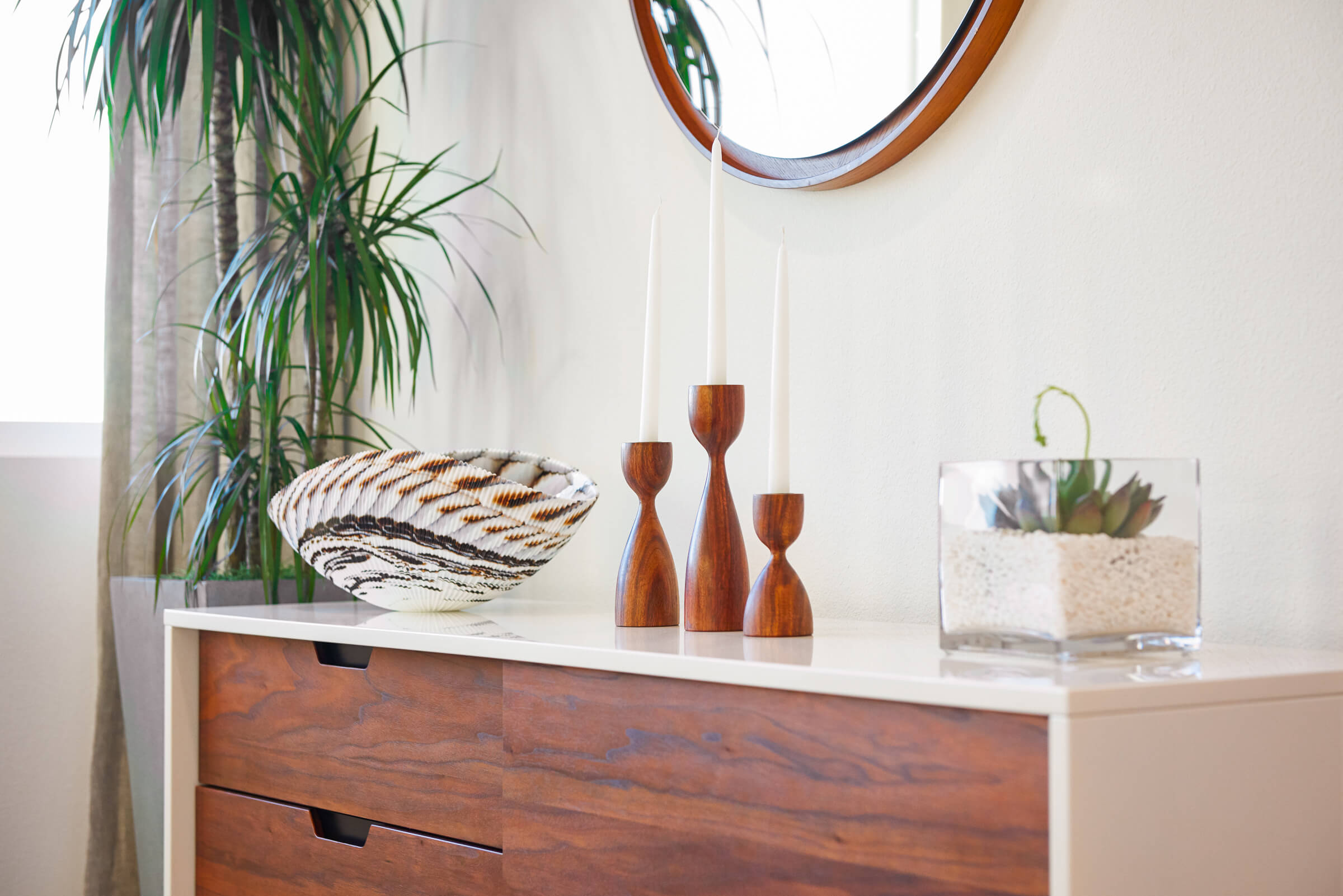
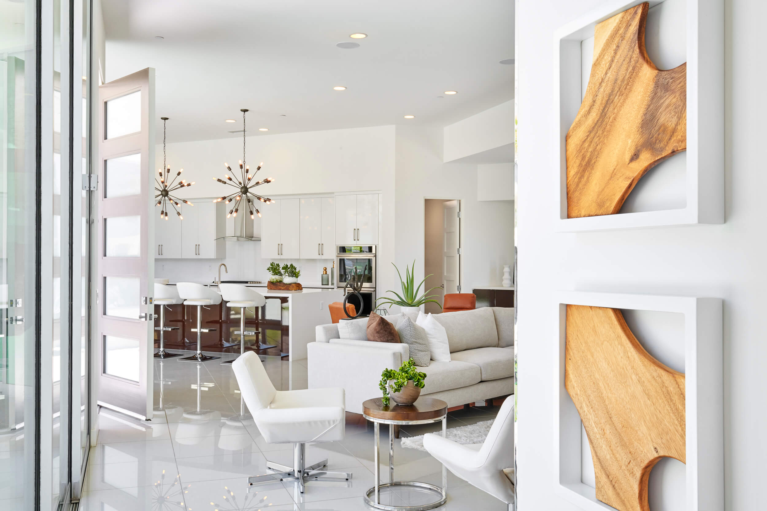
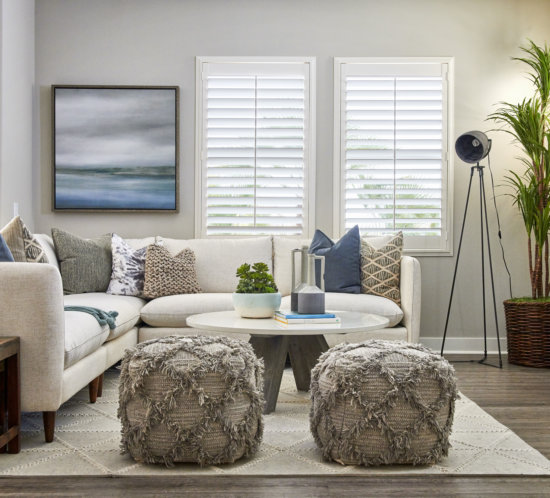
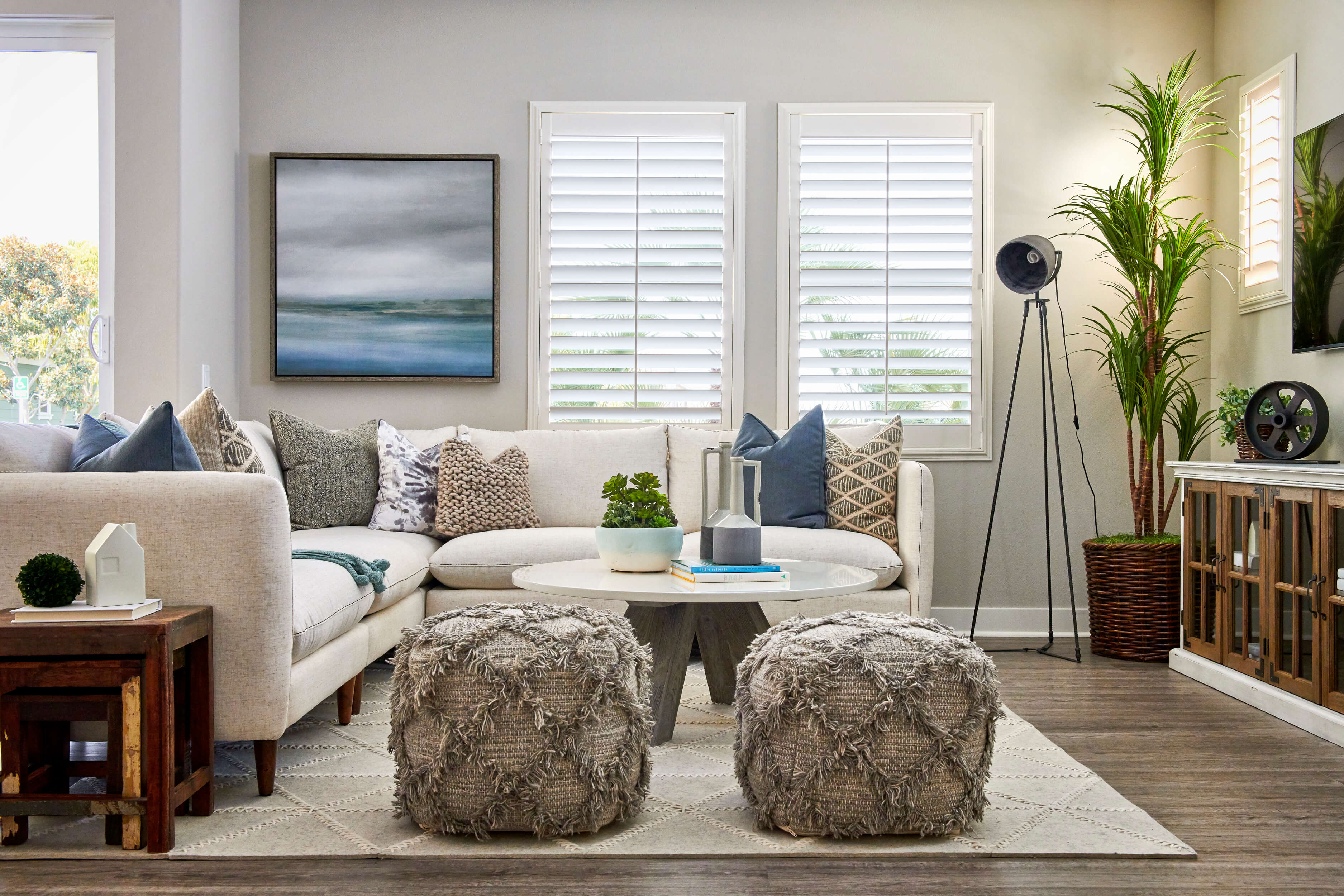
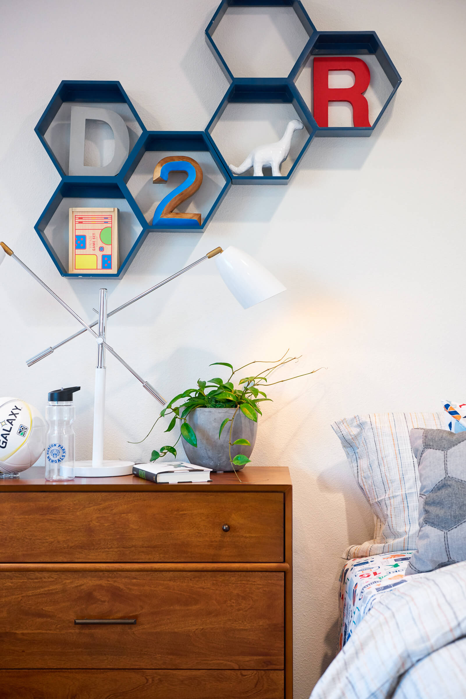
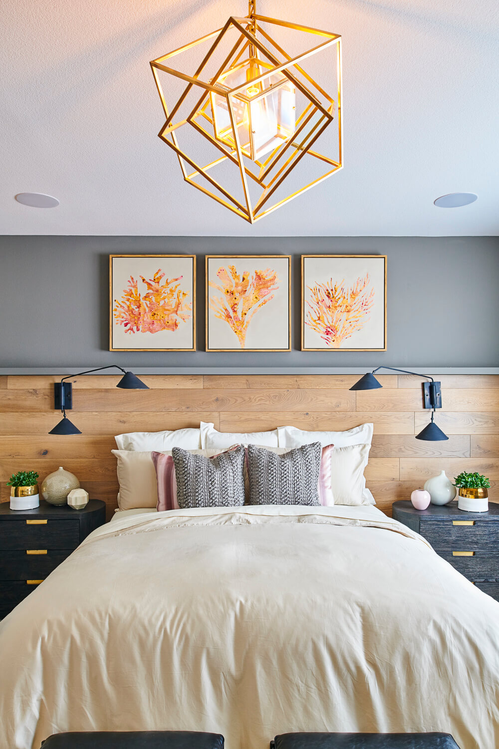
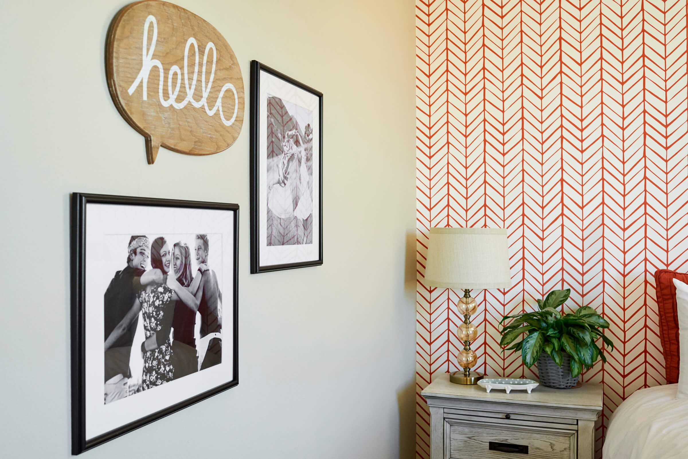
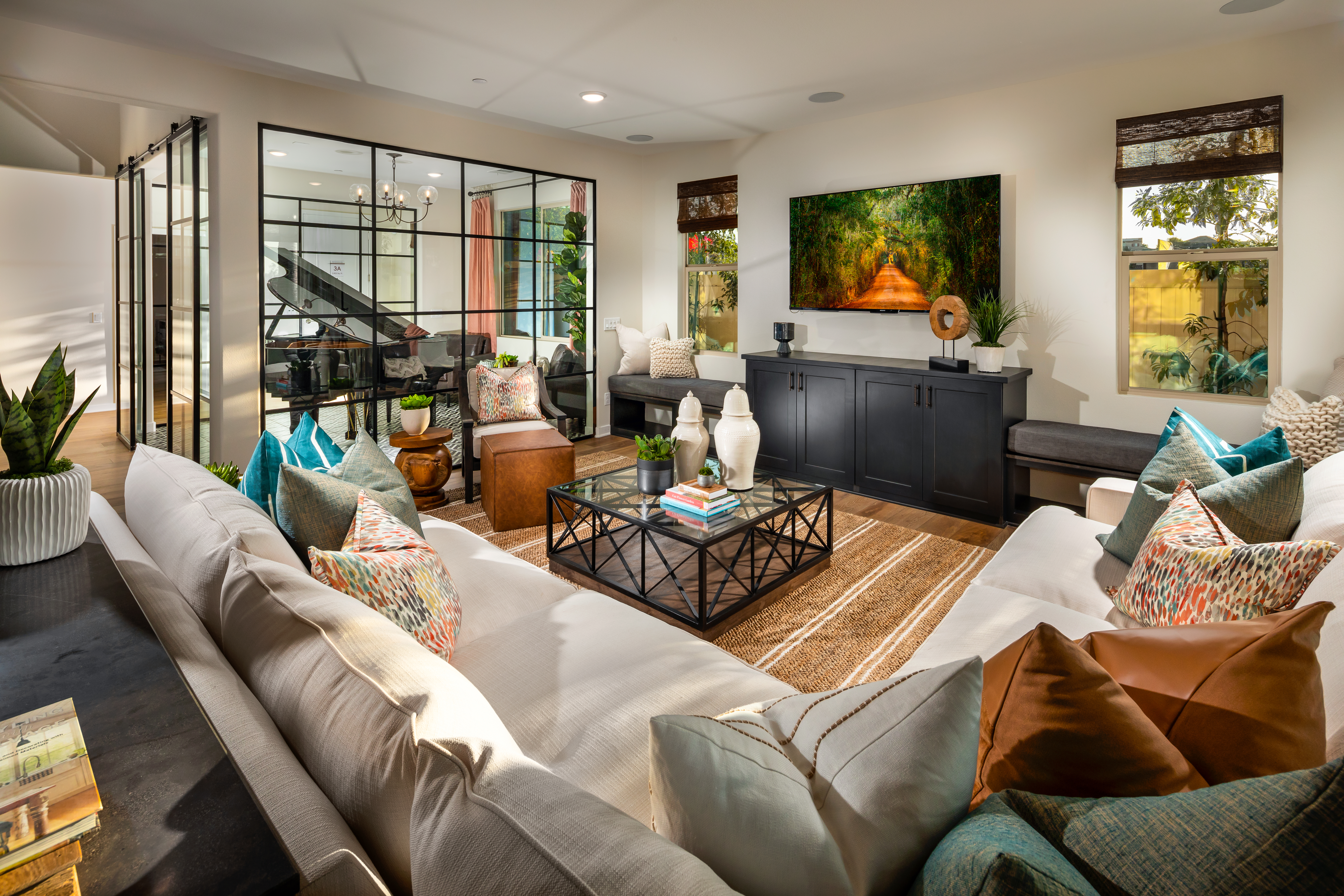
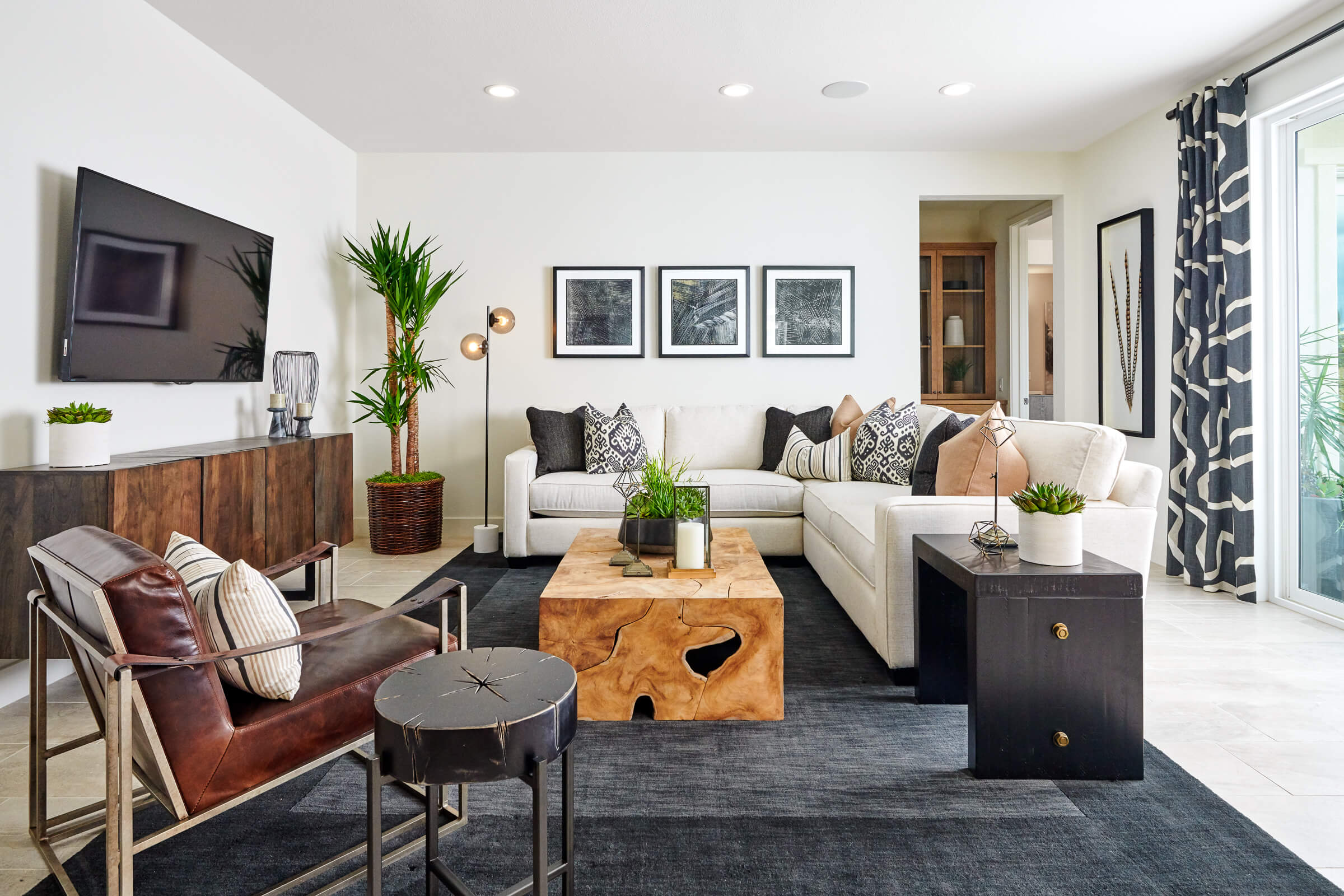
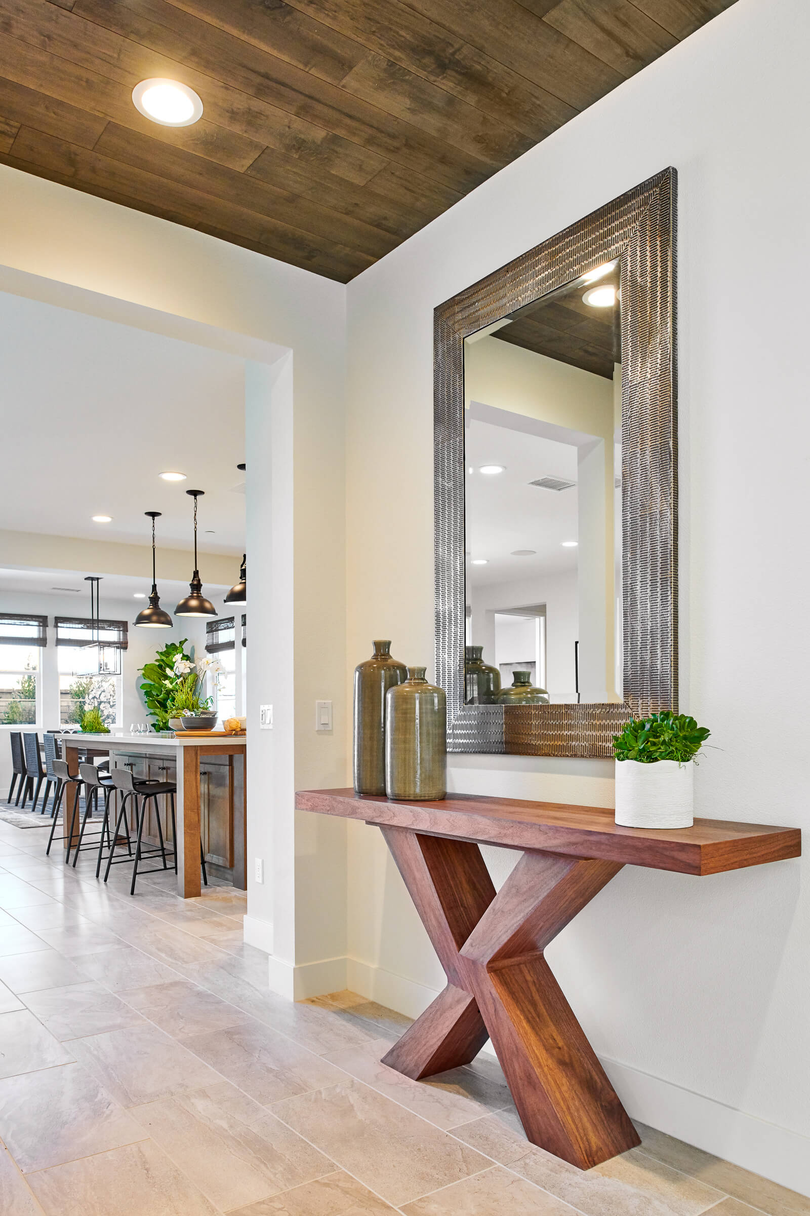
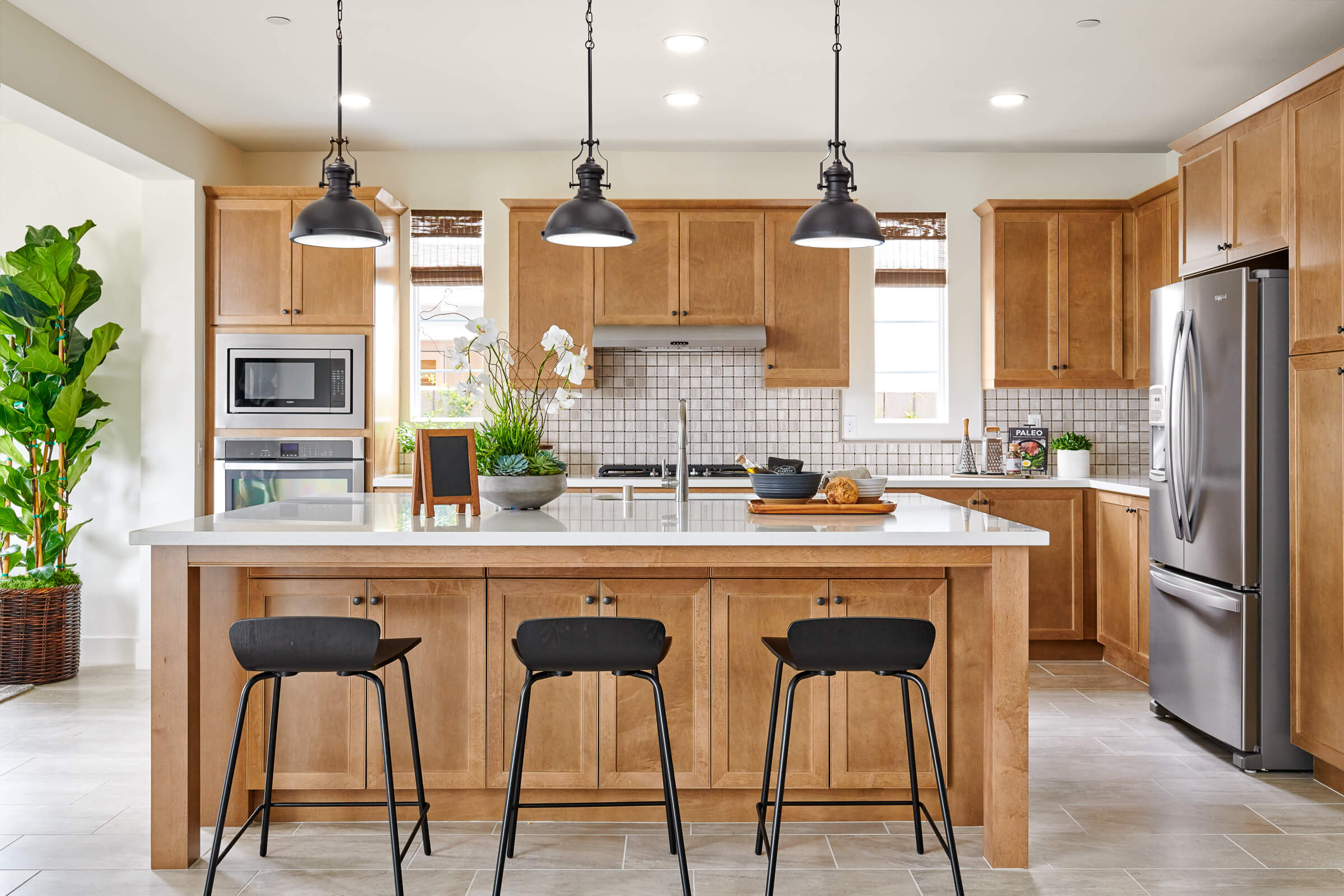
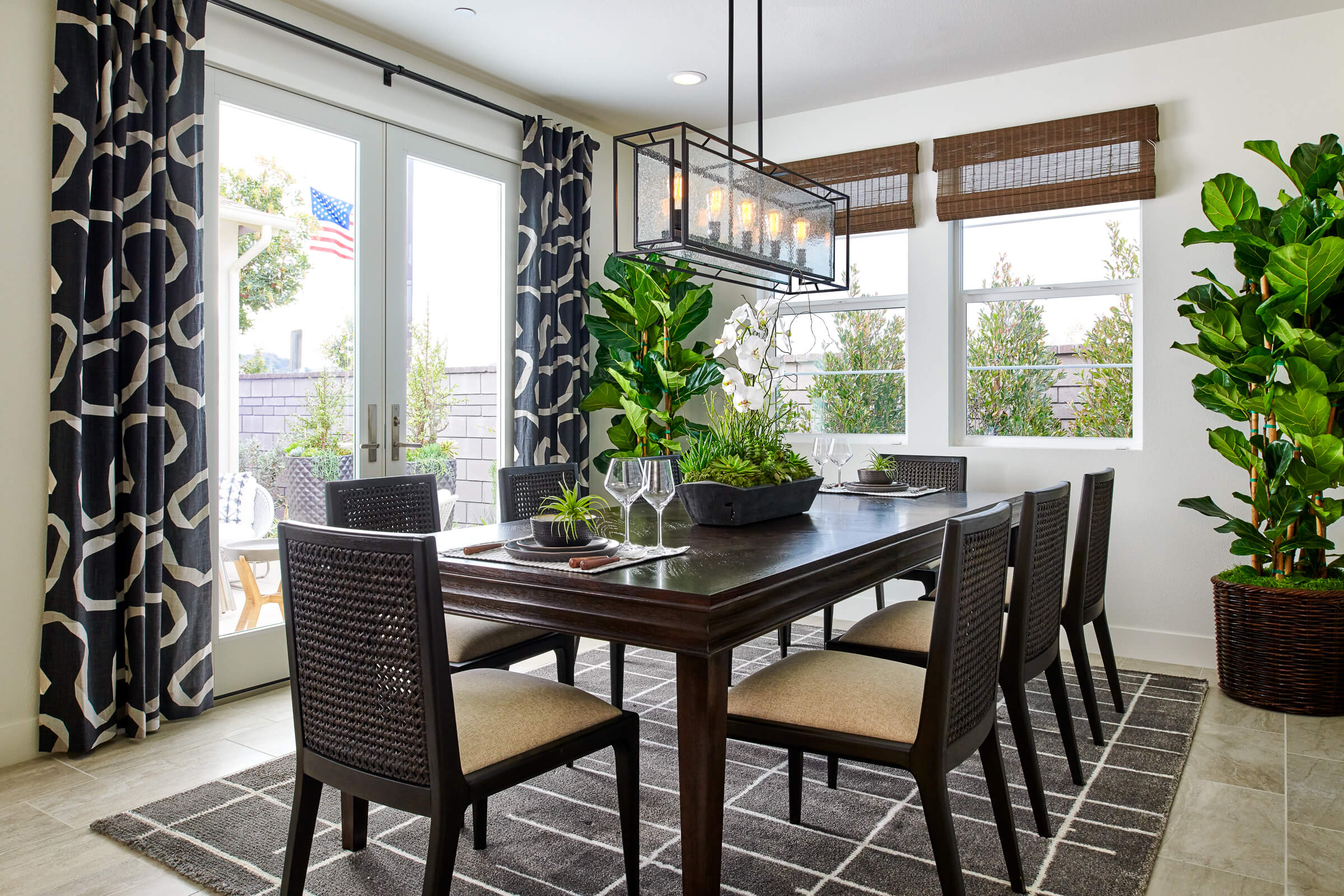
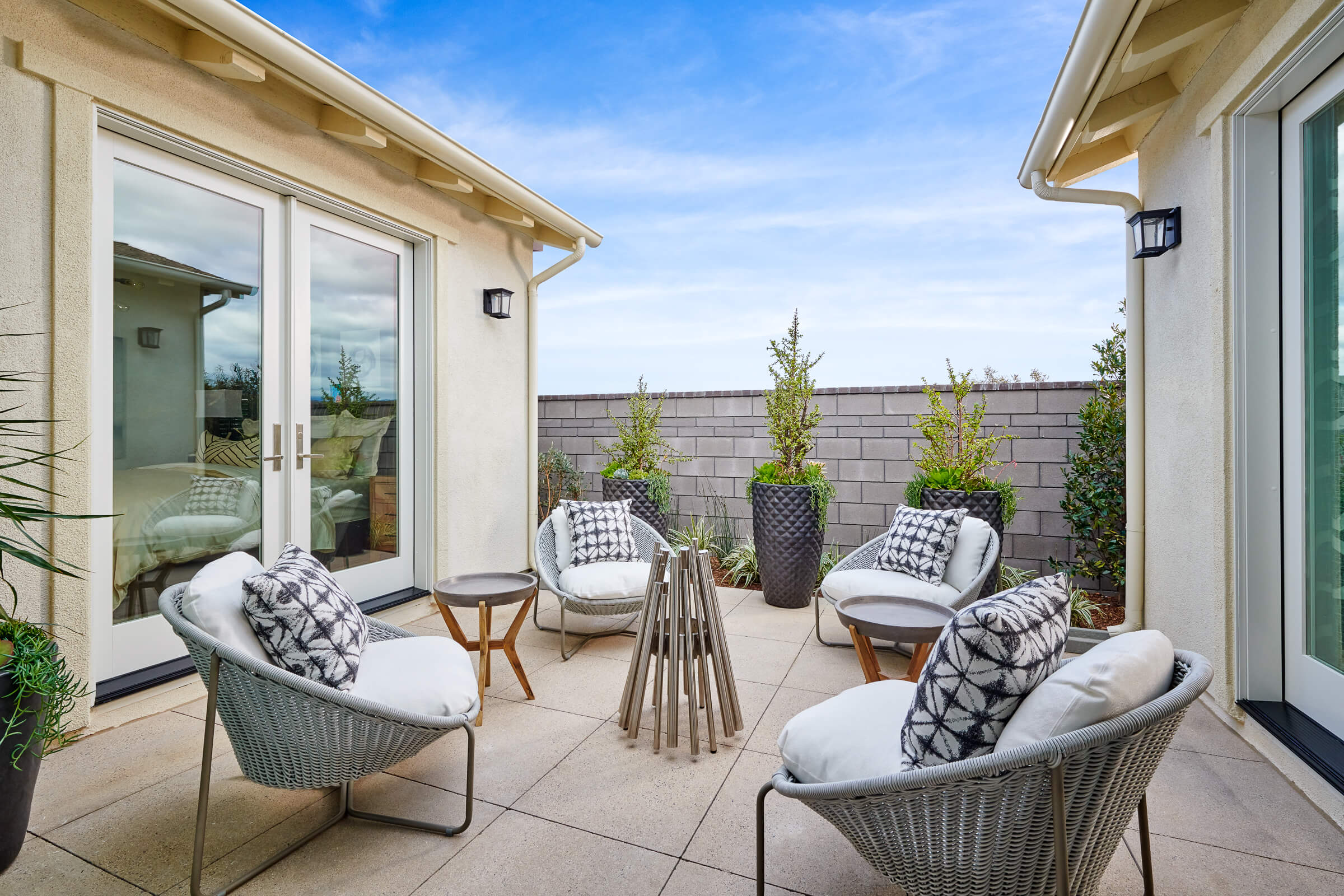
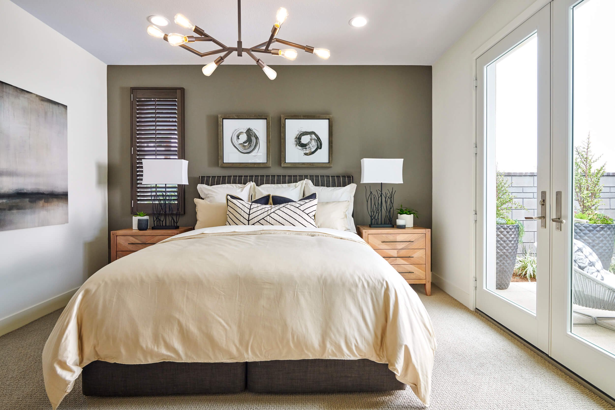
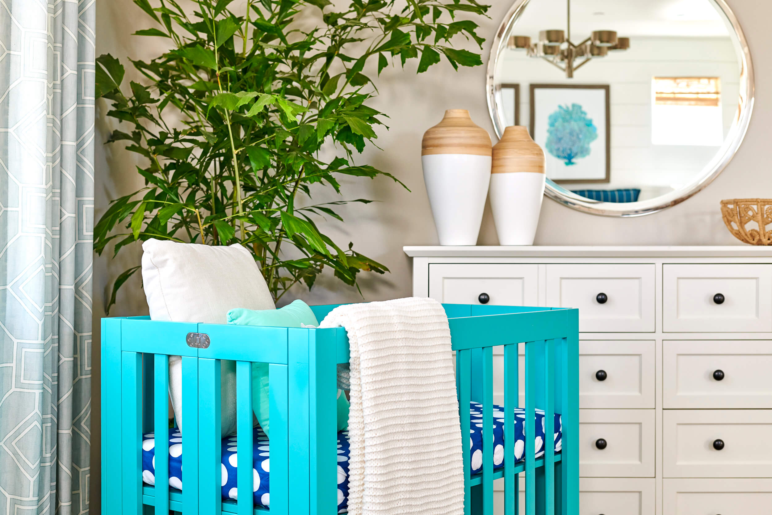
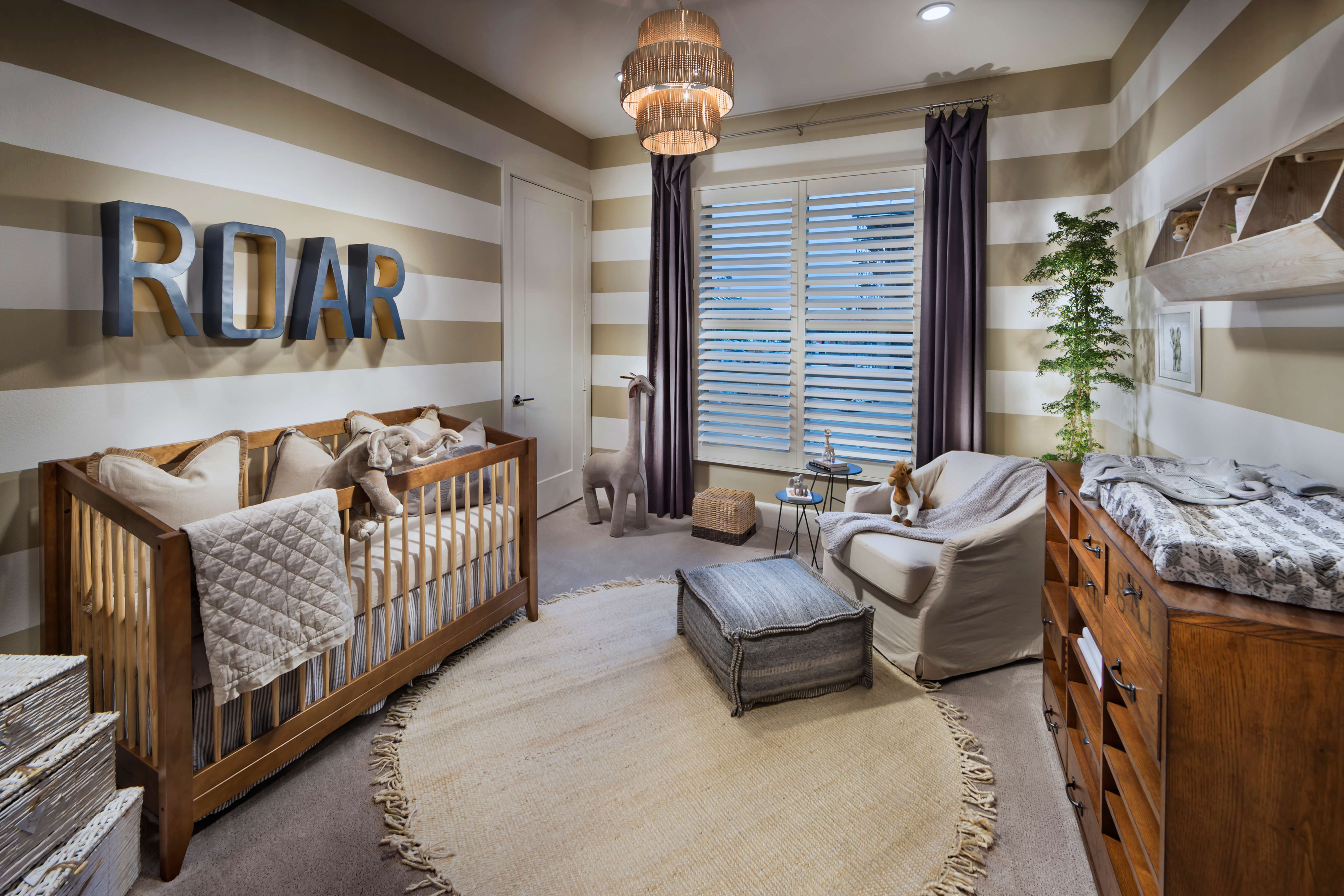
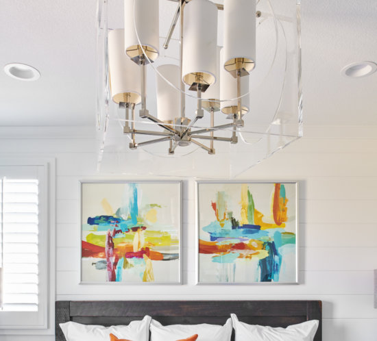
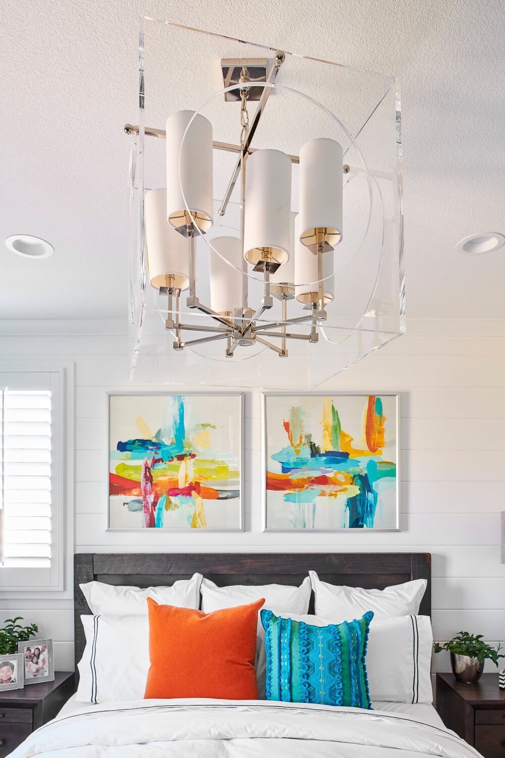
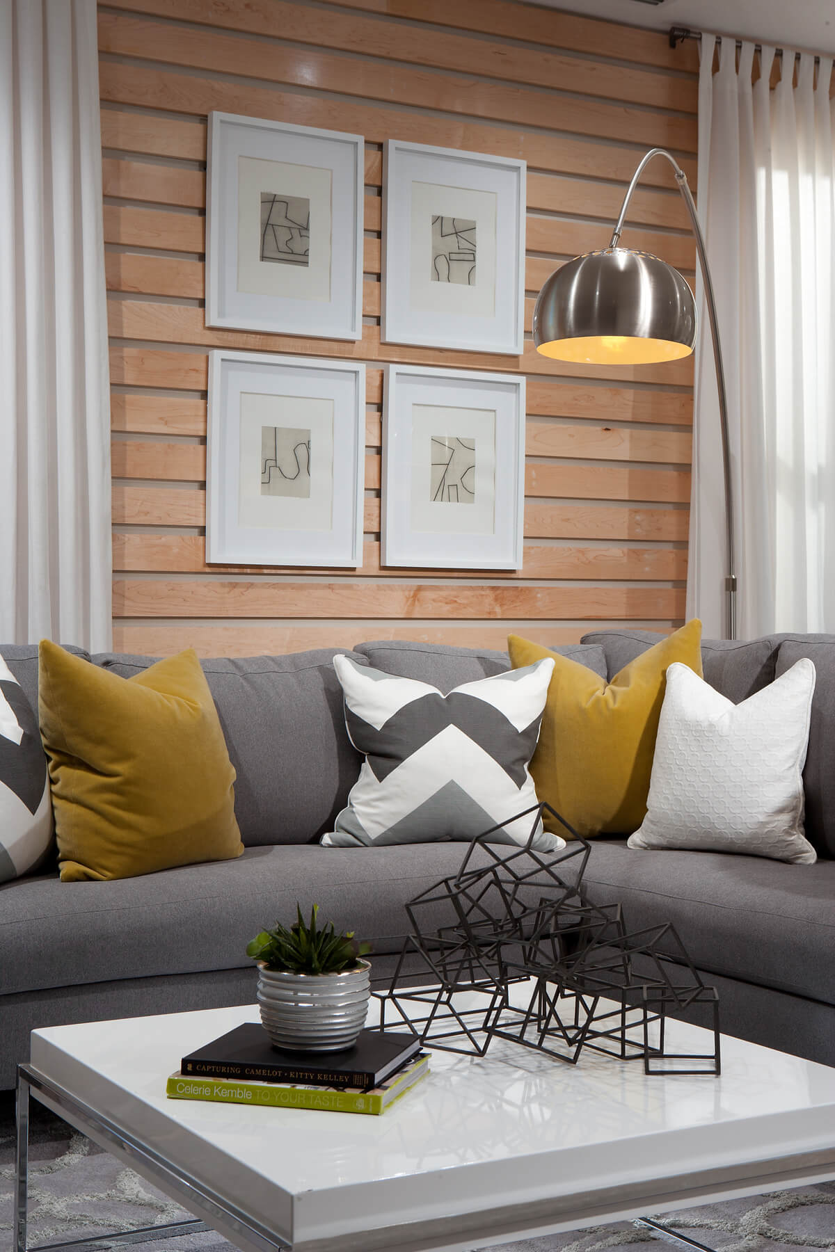
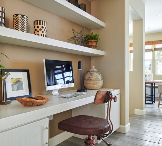
In Azusa, CA Builder Brookfield Residential has crafted something special in the Citrus and Palm Plan 2. Three-stories of refined rustic, this townhouse is full of flexible and adaptive features. Think built-ins, like an extended bench seat with storage in the dining area for big family gatherings, and an architectural niche with a built-in desk and open shelving to help strike the perfect work/life balance. A mix of crisp, polished pieces with refined rustics and woven accents create a distinct feeling of warmth, while the grey wood-like tiling lends a cool contrast to the soft honey hues. Inspired by the beauty of nature, the home’s collection of neutral tones fashion a light color scheme, leaving every square foot feeling wonderfully bright and open.

Neutral Color Power: Bold Isn’t Always Better

Neutral Color Power: Bold Isn’t Always Better

Whether warm and inviting or calm, cool and collected a neutral palette offers a bounty of possibilities. Hand-tailored by Mother Nature herself, it’s no wonder this concoction of earthy tones has stood the test of time.

Neutrals serve as a versatile design foundation—one that can “calm” or ground furniture or accent pieces in brighter shades and unique shapes. A neutral color palette can also create opportunities to add in or swap out splashes of color as trends and seasons change. Plus, neutrals are a great way to highlight textures in a room; making the oft-overlooked design elements of wood, tile, or unique fabrics feel right at home. But perhaps best of all, neutral colors are a smart and timeless investment. They are soothing and classic, work with all styles, and have a mass appeal.

With seemingly endless possibilities in textures and tones, the key is to mix things up. A blend of textures, materials, and shapes in combinations of cool and warm shades enhance the natural characteristics of the room while in its neutral surroundings.

Geometric Flare, No Math Required.

Geometric Flare, No Math Required.

No longer must geometry be an intimidating subject to the math-challenged. Instead, it’s a formula for making a room feel more open by simplifying the lines and shapes of a space. Pattern-adorned contemporary rugs or accent tables can elevate the look and feel of a room, especially along hallways or in modern settings. Make the living room a showstopper by adding a sofa or side table with a geometric flare, or by incorporating ‘acute’ lighting fixture. These eye-catching focal points give it a bold, minimalist, and crisp vibe.

Photo Credit: Chameleon Design

Photo Credit: Target

Photo Credit: Target

Photo Credit: Chameleon Design

Photo Credit: Chameleon Design

Photo Credit: Chameleon Design

Photo Credit: Crate and Barrel

Photo Credit: Crate and Barrel

Photo Credit: Chameleon Design

Seeing Spots

From the jungle to the den, leopard is one of those trends that takes the market by storm – then does it again and again in a few years’ time. Proving that leopard is timeless, its roots in interior decor date all the way back to the 17th century. Yet, most experts will characterize leopard as lending a “modern” feel to a space. Even the smallest leopard accent gives a space a chic and playful facelift that’s sure to draw the eye, especially when paired with soothing neutrals. Try using leopard in small doses so its elegance doesn’t overpower. Dotted accent pillows? Spotted area rugs? From the savanna to the sofa, anything’s possible.

Photo Credit: West Elm

Photo Credit: CB2

Photo Credit: Abyss & Habidecor

Photo Credit: Macys

Photo Credit: Pottery Barn

Photo Credit: Joss and Main

Energizing and Relaxing: Pantone’s Color of the Year is a Juxtaposition of Emotions

How coral snagged the #1 spot as Pantone’s “2019 Color of the Year” is no mystery. There’s just something special about it. “Just as coral reefs are a source of sustenance and shelter, we see this color giving us assurance and buoyancy in an environment that’s been continuously shifting for 10 years,” says the vice president of the Pantone Color Institute, Laurie Pressman.

Double Duty

Coral is a testament to how color enhances the way we experience life, playing a dual role of energizing and nourishing. Evoking imagery of bustling ocean life and brilliant sunsets, it’s easy to gather why coral is pleasing to the eye. Perhaps it’s the unique way it hovers energetically between red and orange without choosing a side. Its striking appearance draws the eye with a revitalizing pop of color that makes every room look brighter.


The Perfect Wingman

Coral’s versatility as both a standalone and partner shade deserves twice the applause. For a calm or beachy vibe that doesn’t overwhelm, beige tones make a perfect pair. To ramp up the energy, look no further than coral’s two complementary colors – green and blue. Whether it’s lime, turquoise, teal, royal blue, or navy, they all play nice with coral, and serve to illuminate its ability to open the eyes and the heart to any space.


Nature Meets Modern Man at Reverie Plan 1

This clean and modern farmhouse in Rancho Mission Viejo by William Lyon Homes lends a chic, yet inviting atmosphere. Chameleon Design showcases our take on a purely natural palette by featuring varying shades of ebony, natural wood textures, and creamy whites. This space is unique in that its light tones and ample space make the home feel open, while charcoal accents like drapery, area rugs, and statement seating anchor it together. This home’s decidedly masculine aesthetic wouldn’t be complete without featuring an ode to the great outdoors. Wood ceilings in the entryway create a sense of arrival, while a tree root coffee table and toasty fire pit, seen through three sets of doors, welcome family and friends to gather both inside and out.

Teeny, Tiny & Trendy

Teeny, Tiny, & Trendy

Baby-fresh fashion has taken over infant’s rooms everywhere. It all started with endlessly stylish Instagram mamas who began designing kid’s rooms that have inspired grown-up envy across the nation. Now, rugrat refinement is having a moment. Here are some of the styles to watch:


Color Wheel

Venturing all around the color wheel is 2018’s new nursery trend. As more and more parents-to-be forego the traditional blue-for-boys and pink-for-girls color schemes, they’re enjoying the newfound freedom of choice when it comes to the nursery. Keeping the palette to a central color theme ties the room together in a thoughtful way without losing this new-found creative freedom. After all, a nursery should flow with the rest of your décor, not disrupt it. Being creative with colors, allows parents to welcome their babies with personality, and give them a taste for how exciting the world can be. Try coupling gray tones with playful pastels, adding bright pops of color or going bold with a blacked-out accent wall.


Bold Contrast

For our nation’s tykes, layered is the new look. Kid’s rooms are making simple, yet exciting statements with fun, contrasting patterns that are sure to make any baby’s eyes light up. This trend comes in many flavors, whether it’s pairing buffalo check with hand-painted polka dots or pin stripes with chevron. The secret ingredient to mastering this perfect blend is found in the mixing of furnishing finishes. Make it chic by adding modern furnishings then take a walk on the wild side by adding an element of rustic flare. Mix and match to add a splash of fun.


Tailored for Two

Given that parents often frequent the nursery nearly as often as their newborns, nurseries are growing smarter. While yesterday’s nurseries were solely designed for the baby, today’s spaces are more functional, prioritizing mom’s needs too. The nursery should be a haven for parent and child to bond together, thus including comfortable seating is a must—update the classic rocker to one that is plush. Be spatially-savvy by adding wall-mounted storage to accommodate baby’s necessities. And if that little one still feels too far away, try adding a stylish bassinet to the master.

Very Velvet

Is it this year’s royal wedding that set this trend into motion? Whatever the cause, designers are welcoming velvet back into the home, popping up on pillows, drapery, rugs, and even comforters. The resurgence of velvet is here just in time for the holidays, lending a plush elegance to the modern home. Designers are implementing it in a variety of ways from accent pillows to furnishings. The velvets of today are versatile, soft and sophisticated. For starters, embellishments are the way to go, such as with accent trays, throw pillows, and subtle textiles. The bold can utilize this fabric to reupholster just about anything from dining chairs to sofas.

Photo Credit: Chameleon Design

Photo Credit: Crate and Barrel

Photo Credit: H&M

Photo Credit: Chameleon Design

Photo Credit: Urban Outfitters

Photo Credit: Lulu and Georgia

Photo Credit: Chameleon Design

PROJECT HIGHLIGHT – KADENCE AT CENTENNIAL PLAN 3

Hacienda Sunrise

Designed by Chameleon Design, Kadence at Centennial for Pardee Homes in Menifee is decked with a lavishly contemporary touch and a hint of hacienda flare. Endless natural light lends a spotlight to every special detail from, bold colors and textured accents to an eclectic combination of rustic and modern furnishings. To keep the space feeling fresh and open, feature a wood paneled accent wall to add intrigue. The finishing touch? A glass-walled room with patterned tile, for an unforgettably fun, yet sophisticated feel.

Three Retro Trends We Hope Never Come Back

We’re all about walking on the cutting edge when it comes to design. But every now and then, it’s even more fun to take a jog down memory lane. Grab your boomboxes and hold onto your turtlenecks – we’re going to unpack some of the most cringeworthy style trends of the last three decades.

1970s: Soaked in your Sleep

Something just wet the bed—it was your mattress. These vinyl water sacks were all the rage, making waves in the 70s until folks finally got seasick by the 80s. If you didn’t have a waterbed, did you even have a bed? Everyone who was anyone was on board, from plain Jane nextdoor to Hugh Hef, who reportedly had a huge waterbed covered in Tasmanian possum hair. These buoyant mattresses were fantastic—as long as Fluffy the cat kept his paws off! We’re so glad the popularity of this trend dried up so we could finally put the waterbed to rest.

Photo Credit: The Atlantic


1980s: The Monster Beneath Your Feet

Not surprisingly, thinking back to the wall-to-wall carpets that swept the market in the 80s does not give us the warm fuzzies! While we’d rather sweep this one under the rug, shag carpets were a wildly popular trend, covering up gorgeous hardwoods from the front door to the (gasp) bathroom floor. Between the flourishing bacteria and hard-to-clean dirt, there was nothing magic about these carpets, which unrolled in popular shades like hunter green, burgundy and jaundice yellow.

Photo Credit: Carpet One Floor & Home


Photo Credit: Networx

1990s: Wild Walls

Perhaps something about the impending millenium made us want to box ourselves into the decade—a feeling which we accomplished with floor-to ceiling wallpaper in every room! Seashell patterns? You bet. Infinite florals? Yes please! This dated fashion trend swallowed even the most expansive spaces, assaulting the eye with colors and shapes galore! On the off-chance we wanted to let walls breathe, there was sponge paint, creating a clashing multi-neon colored collage of chaos.

Photo Credit: Popsugar


Photo Credit: Family Handy Man