Neutral Color Power: Bold Isn’t Always Better
Neutral Color Power: Bold Isn’t Always Better
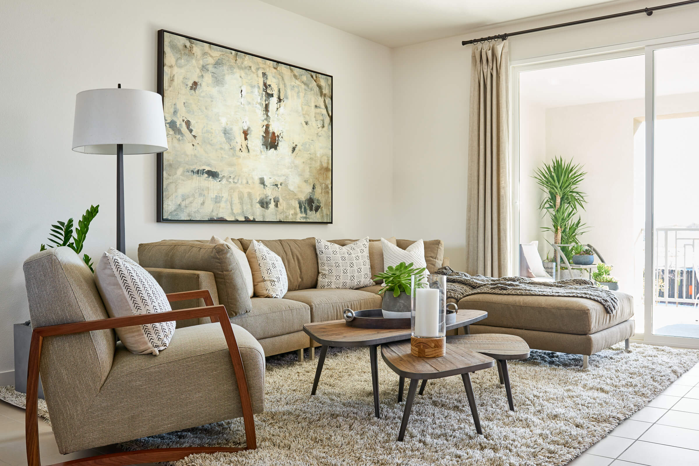
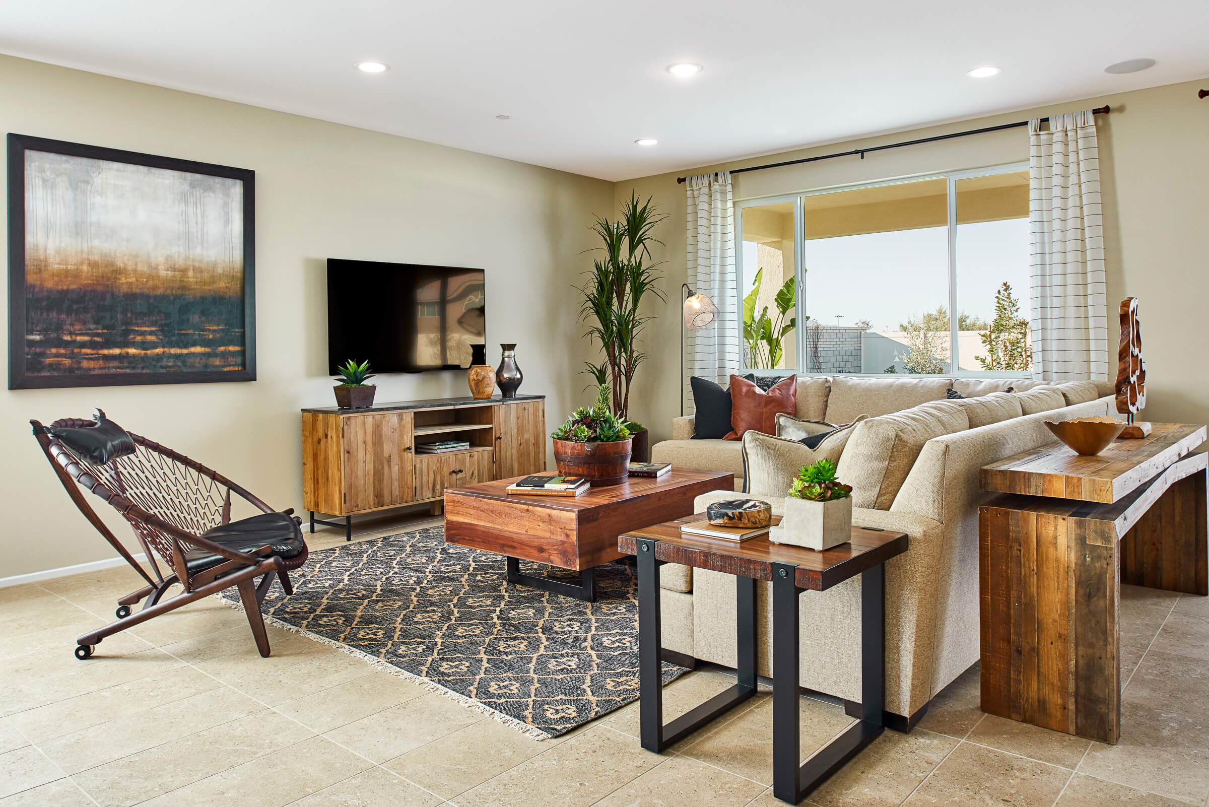
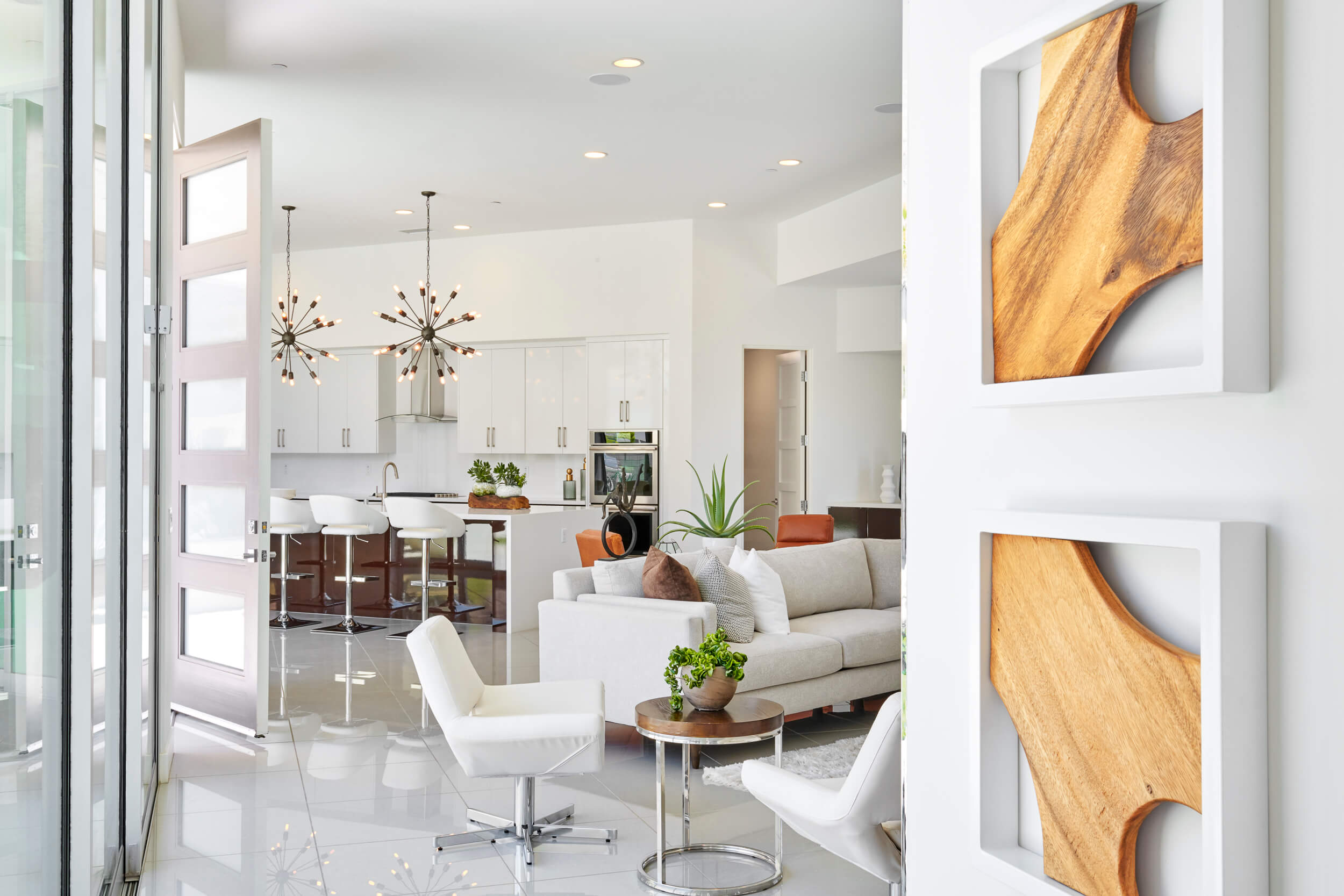
Whether warm and inviting or calm, cool and collected a neutral palette offers a bounty of possibilities. Hand-tailored by Mother Nature herself, it’s no wonder this concoction of earthy tones has stood the test of time.
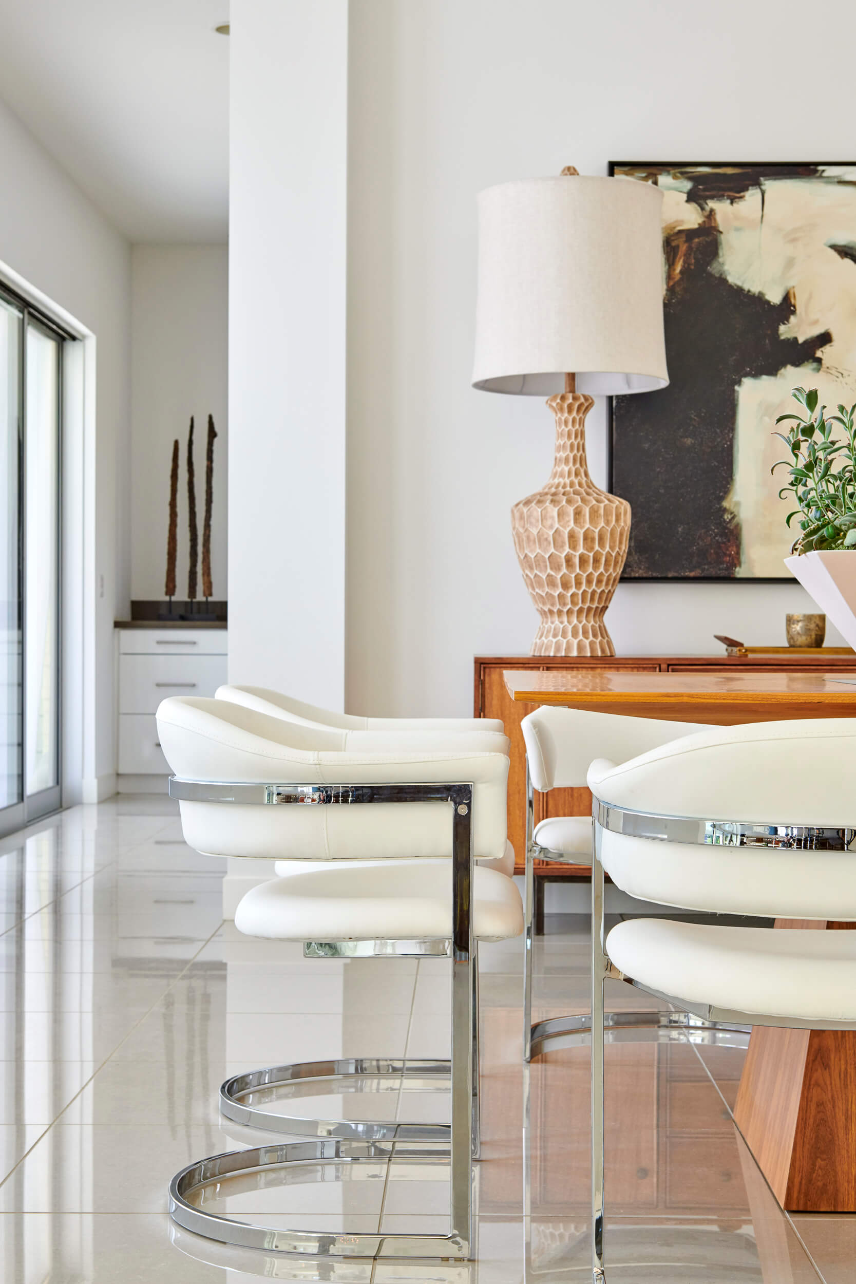
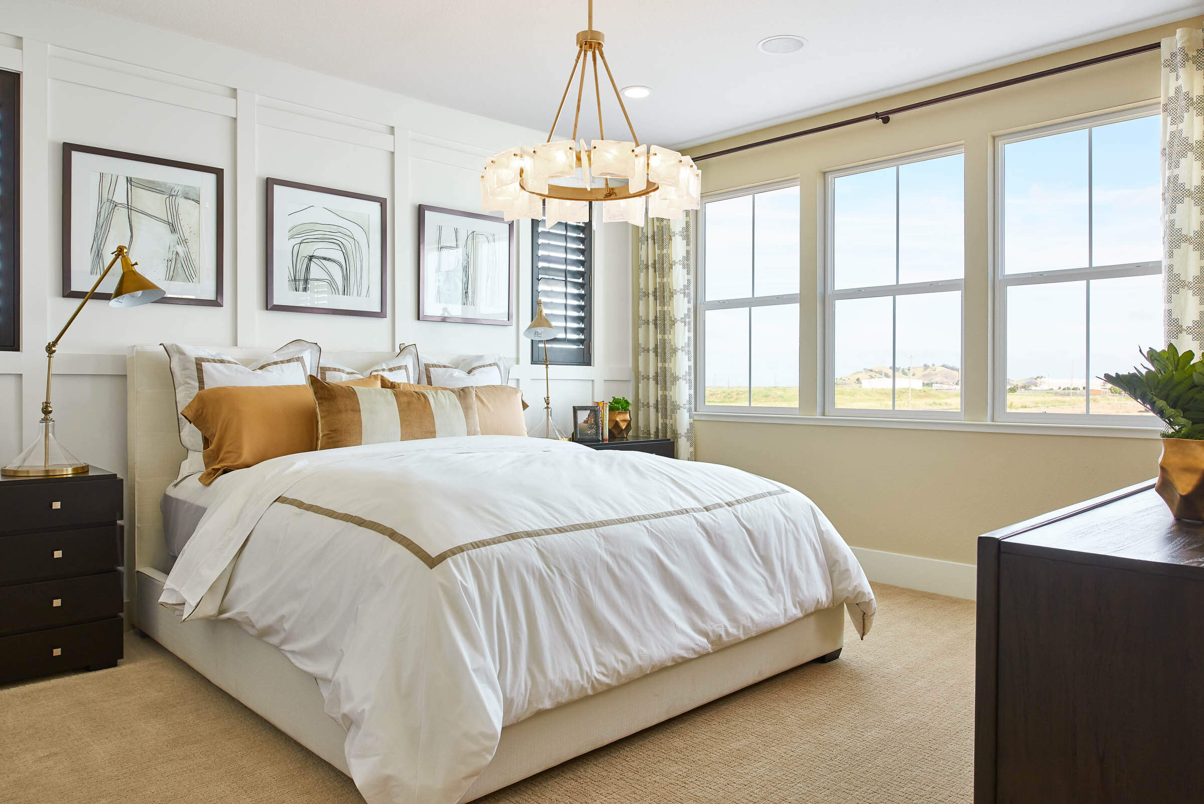
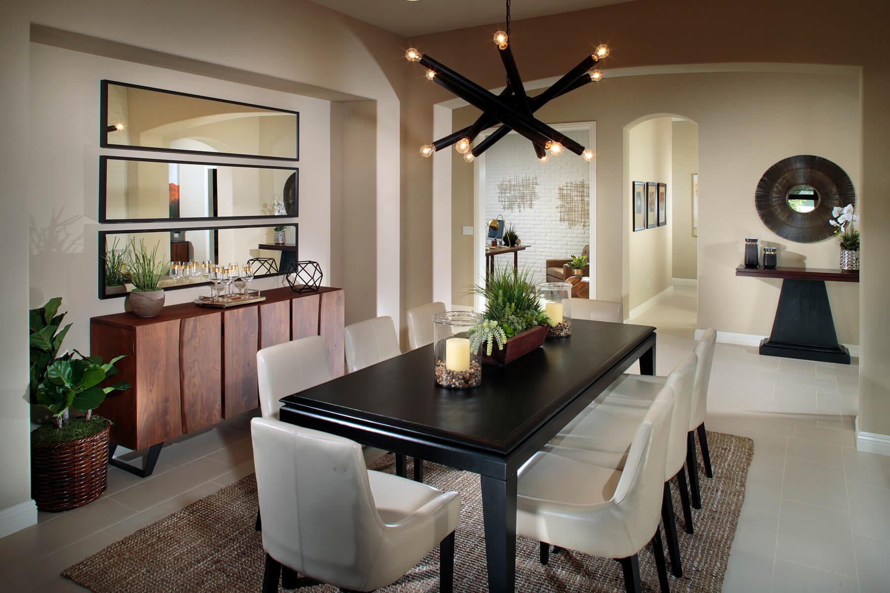
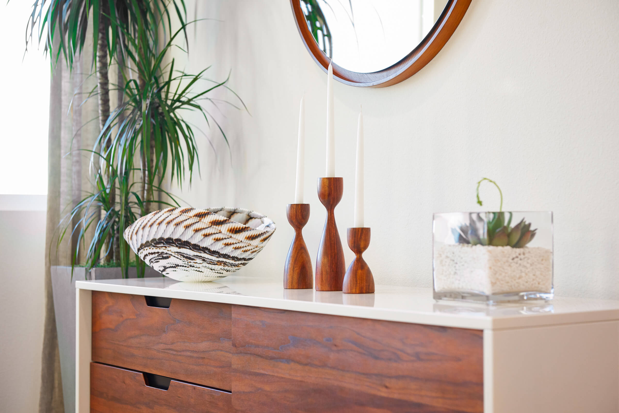
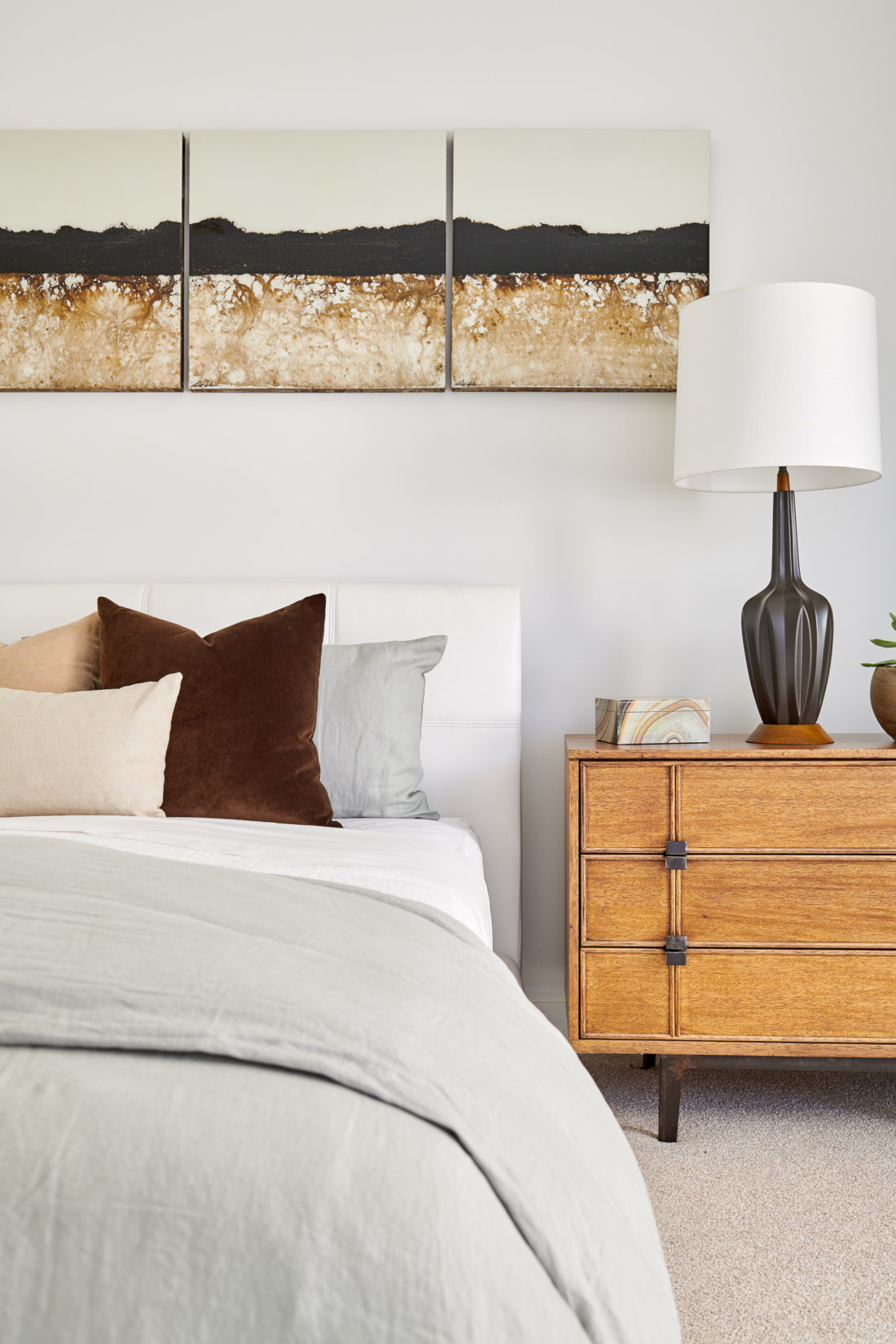
Neutrals serve as a versatile design foundation—one that can “calm” or ground furniture or accent pieces in brighter shades and unique shapes. A neutral color palette can also create opportunities to add in or swap out splashes of color as trends and seasons change. Plus, neutrals are a great way to highlight textures in a room; making the oft-overlooked design elements of wood, tile, or unique fabrics feel right at home. But perhaps best of all, neutral colors are a smart and timeless investment. They are soothing and classic, work with all styles, and have a mass appeal.
With seemingly endless possibilities in textures and tones, the key is to mix things up. A blend of textures, materials, and shapes in combinations of cool and warm shades enhance the natural characteristics of the room while in its neutral surroundings.