Energizing and Relaxing: Pantone’s Color of the Year is a Juxtaposition of Emotions
How coral snagged the #1 spot as Pantone’s “2019 Color of the Year” is no mystery. There’s just something special about it. “Just as coral reefs are a source of sustenance and shelter, we see this color giving us assurance and buoyancy in an environment that’s been continuously shifting for 10 years,” says the vice president of the Pantone Color Institute, Laurie Pressman.
Double Duty
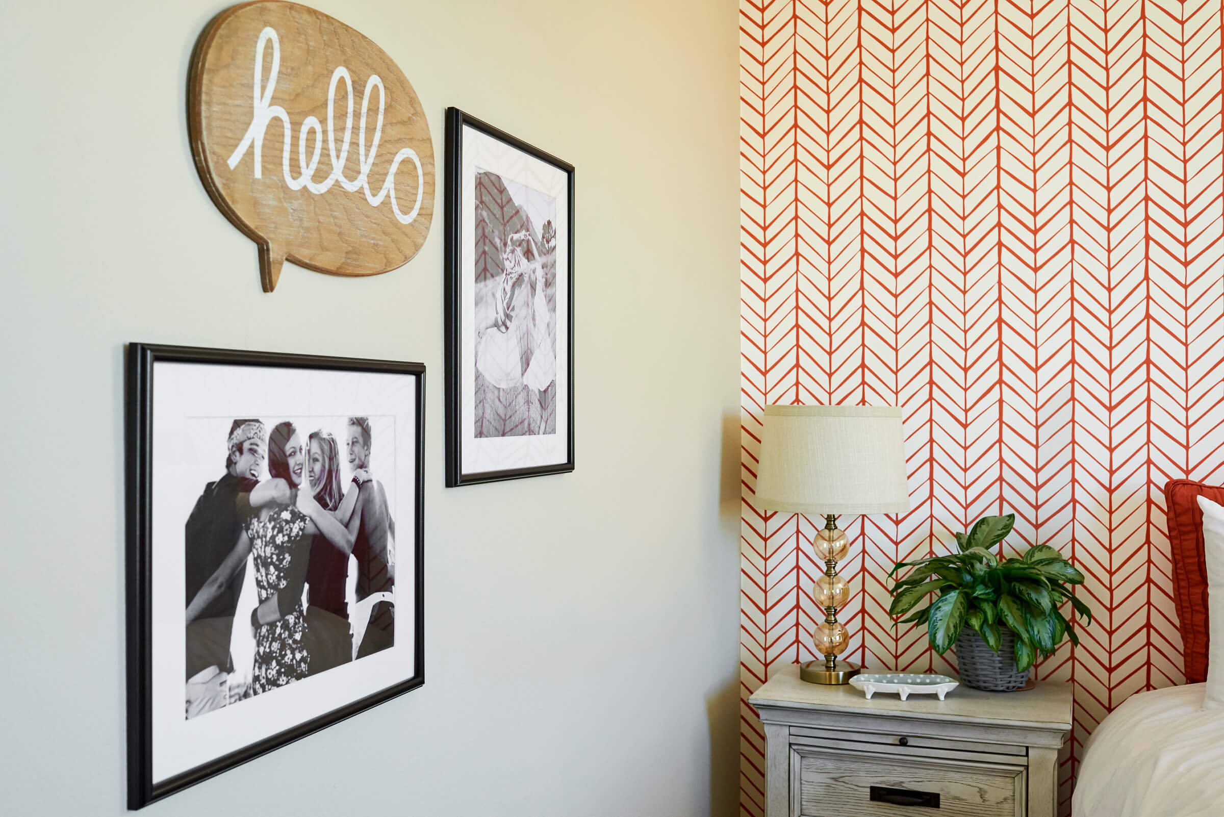
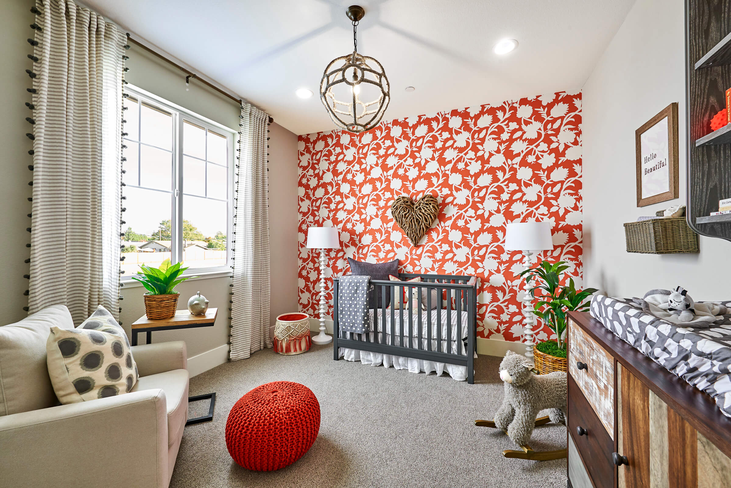
Coral is a testament to how color enhances the way we experience life, playing a dual role of energizing and nourishing. Evoking imagery of bustling ocean life and brilliant sunsets, it’s easy to gather why coral is pleasing to the eye. Perhaps it’s the unique way it hovers energetically between red and orange without choosing a side. Its striking appearance draws the eye with a revitalizing pop of color that makes every room look brighter.
The Perfect Wingman
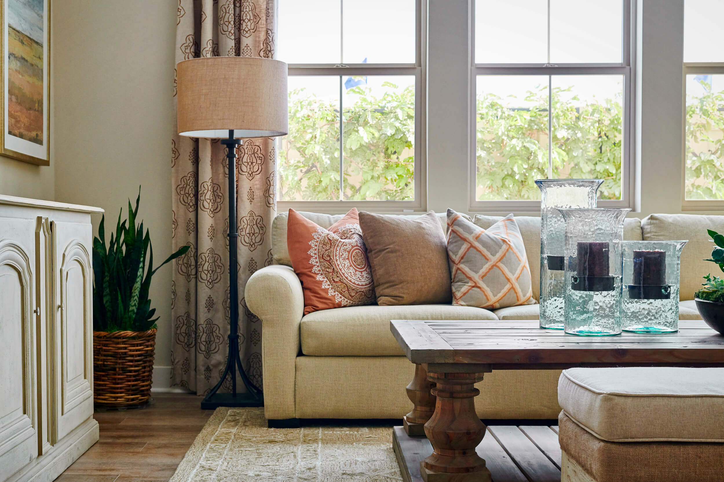
Coral’s versatility as both a standalone and partner shade deserves twice the applause. For a calm or beachy vibe that doesn’t overwhelm, beige tones make a perfect pair. To ramp up the energy, look no further than coral’s two complementary colors – green and blue. Whether it’s lime, turquoise, teal, royal blue, or navy, they all play nice with coral, and serve to illuminate its ability to open the eyes and the heart to any space.