Home Design Trends // Pantone’s Color of the Year: Marsala
Reviews for Pantone’s latest color pick have been mixed, but we like it as an accent color for the home and its rich and earthy tone could be easily used as an updated neutral in any room- as long as it’s done sparingly. The shade would work nicely in the kitchen or dining room, as red shades stimulate the appetite. It would also work well in a powder room, as you can go for stronger, more daring choices in rooms that you don’t spend a lot of time in. The color is deep so just make sure your space has some white and/or natural light so that it doesn’t come off too dark and moody.
Style-wise, Marsala lends well to the bohemian look that is so popular right now. I can see us using it in a beautiful Moroccan rug, accent pillows or upholstery. It’s a beautiful shade and if used correctly, will lend an heir of sophistication to your home.
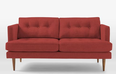
Mid-Century Sofa, West Elm
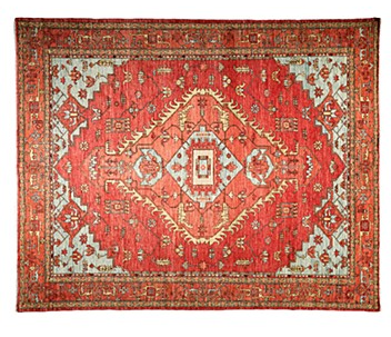
Wool Rug, Bloomingdale’s
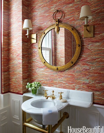
Powder Room, House Beautiful

Pendant Lamp, Matter