A New Angle on Wallpaper
A New Angle on Wallpaper
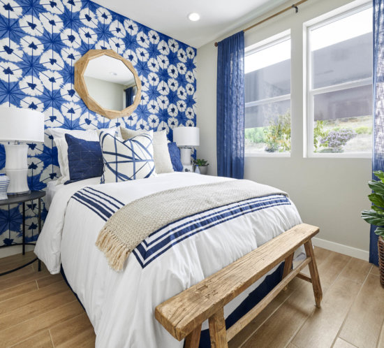
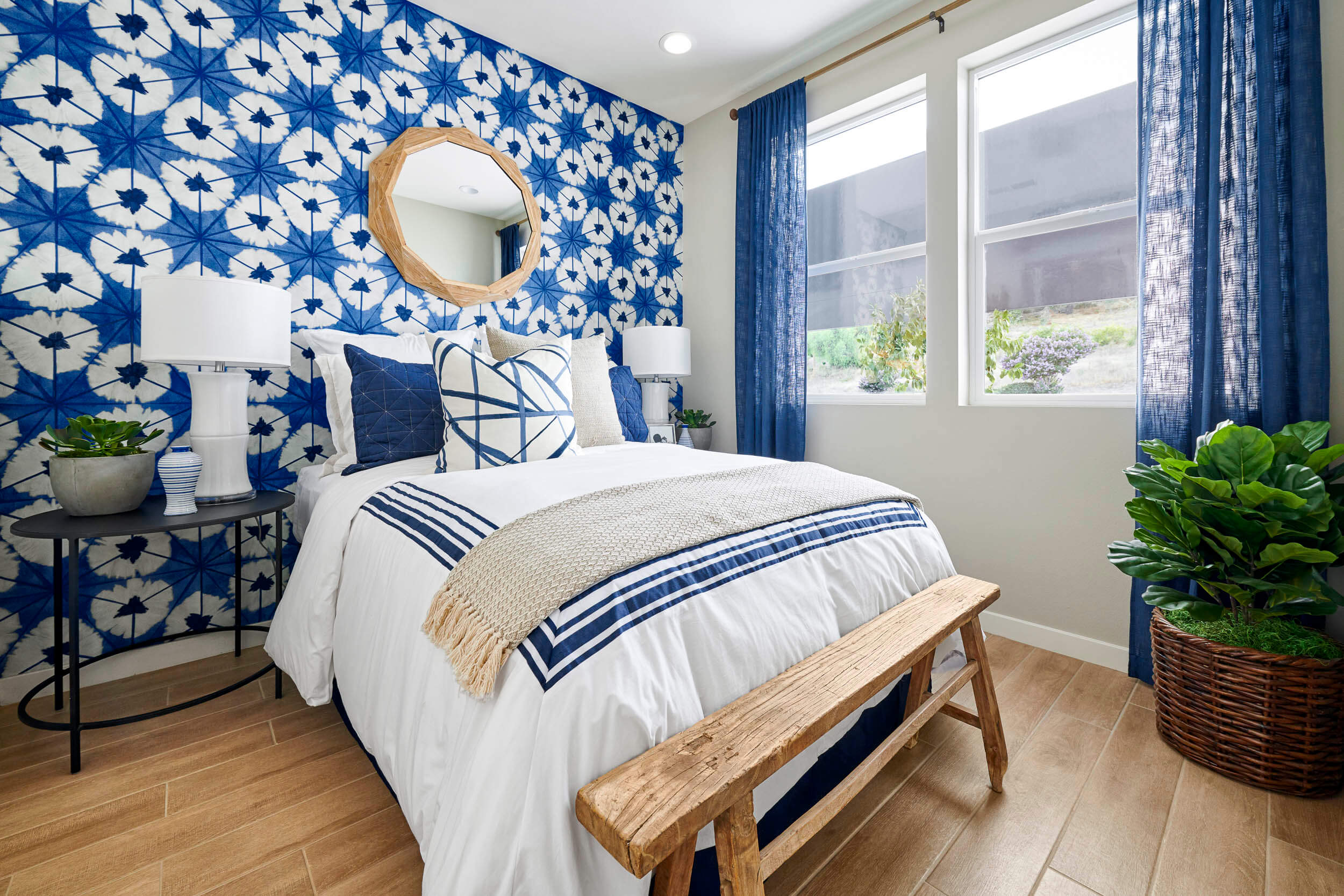
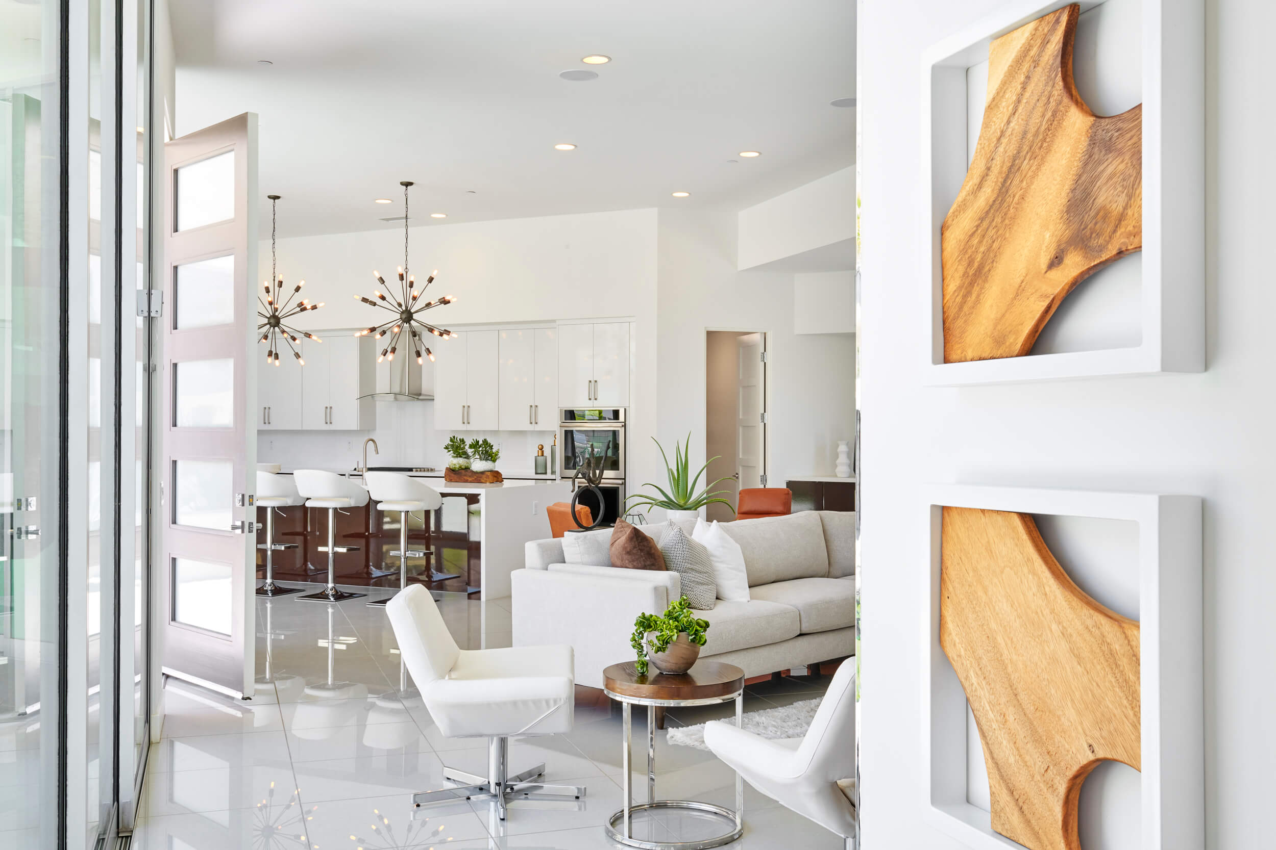
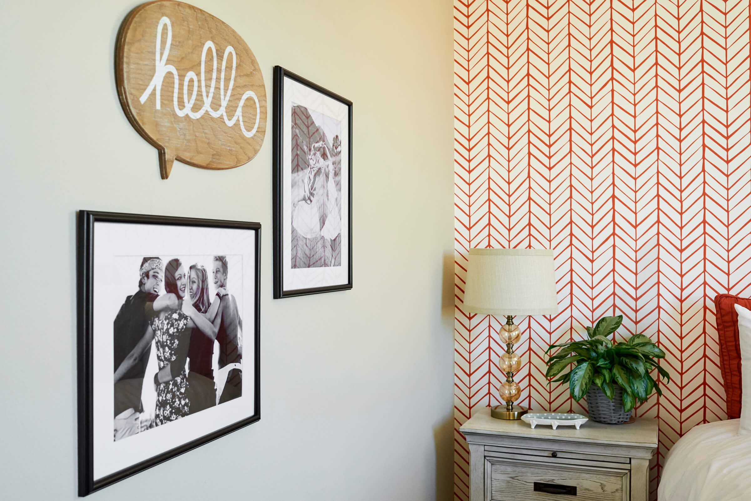
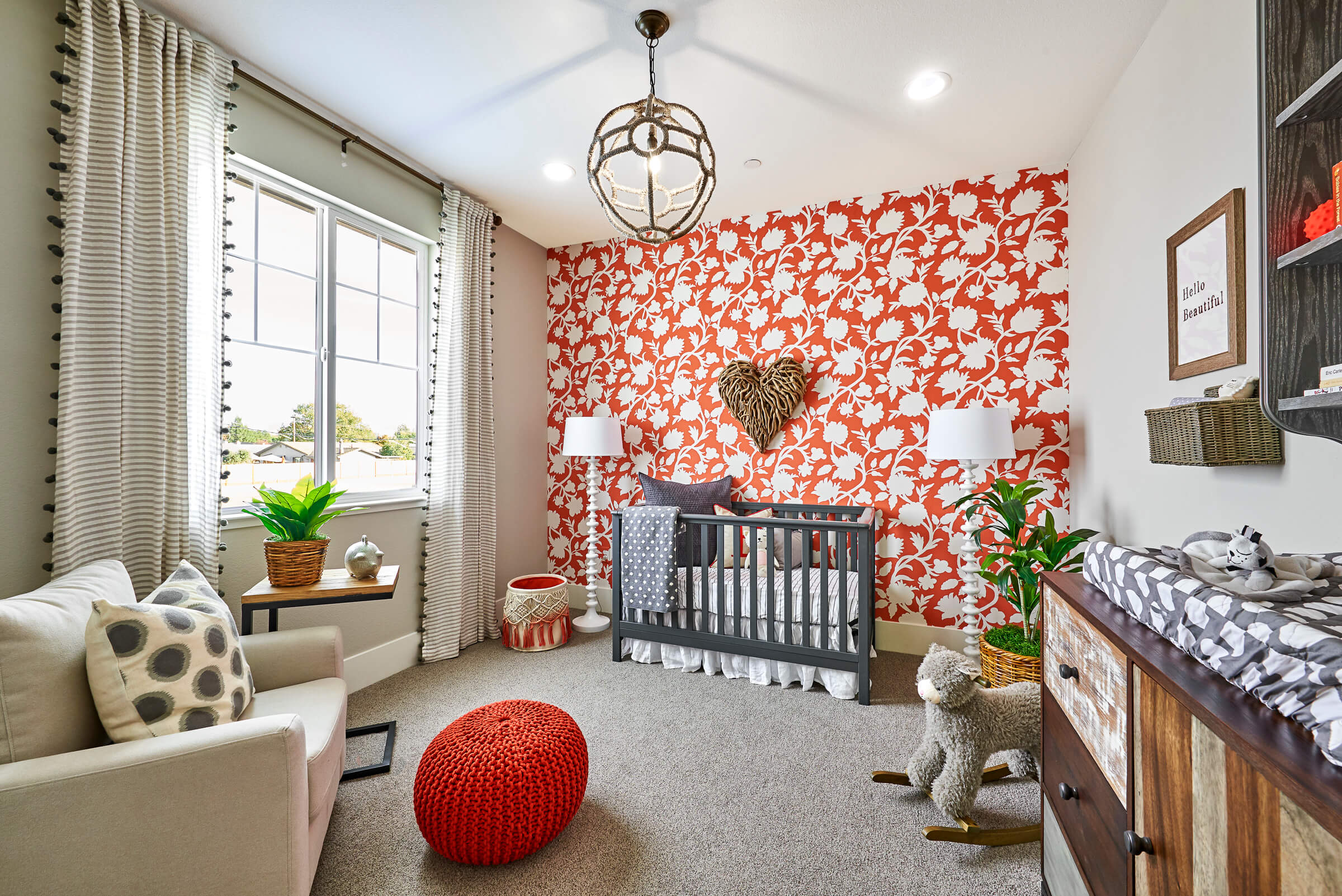
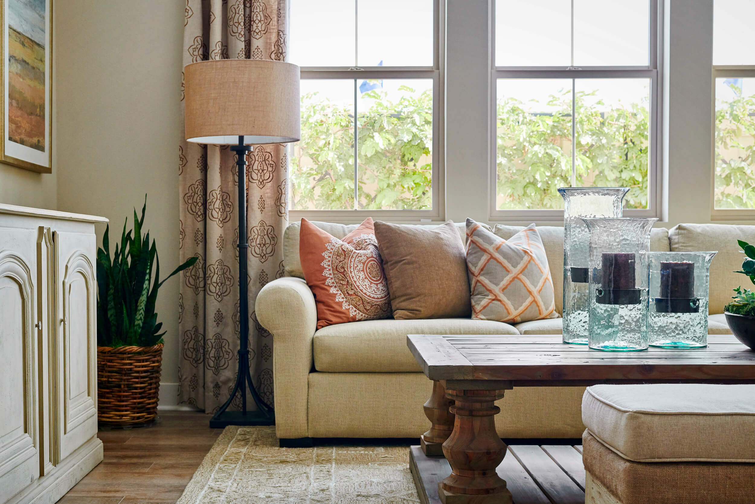
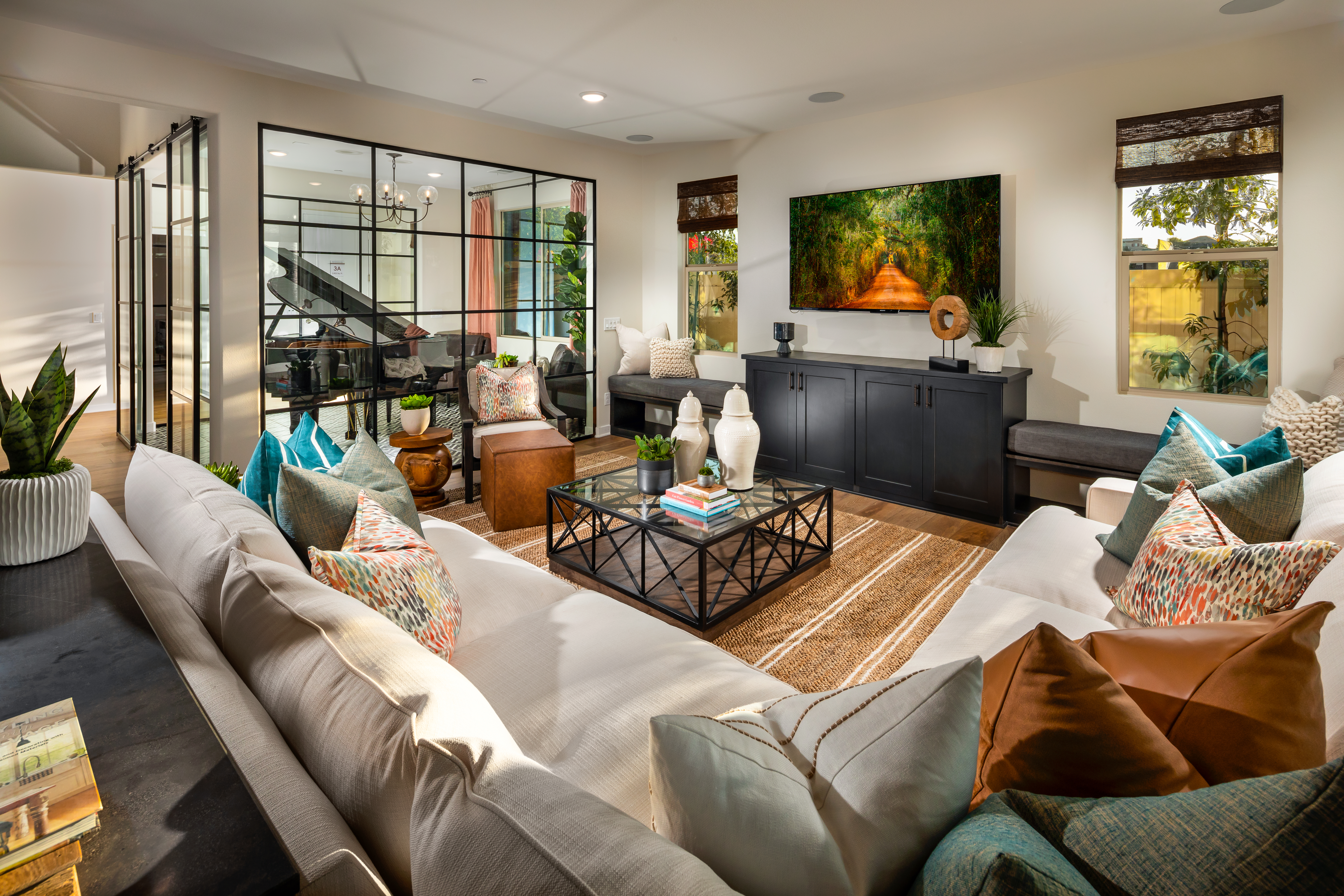
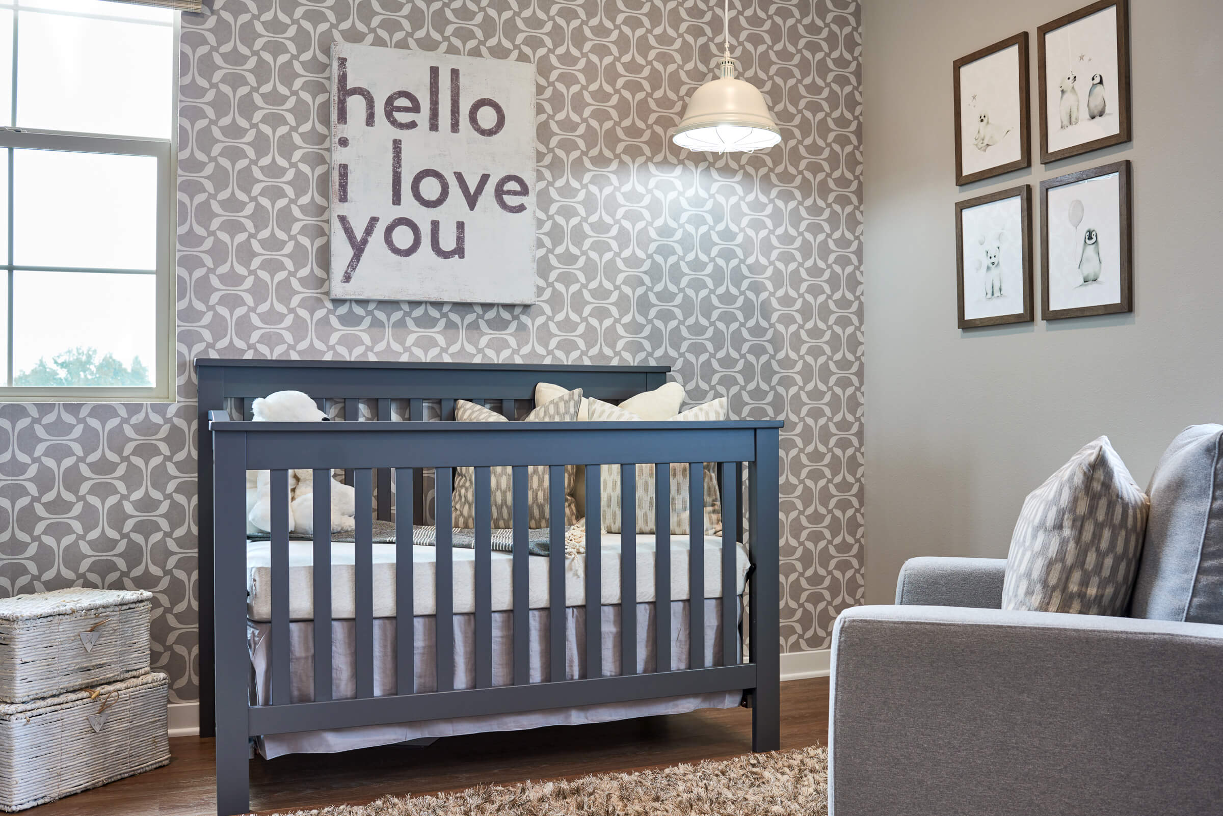
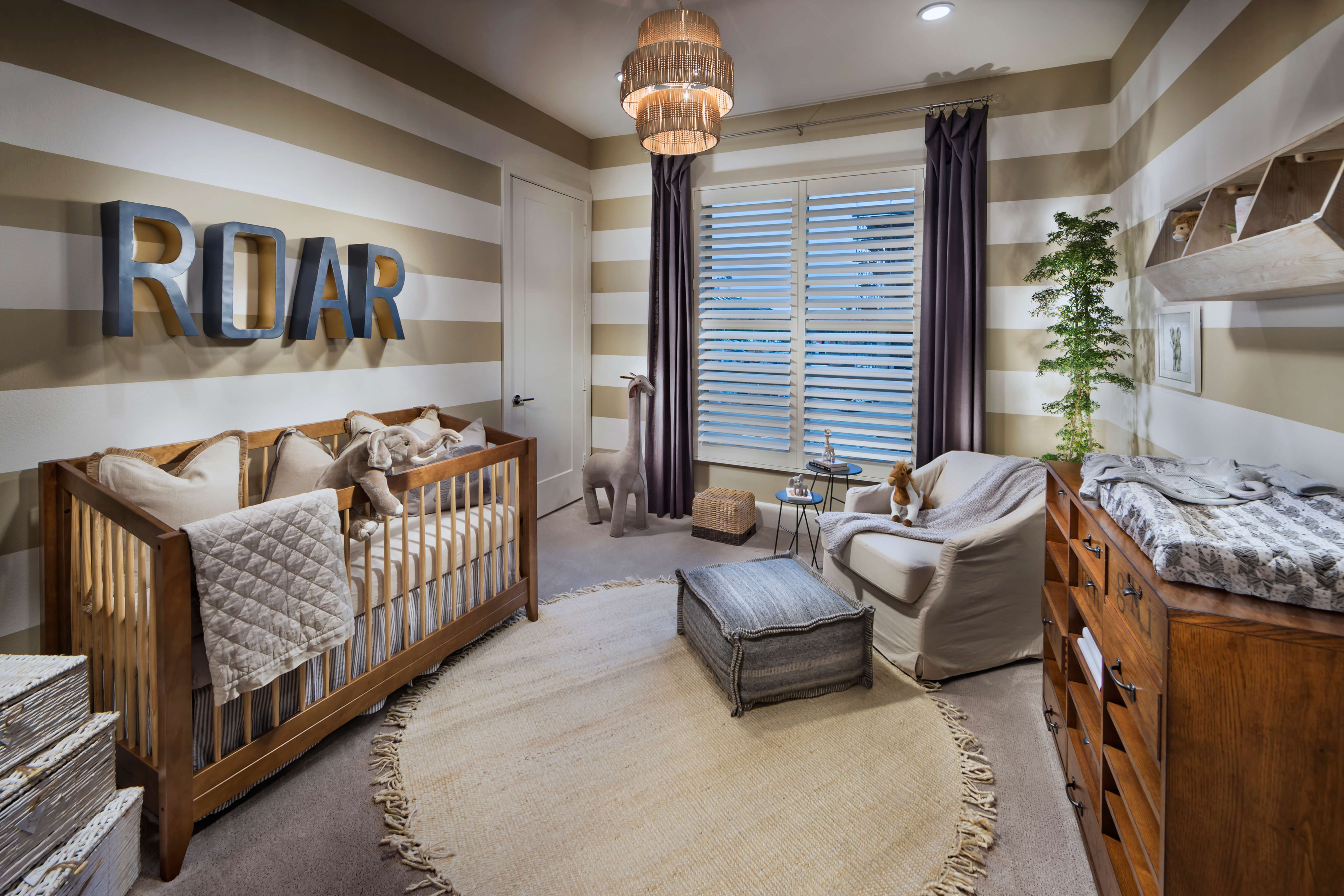
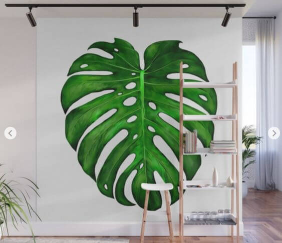
Wallpaper isn’t what it used to be (#grateful). Today, a wide range of patterns are sought out by homeowners and apartment dwellers alike. They’re using this sleek element of décor to add a swath of color or apply unexpected texture to a room.
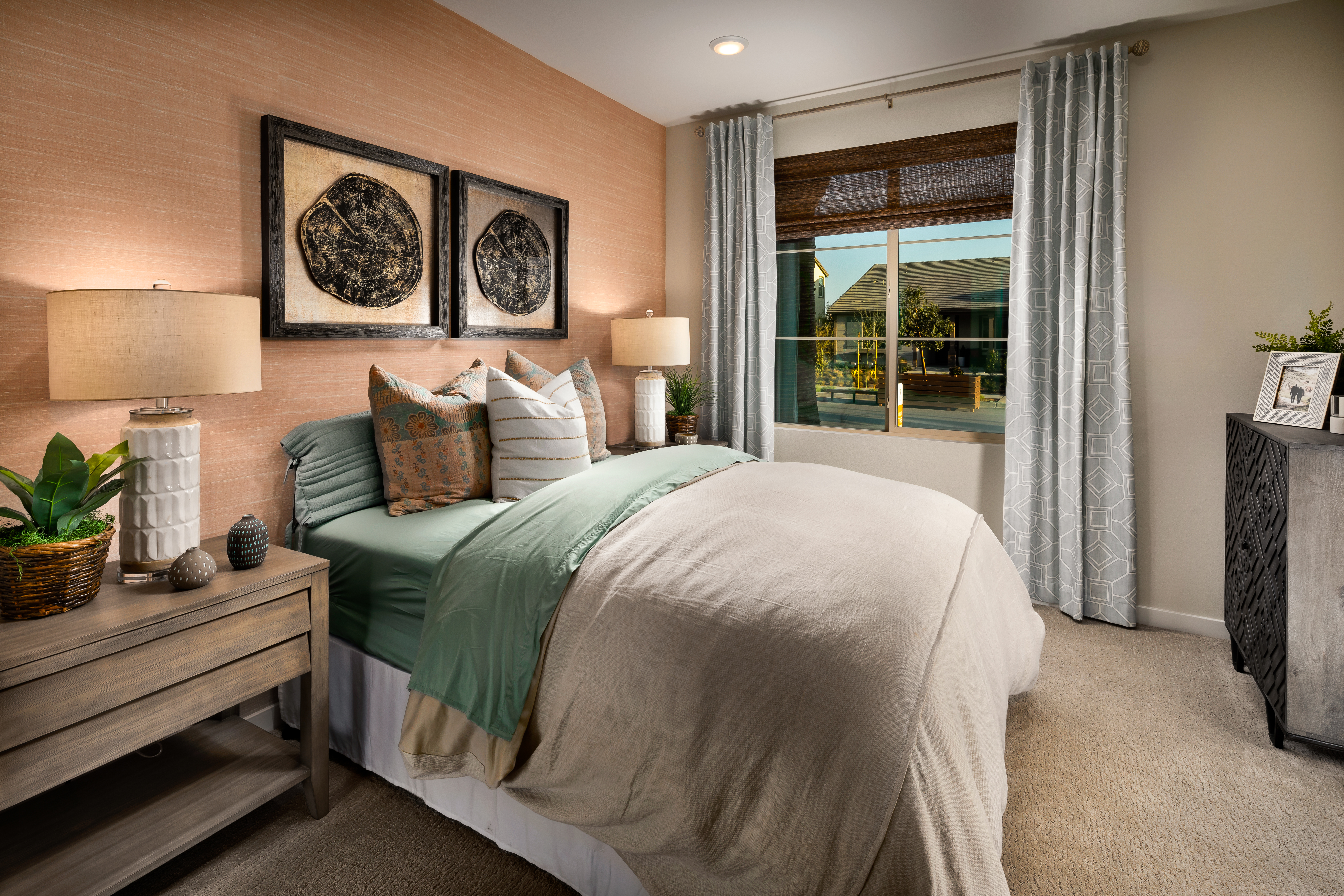
Keep It Simple
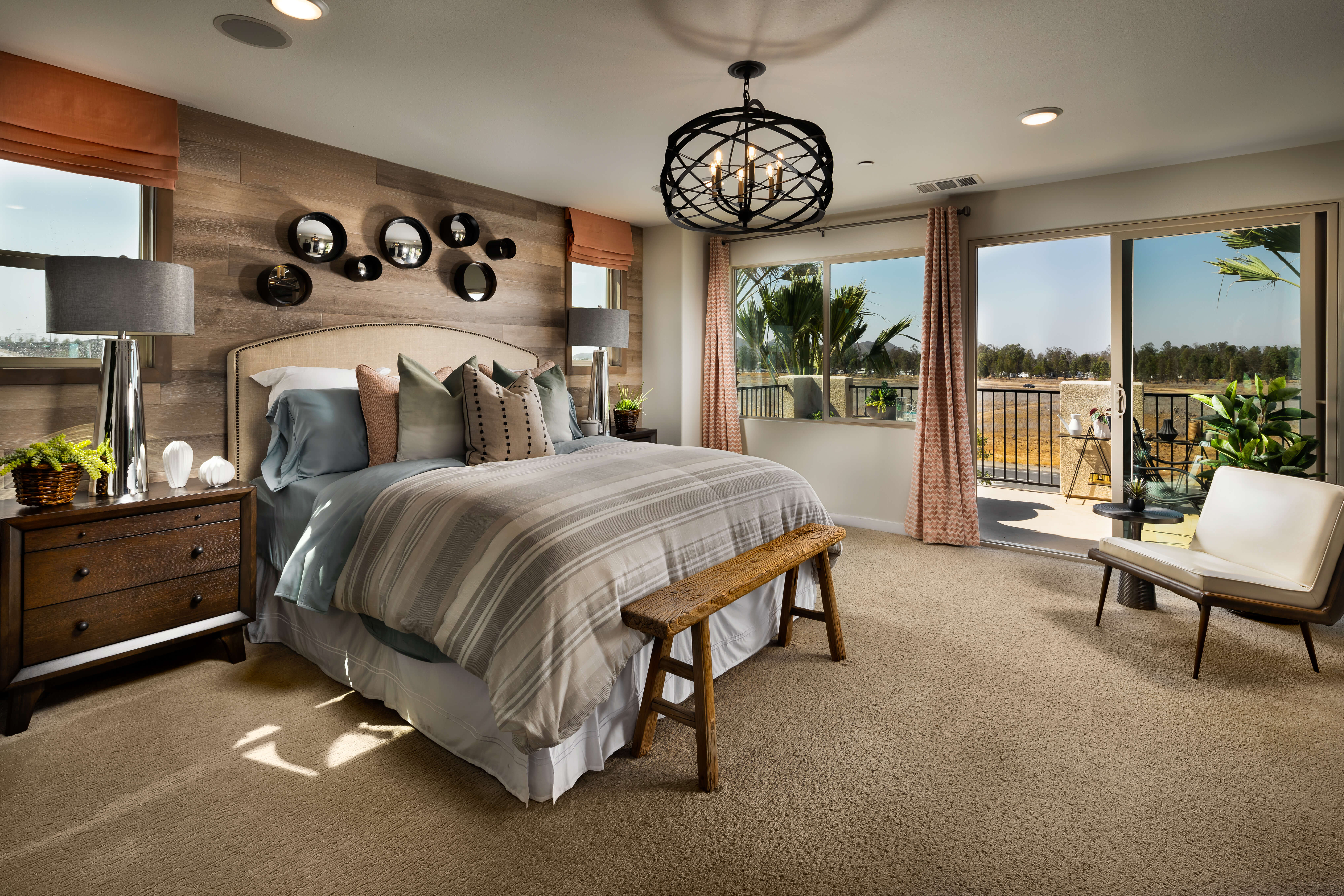
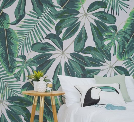
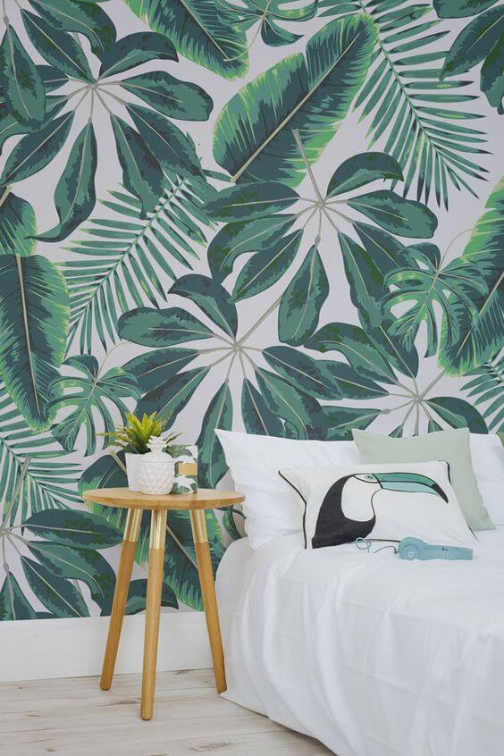
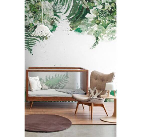
It doesn’t have to be busy. In fact, a simple pattern with clean lines on grasscloth is an ideal way to add visual interest without overpowering a space. Still, there are plenty of options. From bold, botanical-inspired looks, to a cool ombre, to solid and soothing tonal choices, wallpaper is an efficient and instantly gratifying way to create layered depth on walls and even ceilings.
Wallpaper on the Rise
Many people new to the housing market are discovering wallpaper for the first time. Think of all the millennials who have grown up in a clean, minimalistic era who are now seeing all the possibilities of this exciting new option. The hype is driven largely by the low-maintenance aspect of 21st century wallpaper. It’s easy to install and easy to remove with stick and peel materials. No more sloppy paste, decorating headaches or residue-laden walls! Today’s fashionably neat wallpaper is sticking around.

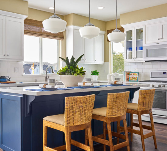
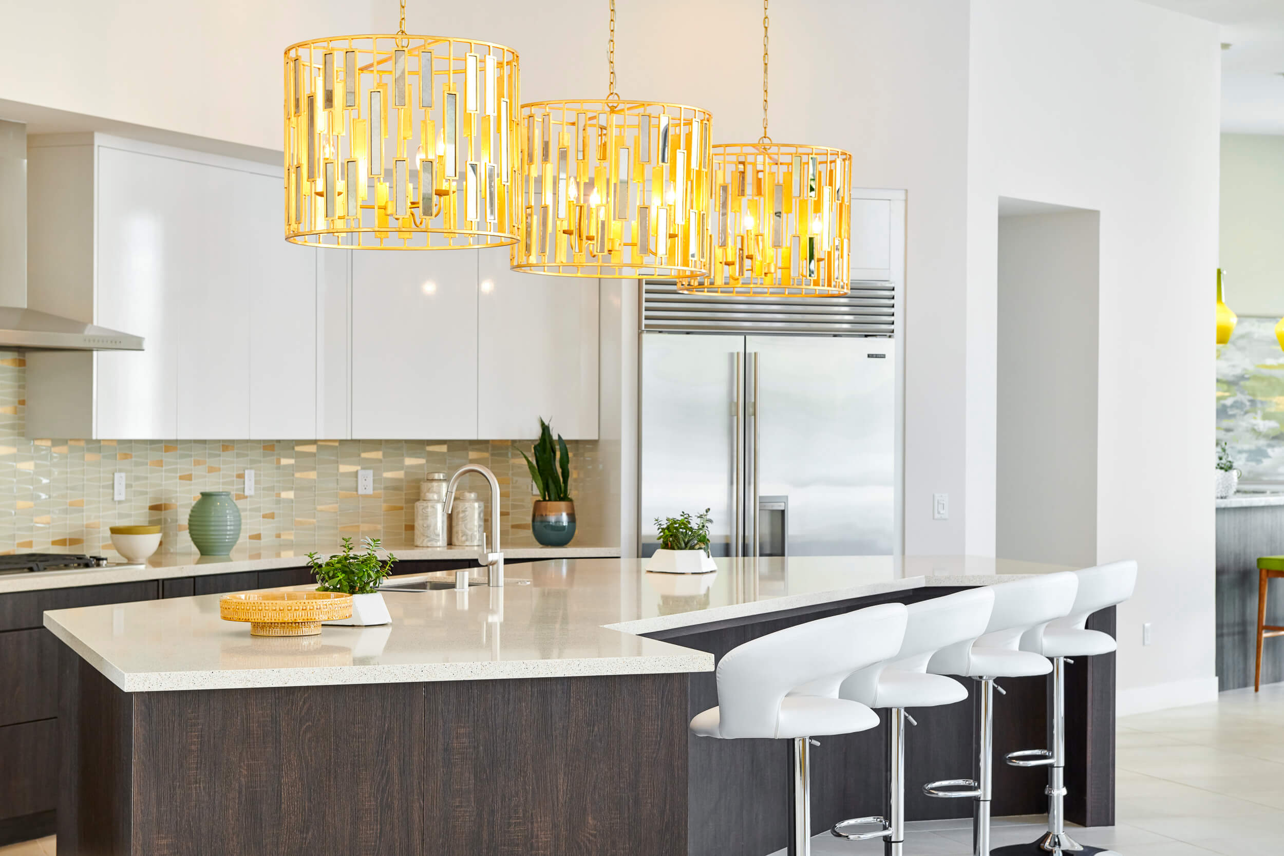
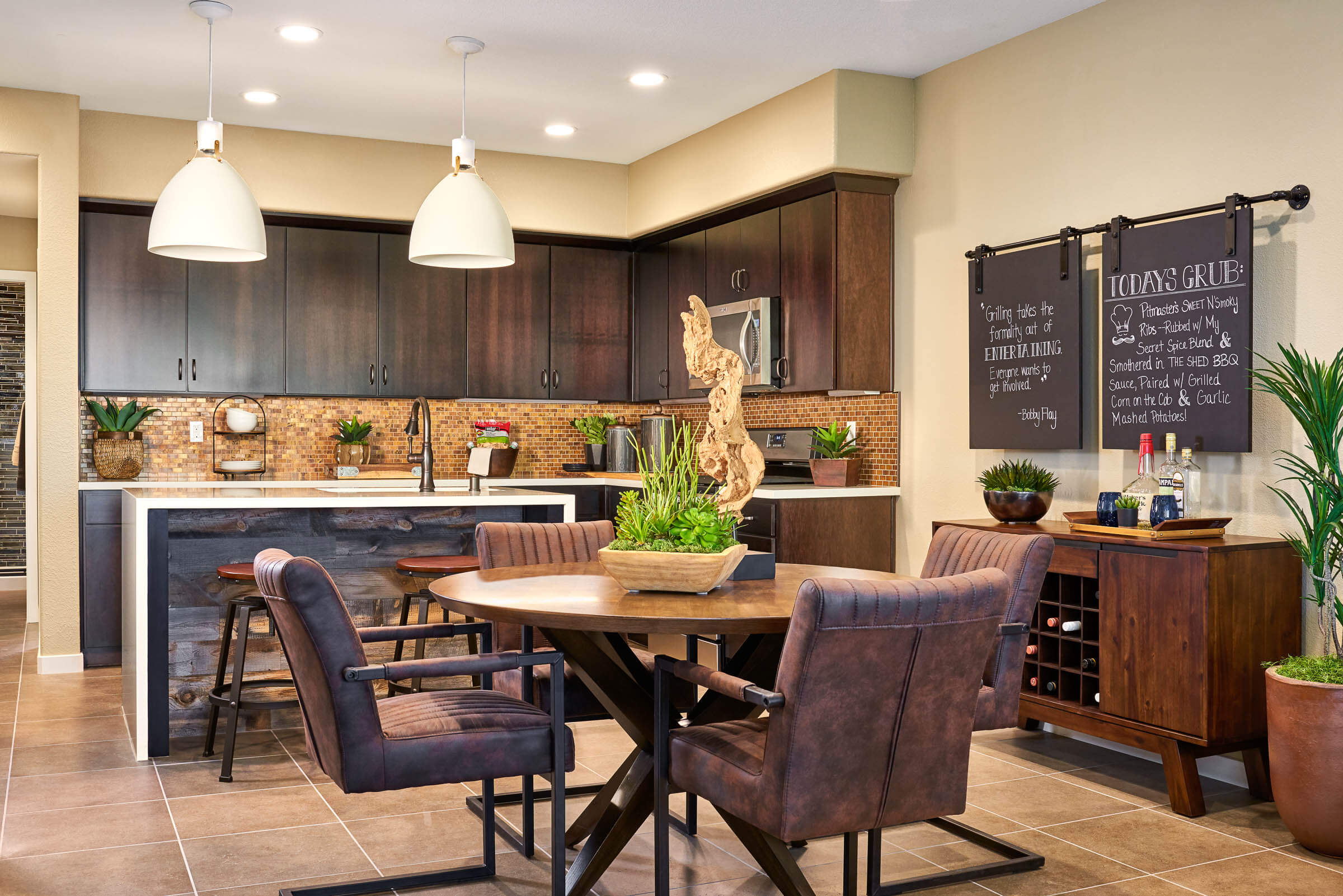
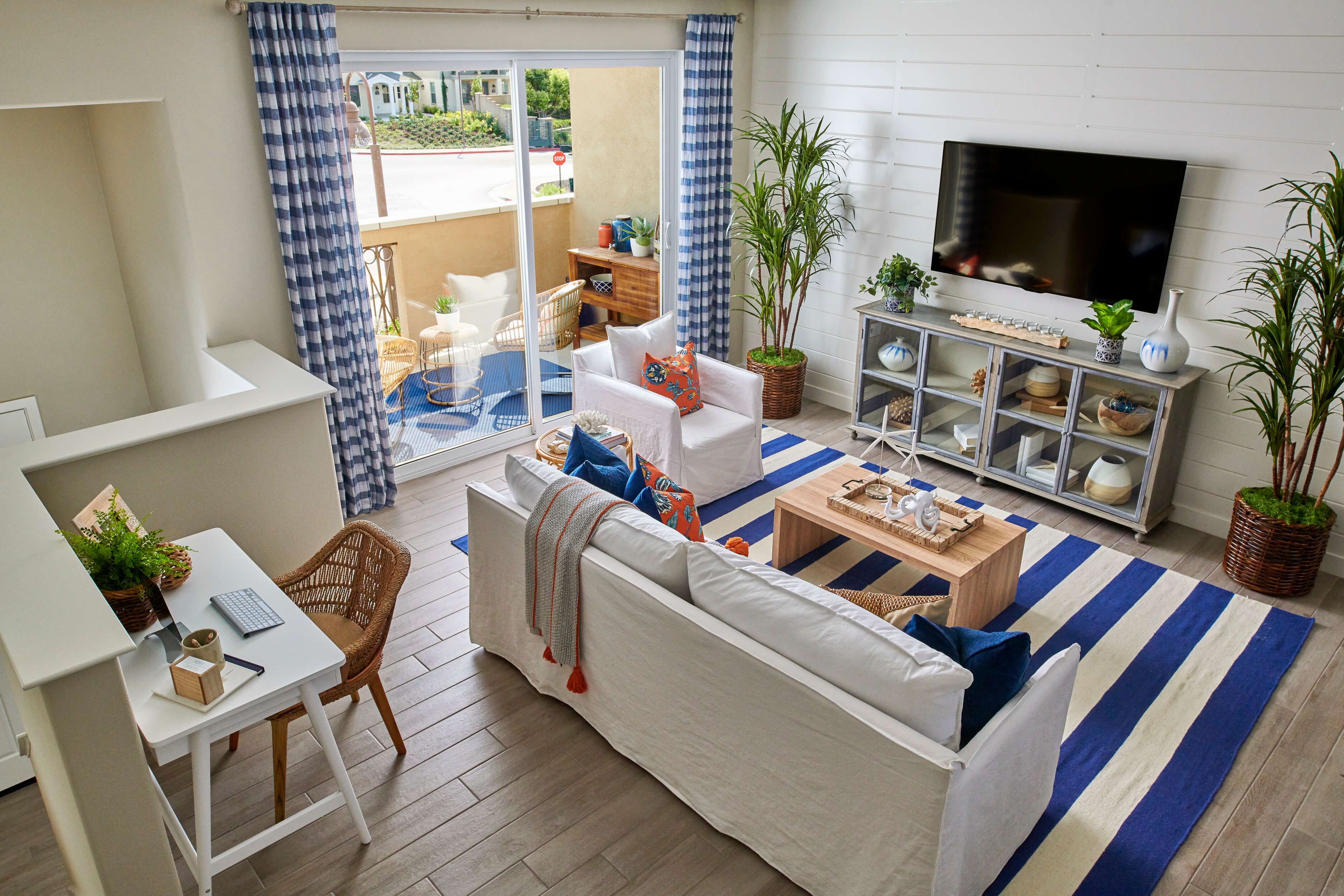
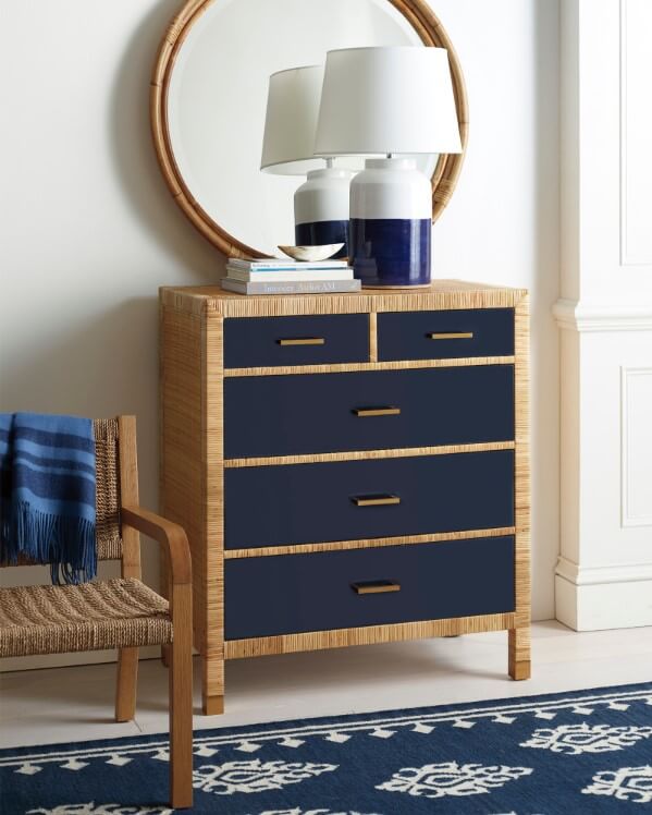
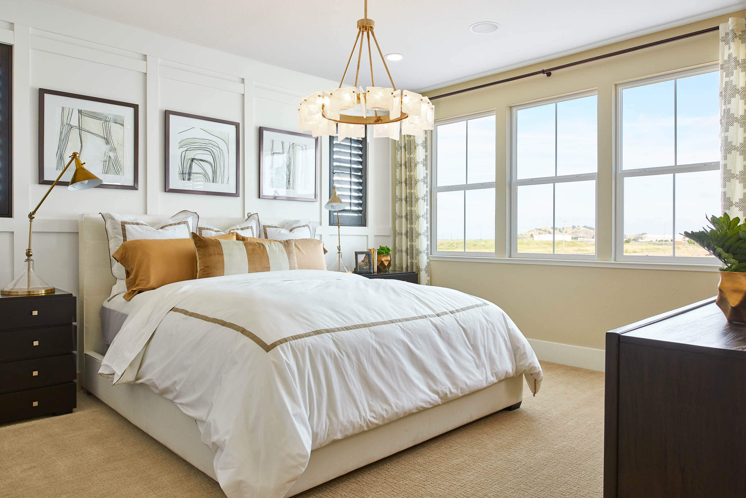
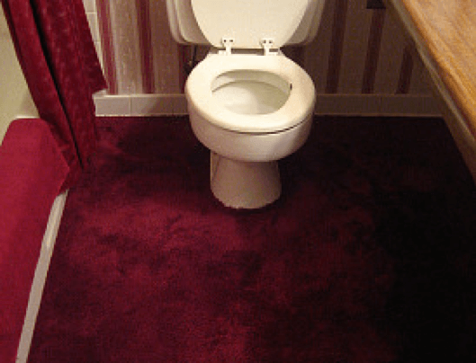
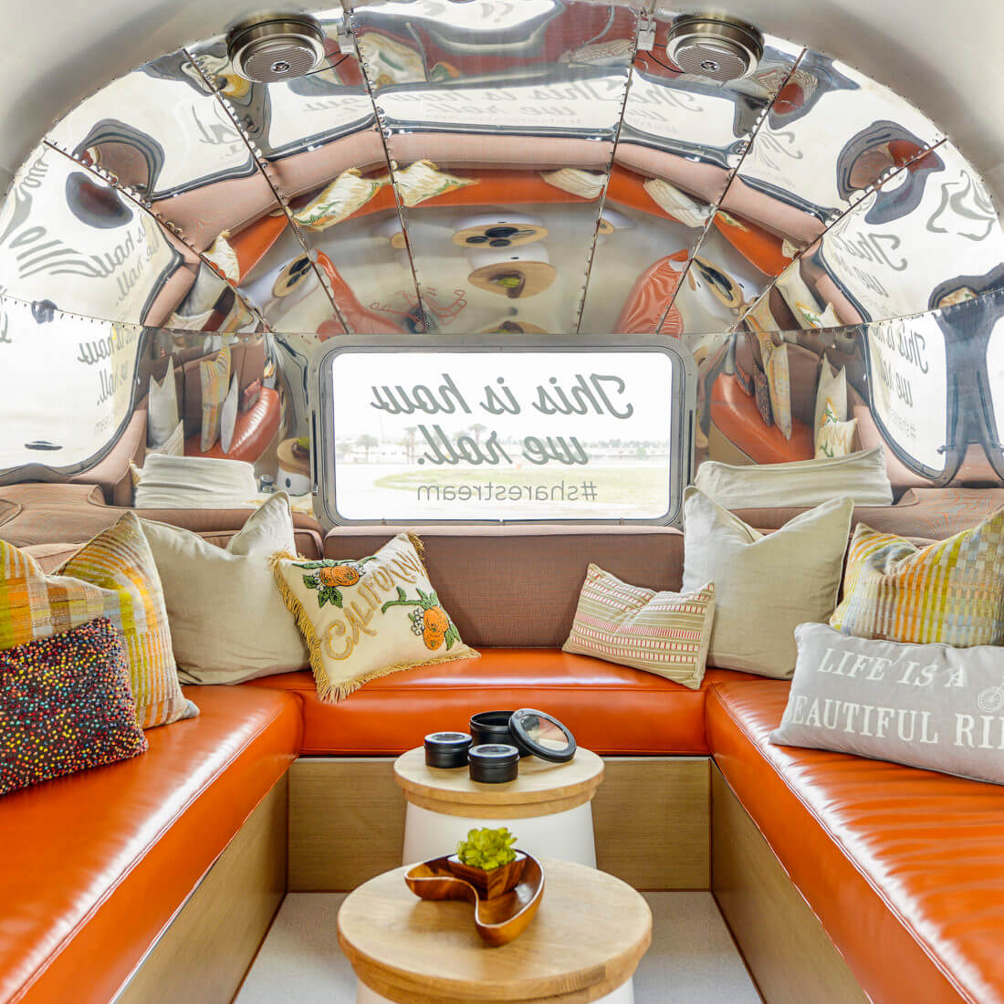
Photo Credit: Chameleon Design
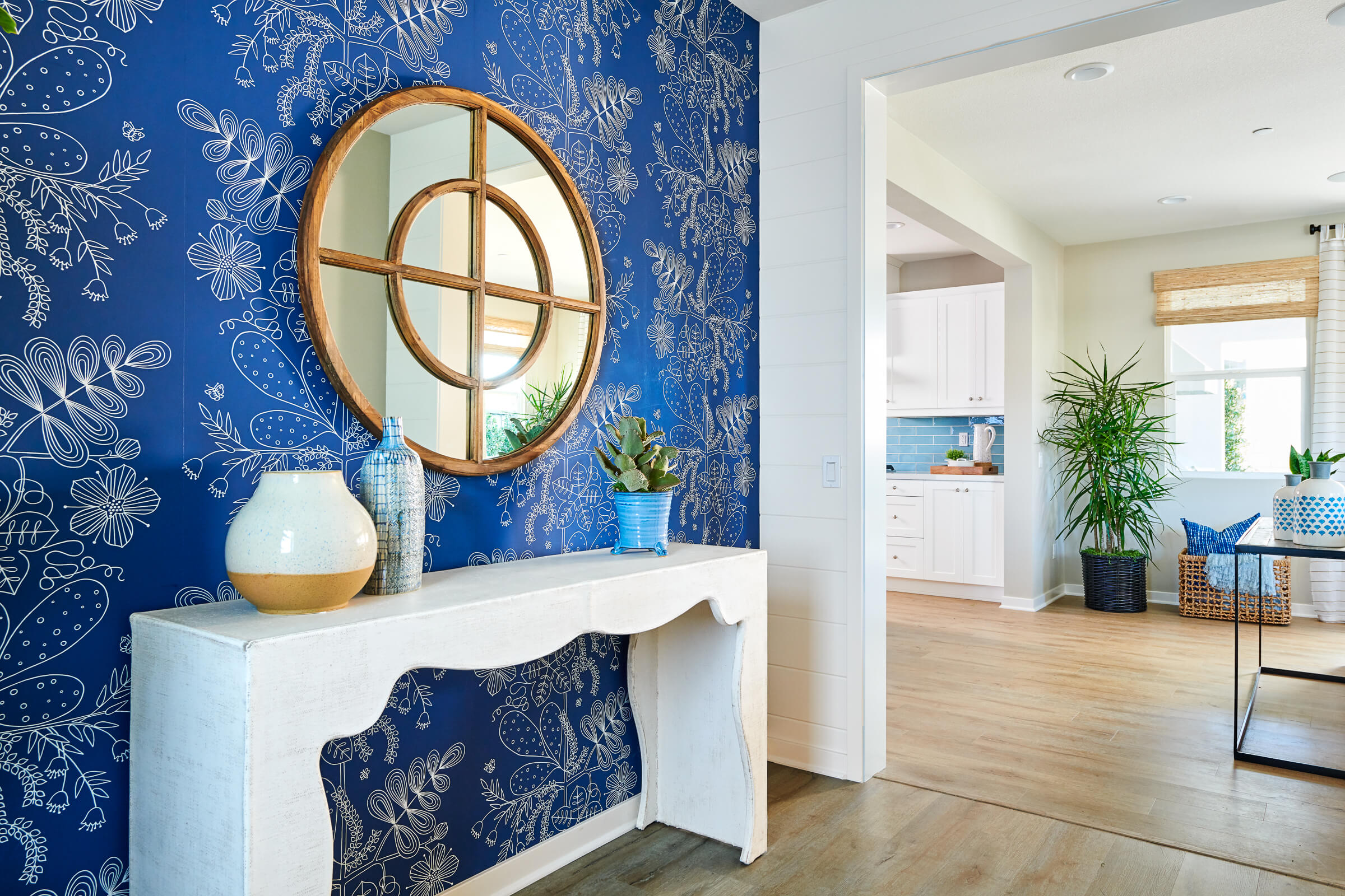
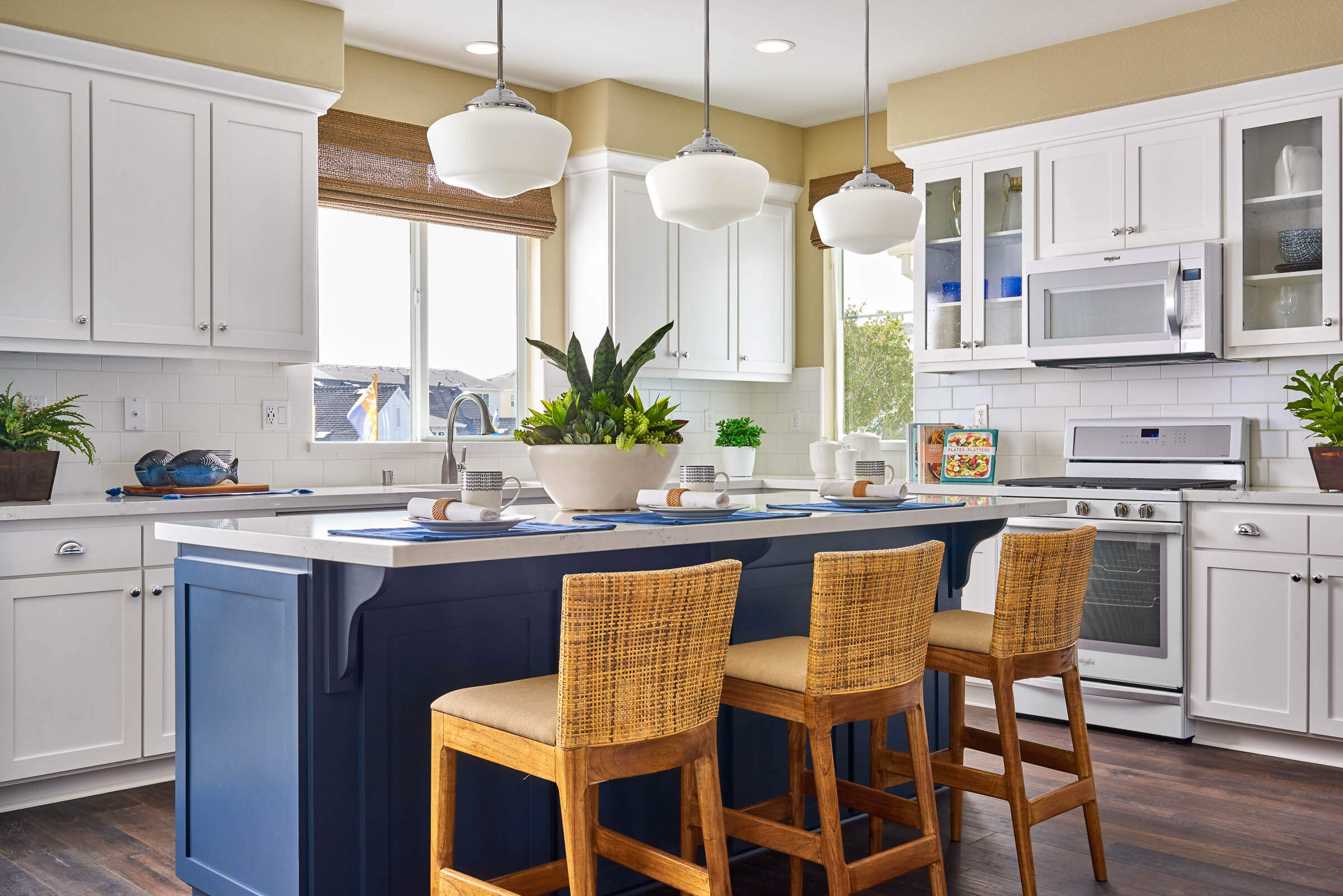
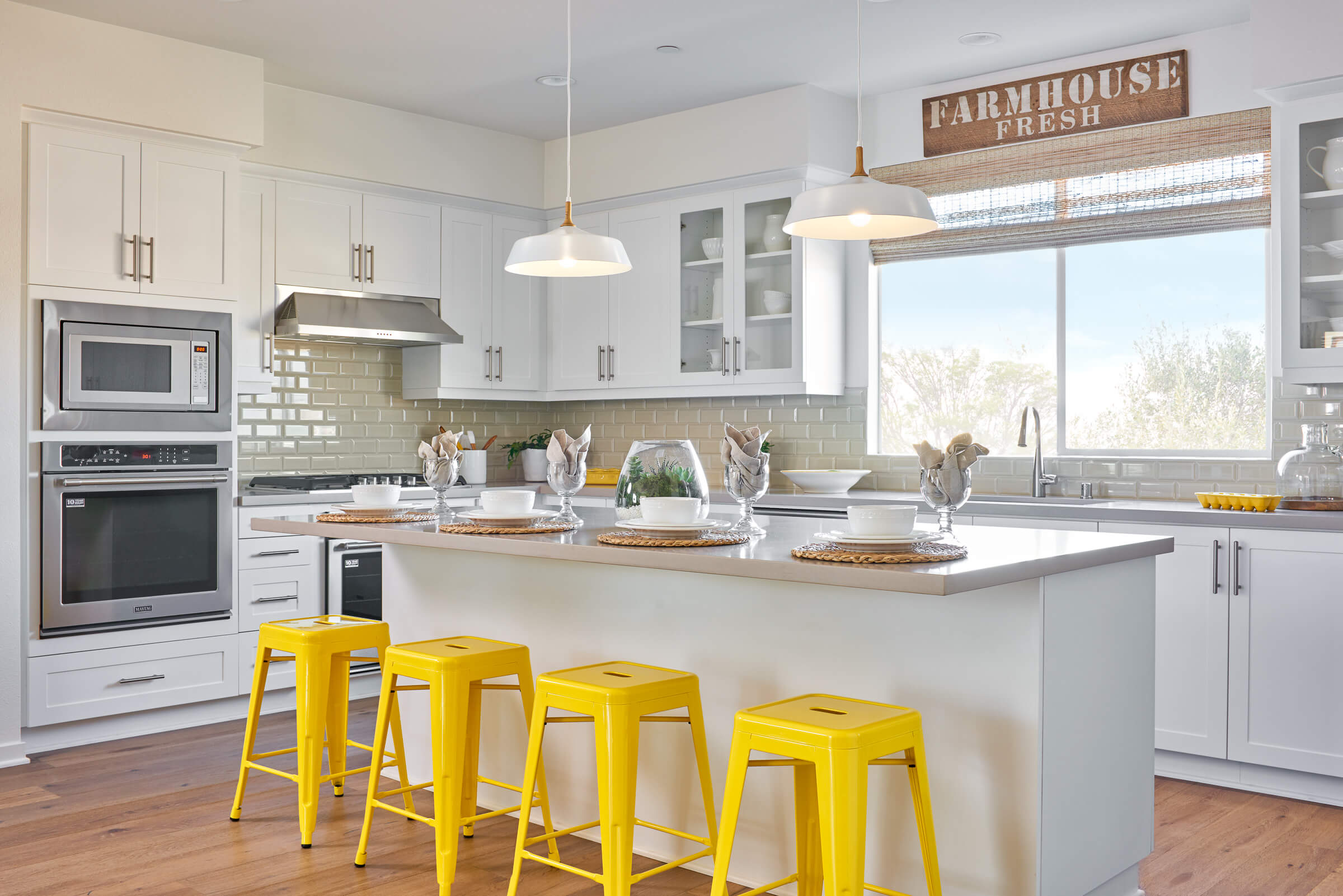
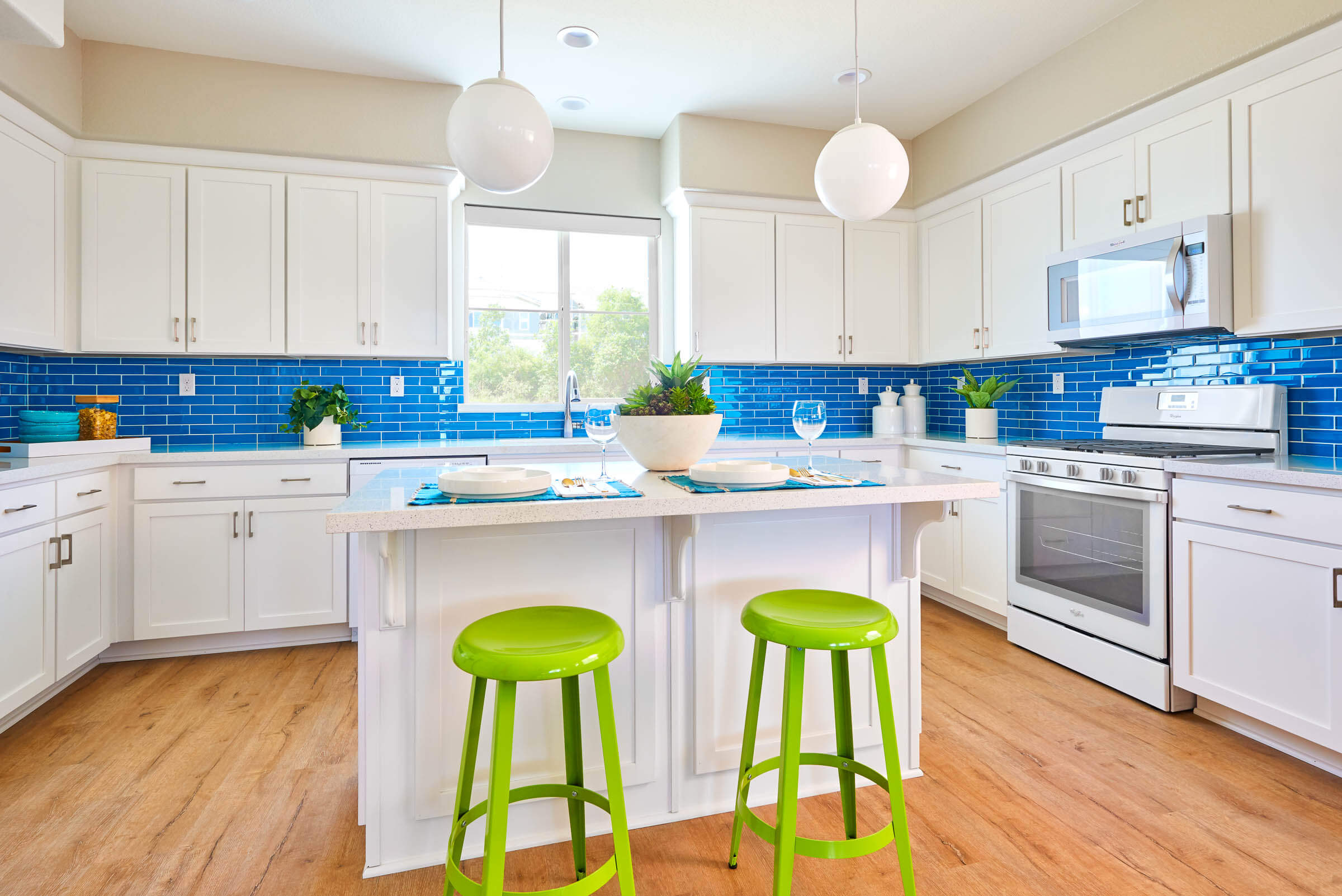
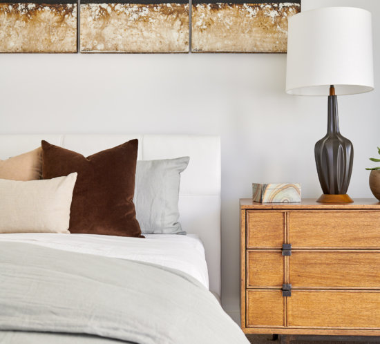
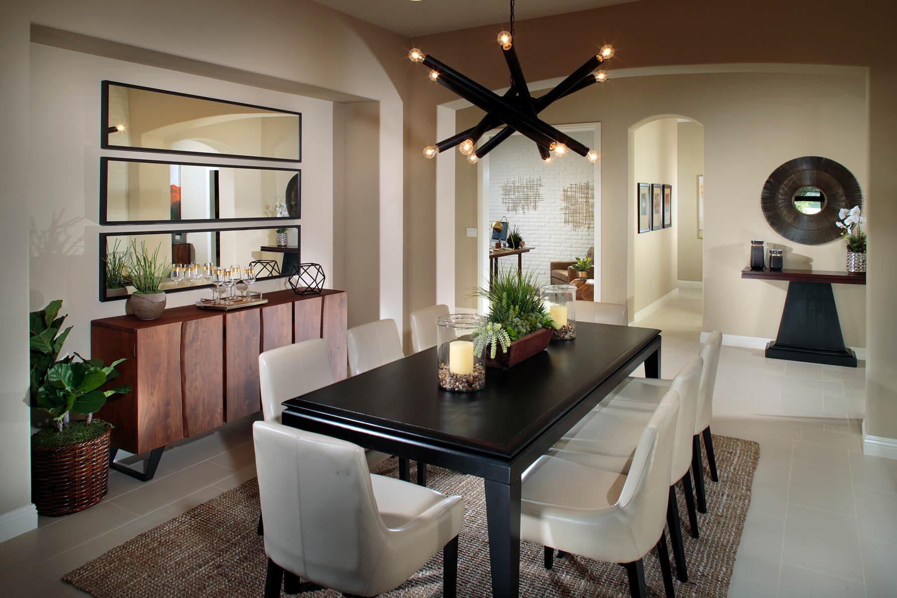
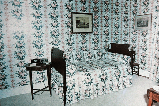
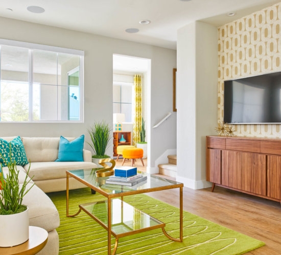
Photo Credit: Chameleon Design
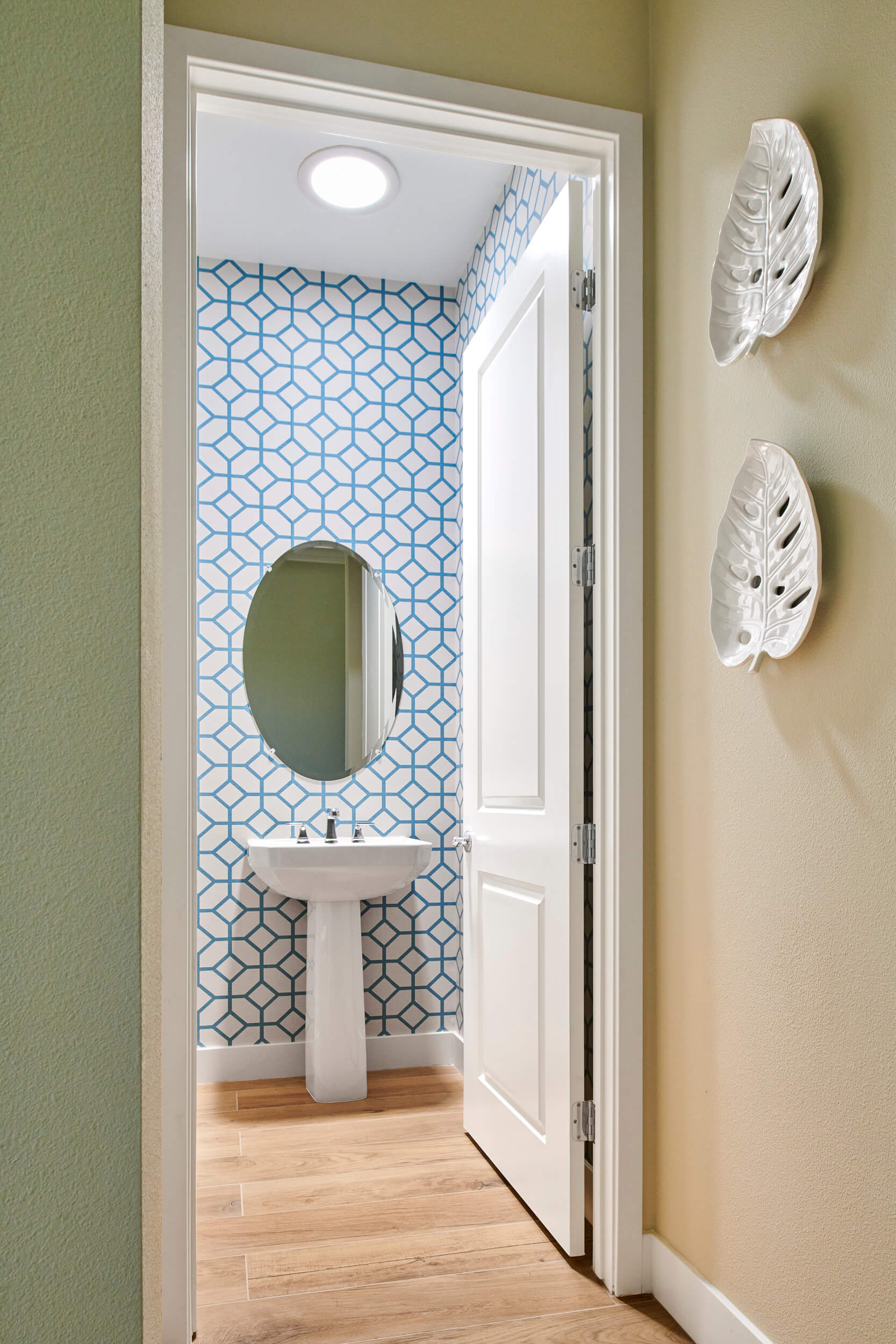
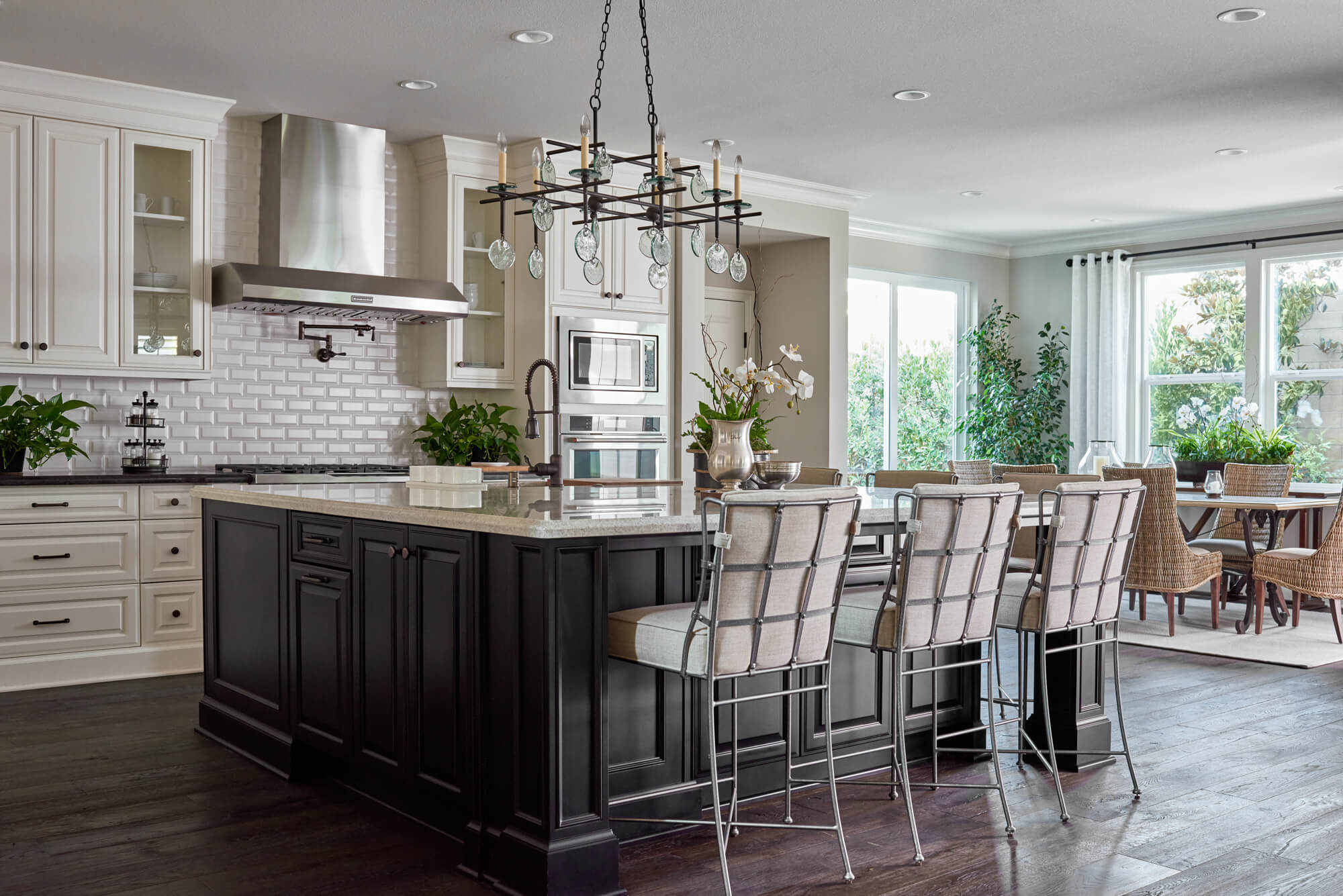
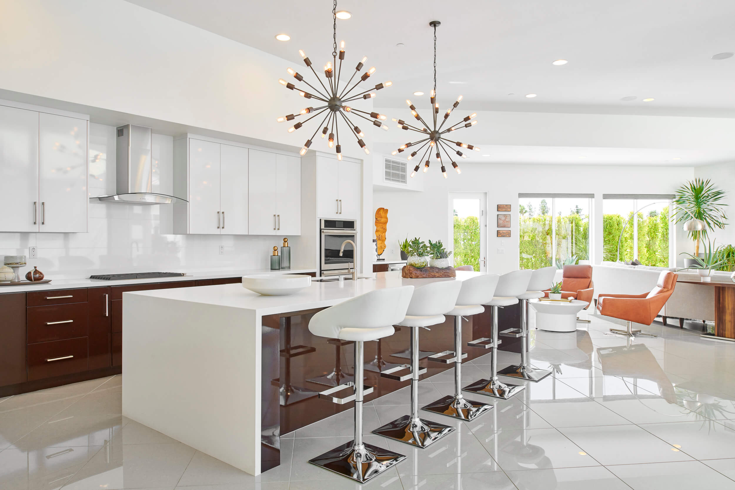
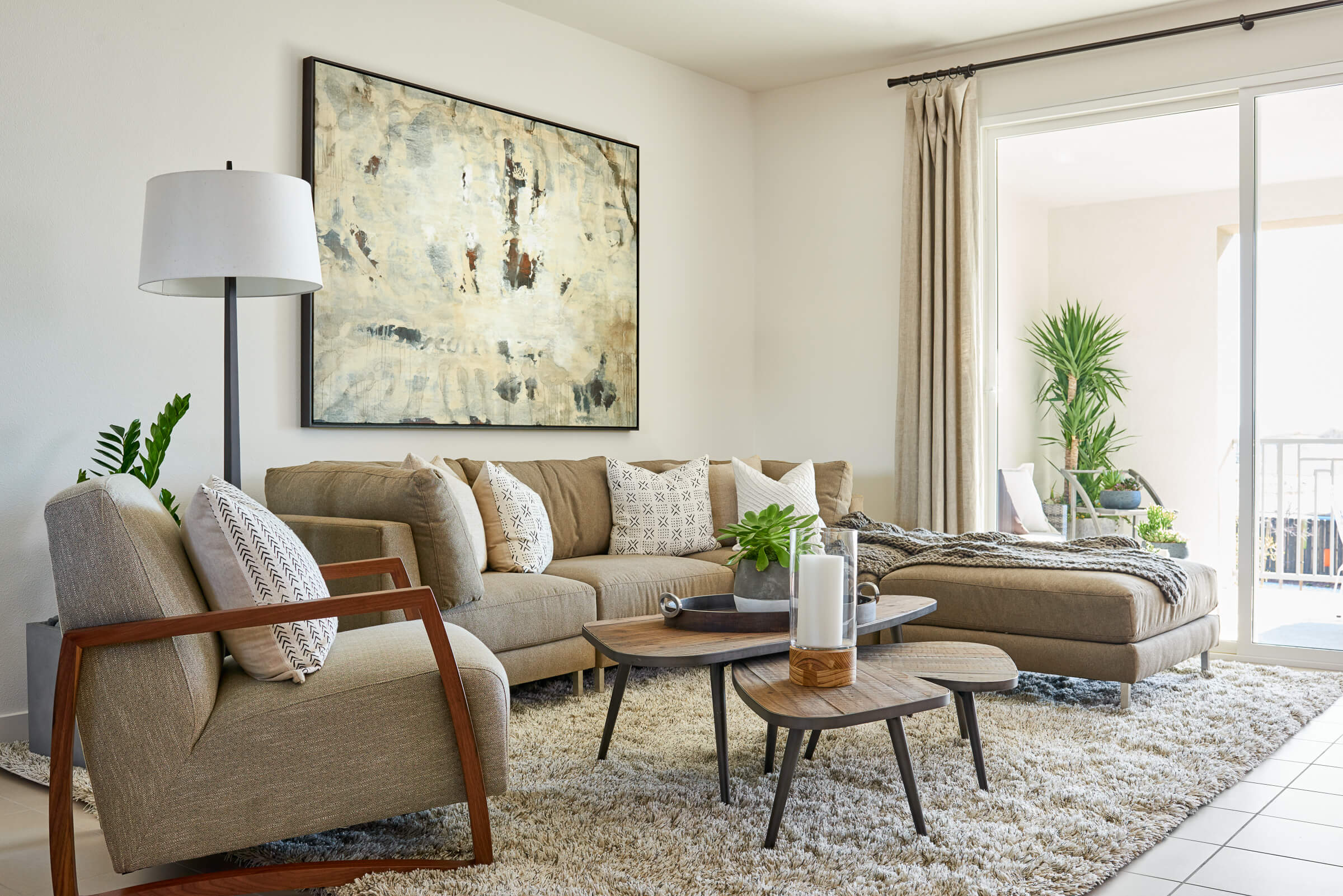
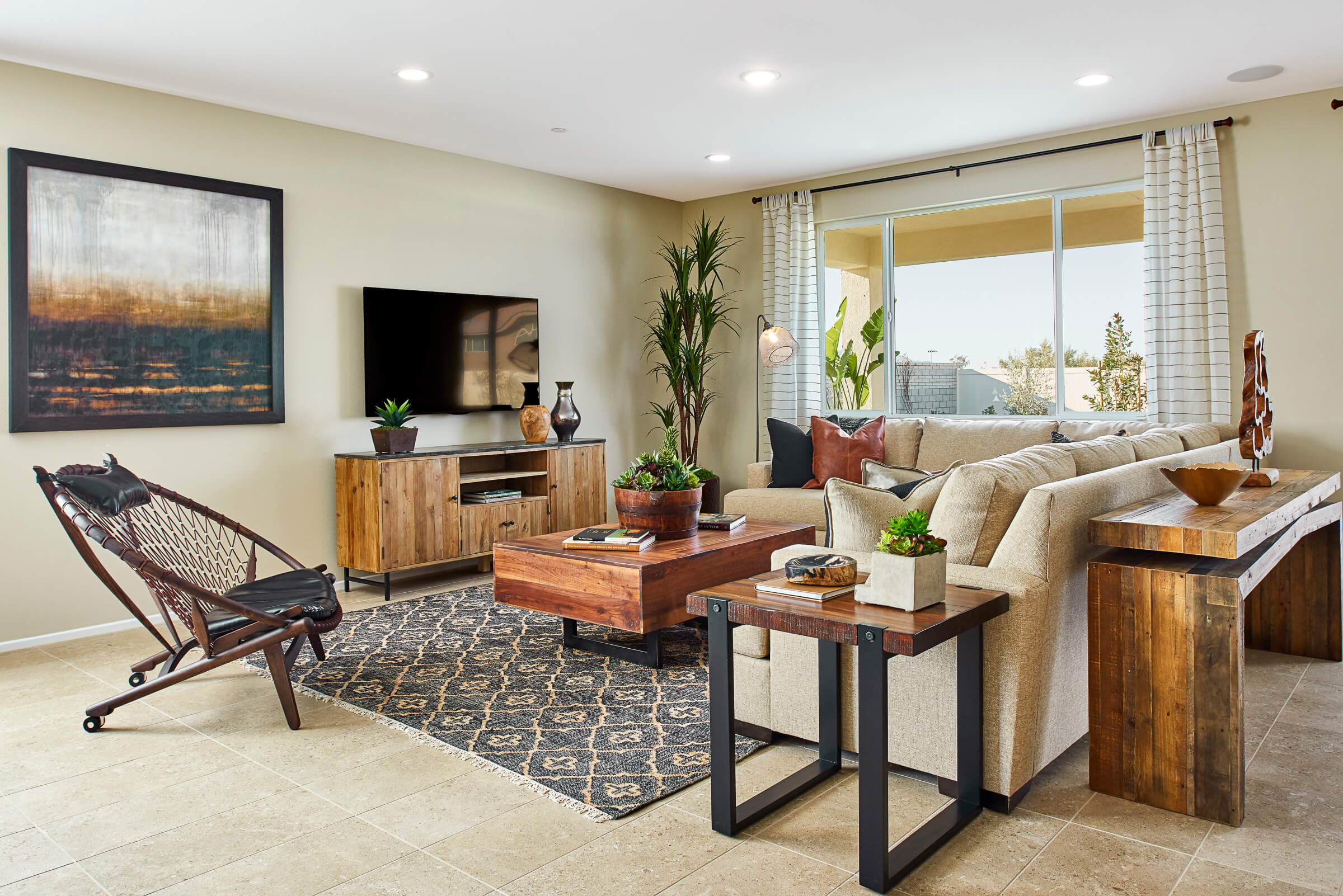
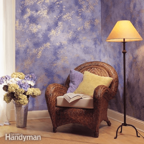
Photo Credit: Chameleon Design
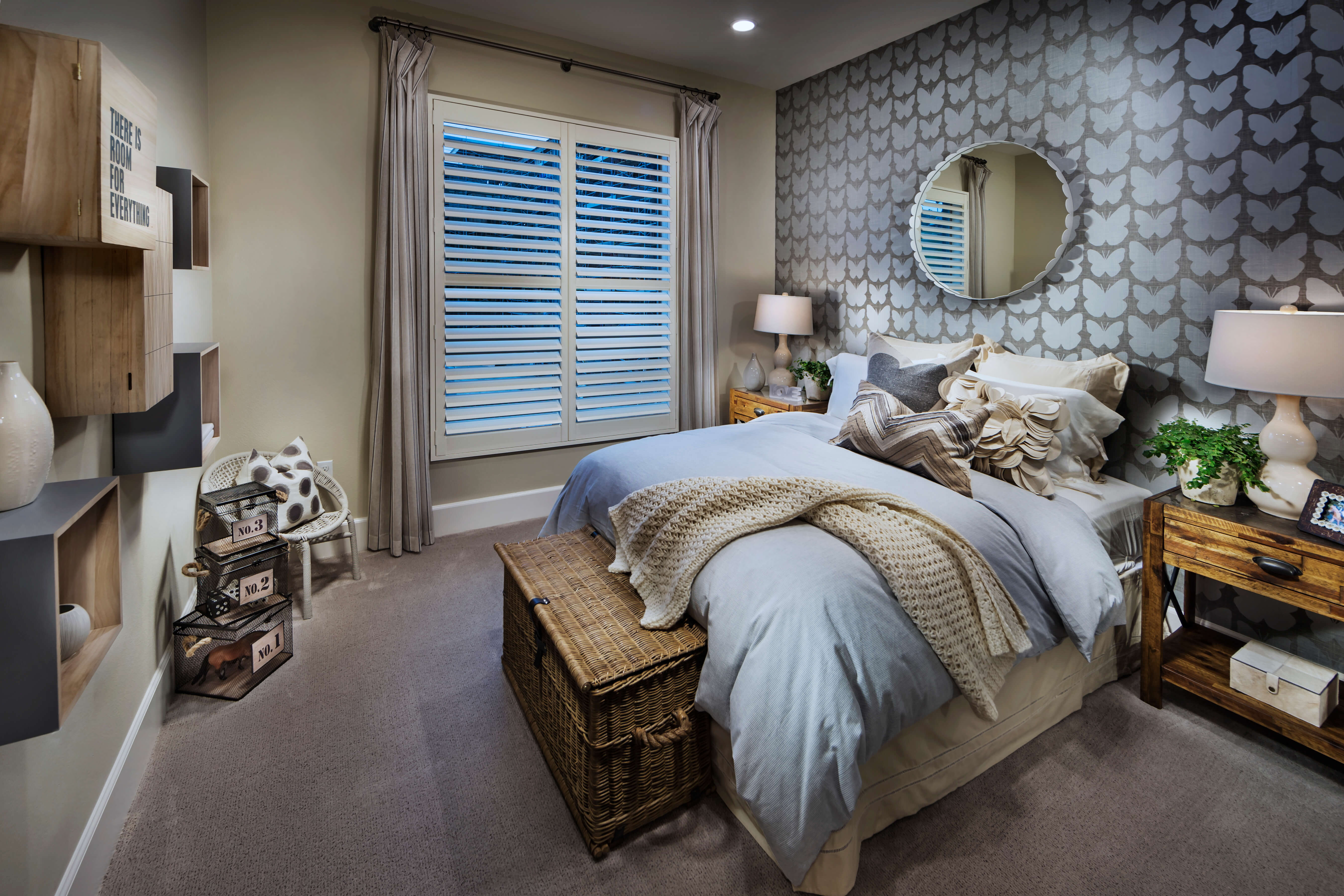
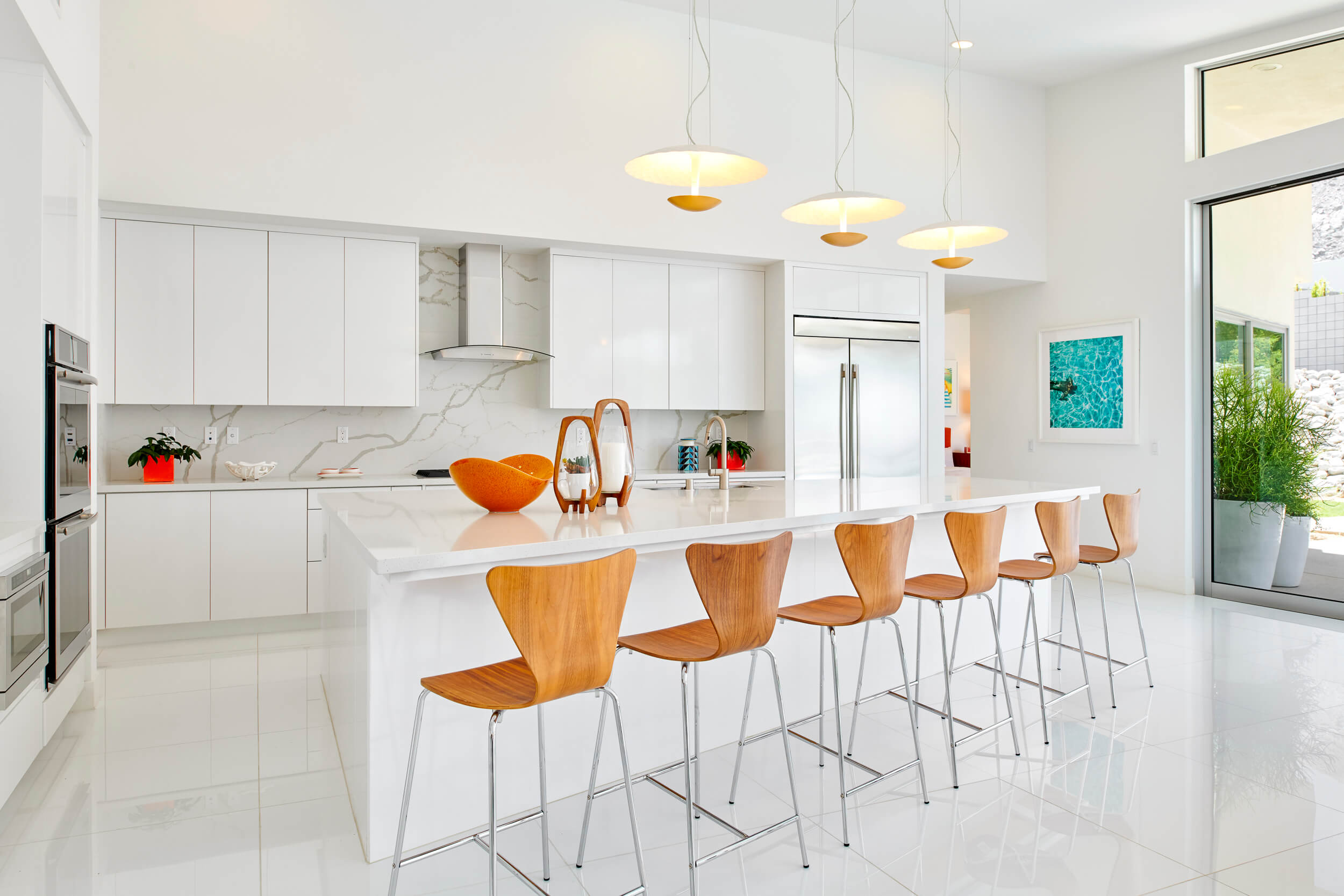
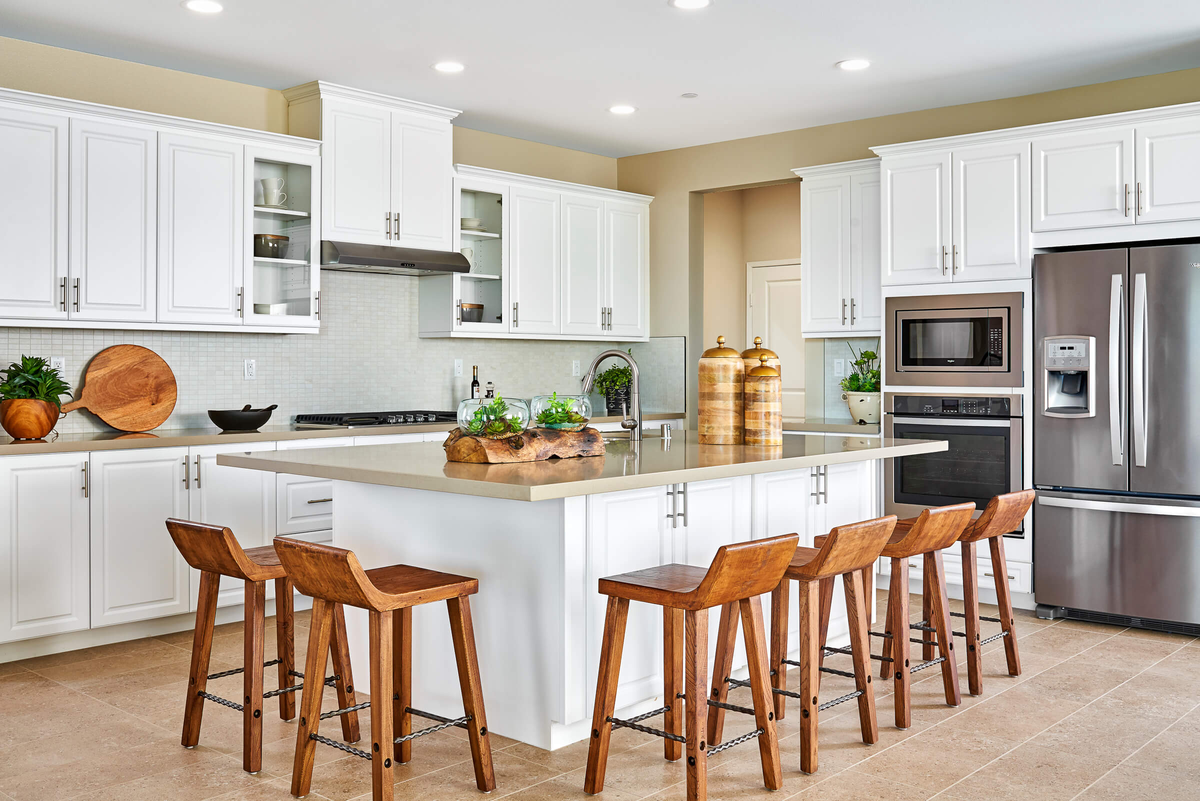
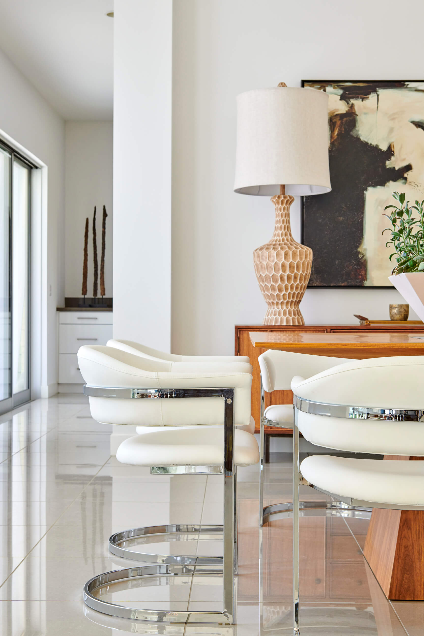
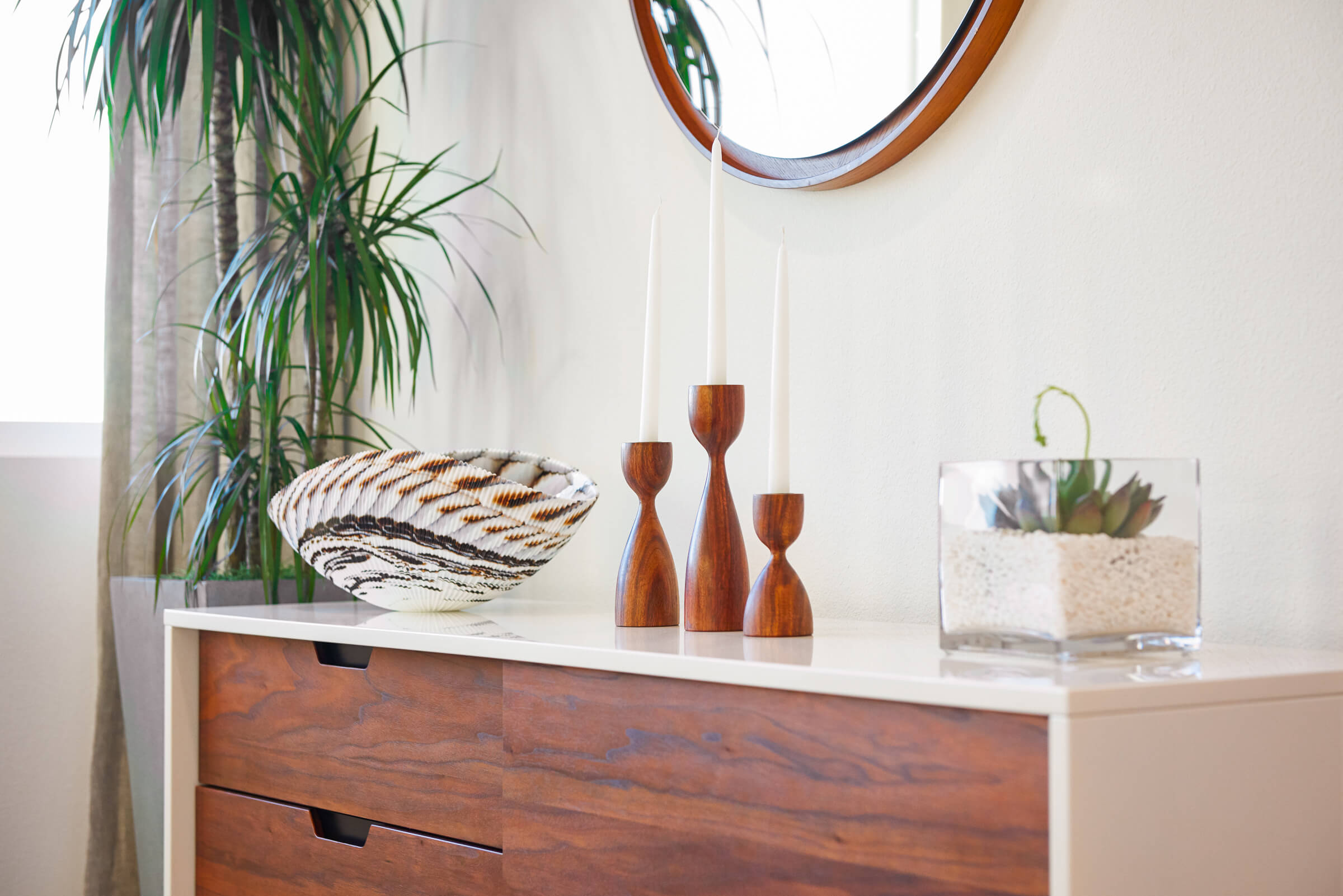
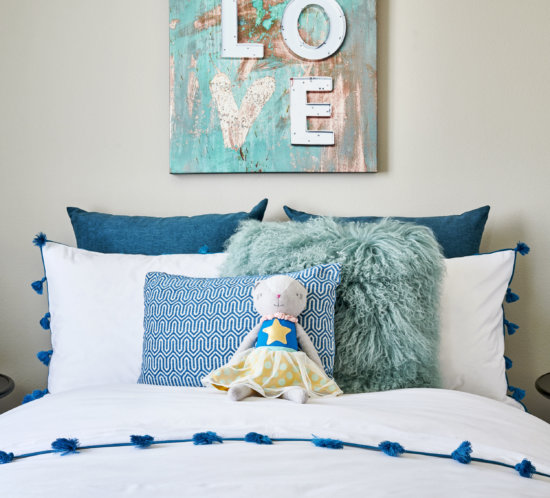
Photo Credit: Chameleon Design
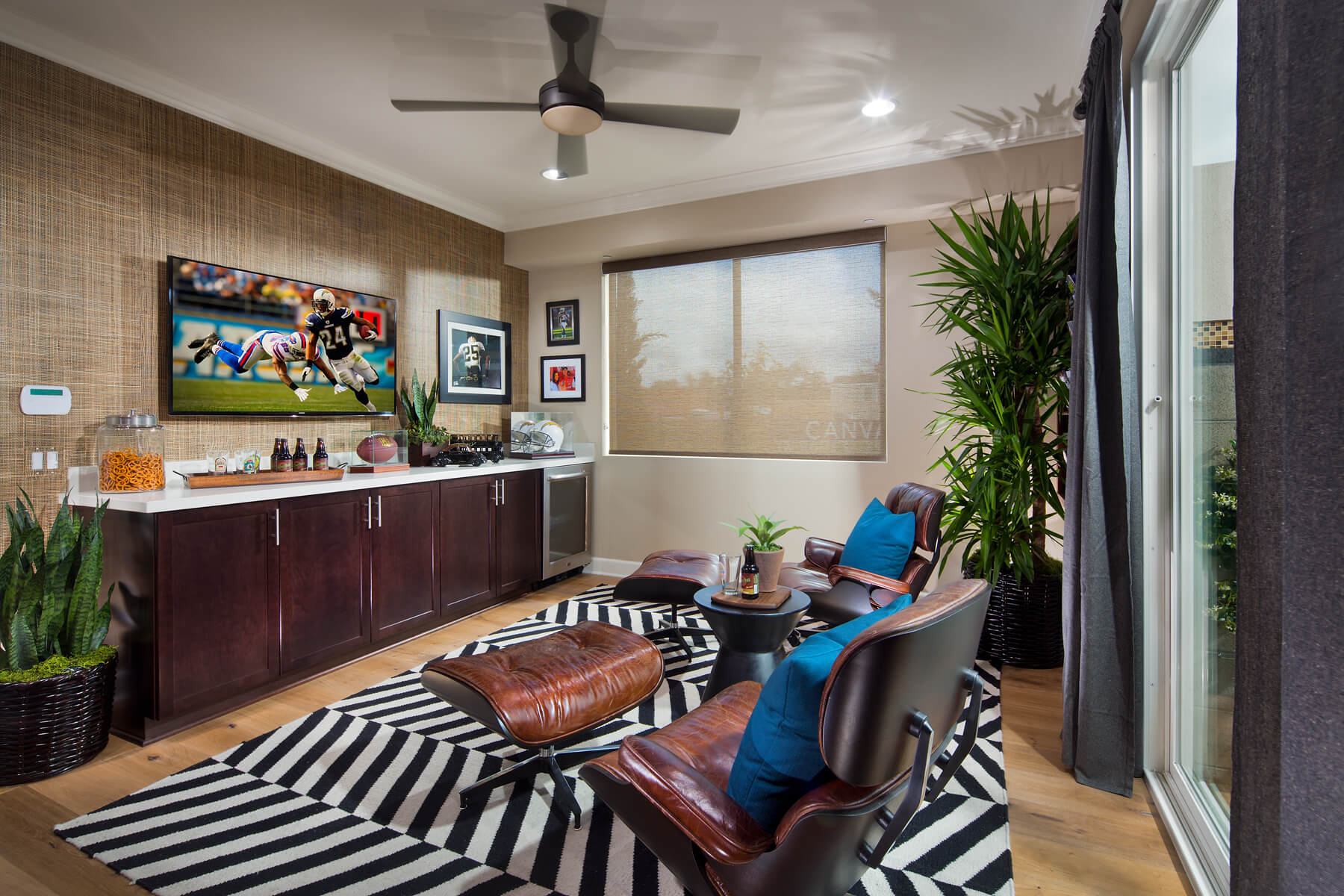
Photo Credit: Chameleon Design
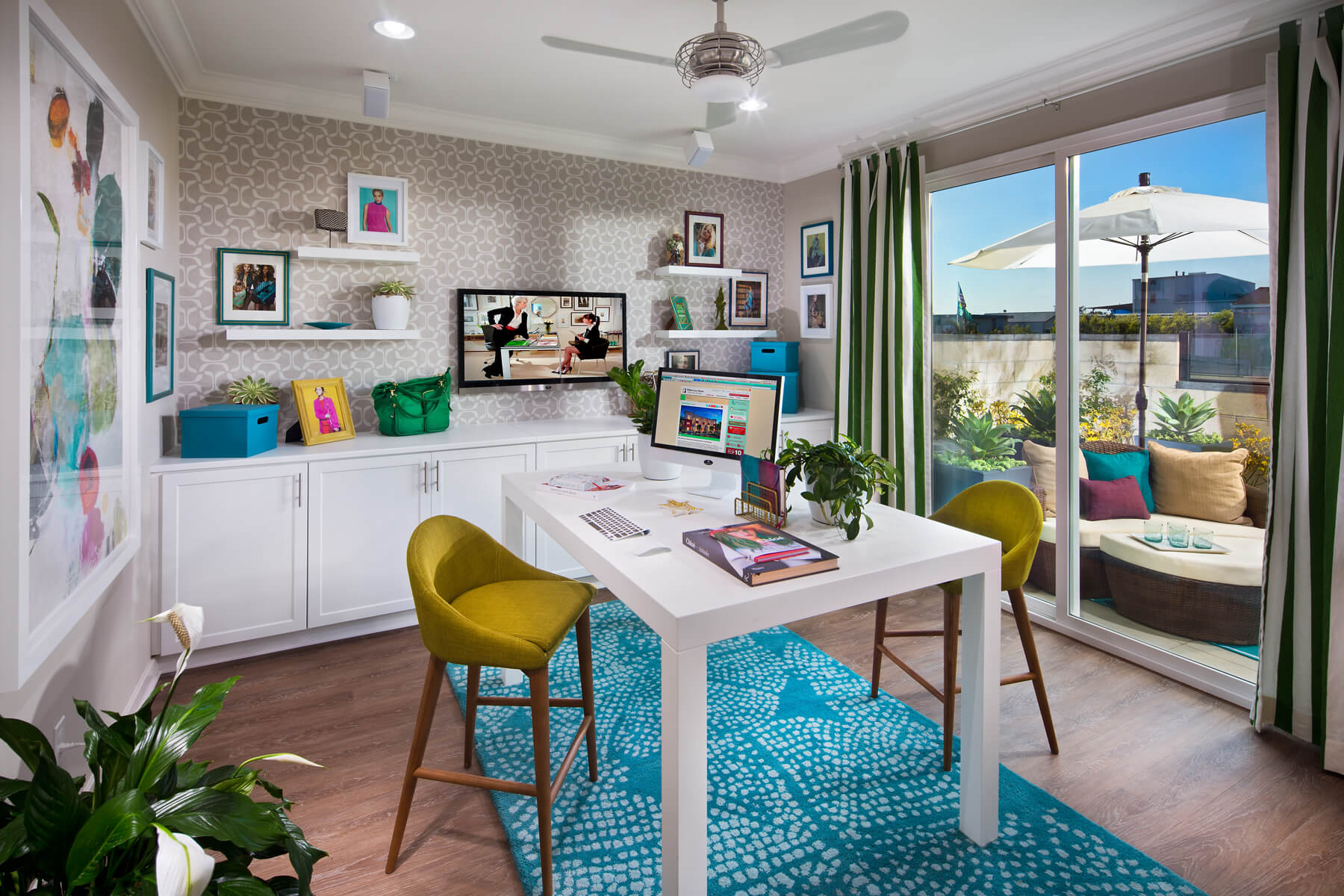
Photo Credit: Chameleon Design

Photo Credit: Chameleon Design

Photo Credit: Chameleon Design
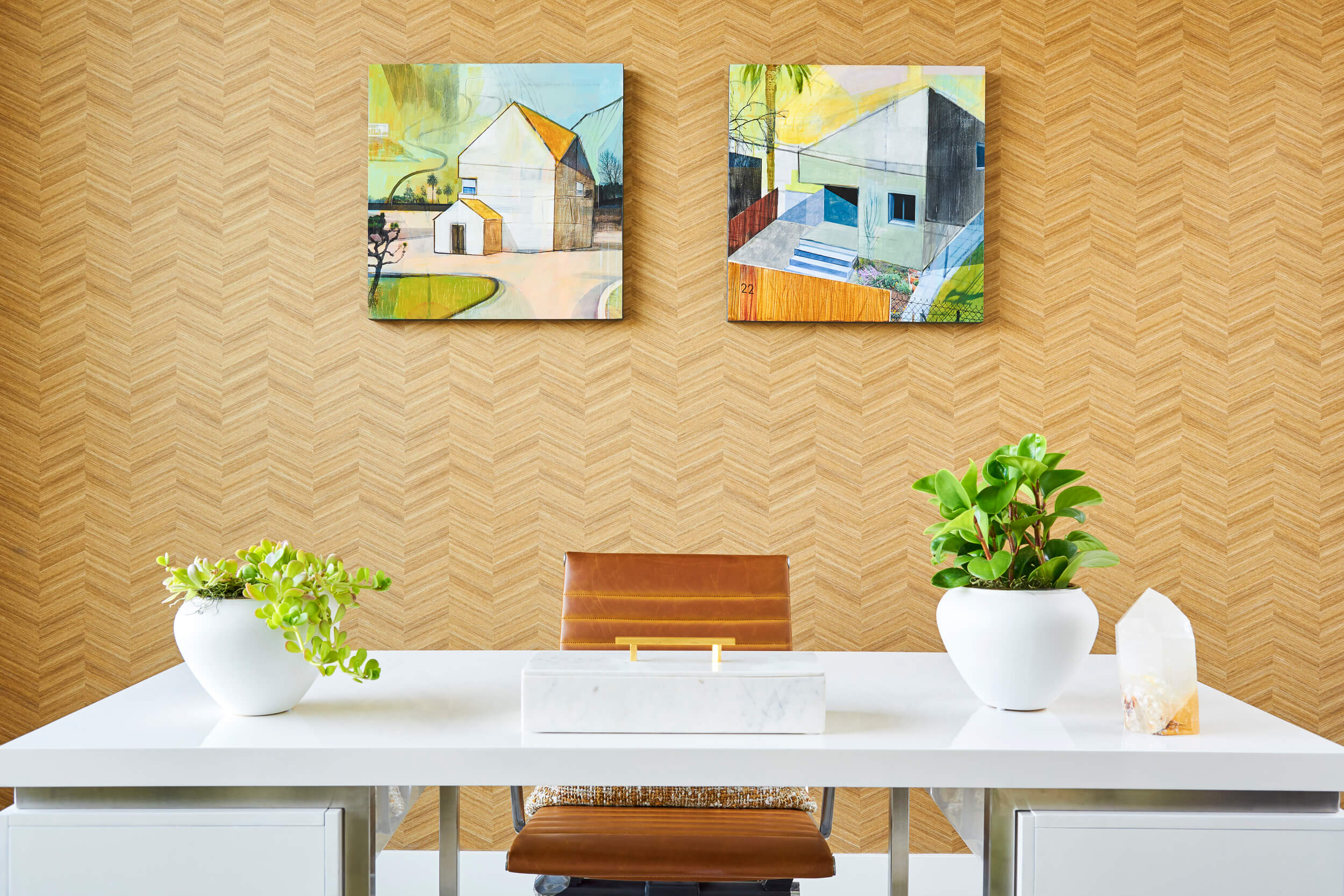
Photo Credit: Chameleon Design
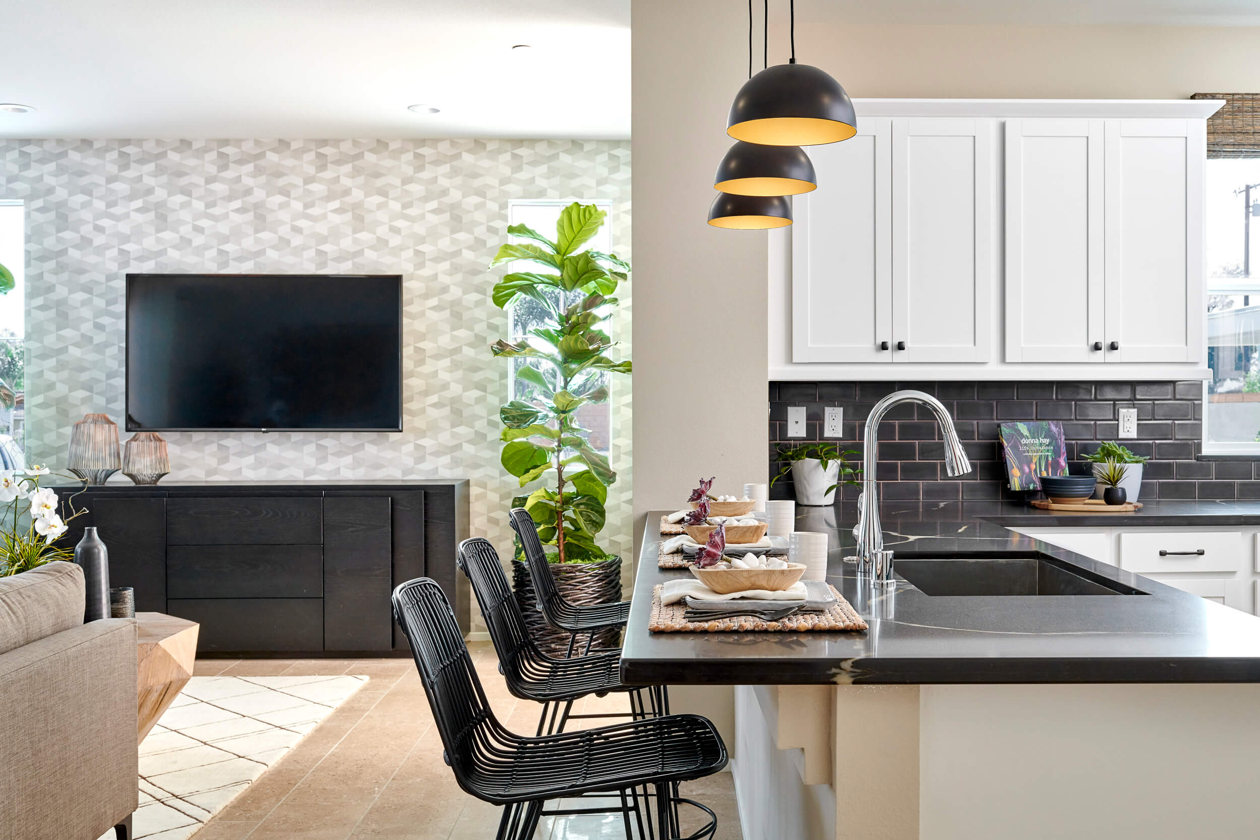
Photo Credit: Chameleon Design