fbpx

Blog

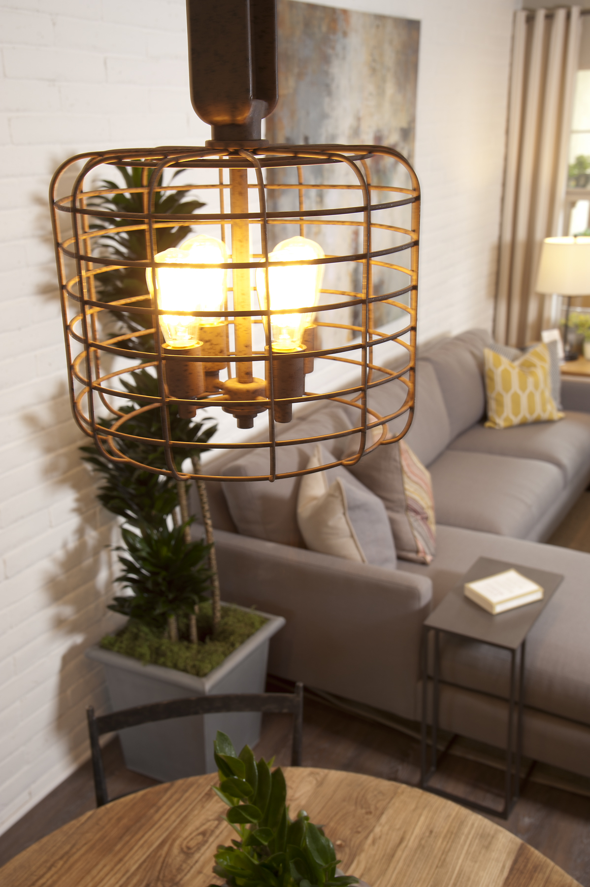
Home Design Trends // Copper Accents

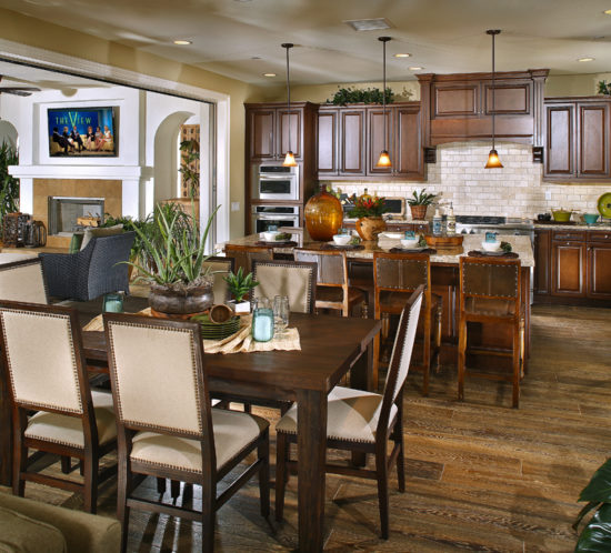
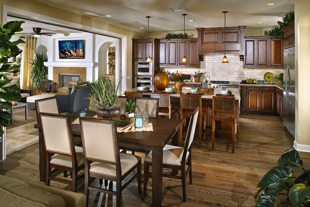
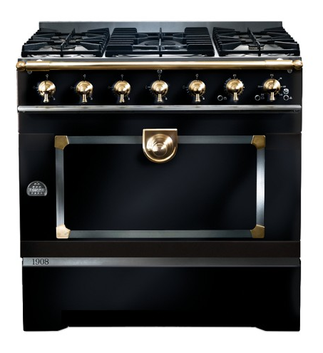
When people think of copper in their homes, kitchenware and plumbing pipes are what usually come to mind. But that perception is about to change. While copper plumbing and wiring continue to perform in the home, the aesthetic beauty and durability of copper are making it the material and color of choice for home décor and accents inside and out.

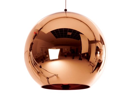
Copper Pendant Lamp, Tom Dixon

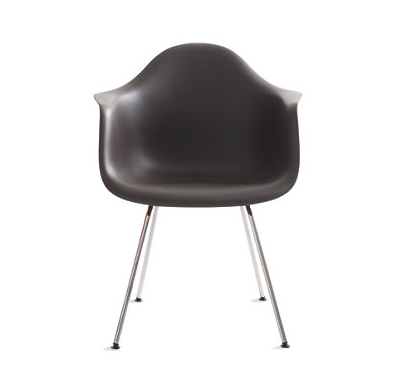
Copper Chair, Blu Dot Furniture

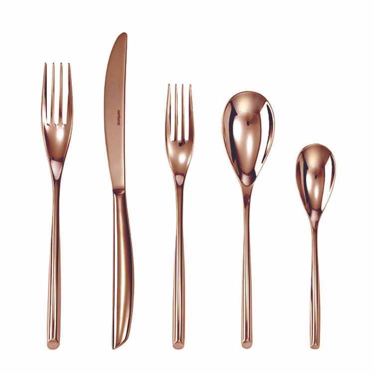
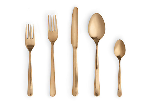
Copper Cutlery, Sambonet

Copper Plates

Chameleon Design Featured Project: Mirador, Plan 3 // San Juan Capistrano

Mirador at Rancho San Juan offers a range of estate-scaled family residences.  Plan 3 is one of four models we recently completed for in this quaint community in San Juan Capistrano. This is a Spanish style plan, very popular in southern California, but with an eclectic twist. For a more modern take on this traditional look, we used color palette of teal, brown and green. The brightly colored fabrics work nicely with the mix of dark and light furniture, the warm look that the hand scraped wood flooring lends and the light-colored walls.

Entry

Living Room

Kitchen

Dining Room

Capistrano Room

Capistrano Room

Master Bedroom

Master Bath

Bedroom

Nursery

Front Exterior

Step Out of Your Decorating Comfort Zone

If you’ve been making the same safe decorating choices for as long as you can remember, it can be quite a challenge to break out of the rut. But change is hard; there’s no way around that — which is why we recommend starting small, with more of a gentle nudge than a big push out of your comfort zone. Take the classic style you naturally gravitate toward and give it a fresh twist. Any one of these ideas here would be a great starting point:

Add a fun pendant light that doesn’t break the bank
Some of the reluctance we experience in making changes around the home is financial — what if we spend a lot of money on a new piece and then regret it? If fear of making a wrong choice has been herding you into picking the same old things over and over, find something inexpensive and fun that you could live with, even if it doesn’t work out.

Photo: Chameleon Design

Update your artwork
When was the last time you picked up anything new for your walls? If you’ve been living with the same prints and other art for years (or decades), make a date to take yourself to an art show, gallery or student sale and pick out a few fresh pieces that speak to you. New art on the walls can do wonders!

Photo: Pinterest

Be daring in a small dose
Want to push the style envelope a bit? Experiment with a small piece, like a stool, a side table or an ottoman, and you won’t have to worry that it will overwhelm the room. Try a bench with interesting legs, a stool in a bright, glossy finish or an ottoman covered in an animal print or a modern geometric.

Photo: Pinterest

Change your table shape
After we live with the same large pieces of furniture for many years, they almost become invisible to us. Try swapping out your dining or kitchen table for one with a different shape — round instead of rectangular or vice versa. In the living room, try using a pair of small square tables instead of one large rectangular one, or a large upholstered ottoman instead of a fussy glass-top table.

Photo: Pinterest

Sneak in something acrylic
If your home is really traditional (and you like it that way), but you’re looking to bring in something new without throwing off the balance, try clear acrylic or Lucite. This sturdy plastic has a distinctly modern vibe yet fits in with any style, because it calls to mind other more formal clear materials, like crystal and glass. It looks amazing for anything from counter stools to tables and has the added benefit of increasing the sense of space.

Photo: Pinterest

Hit on a vibrant hue that makes you happy.
Pay attention to your emotional response to color everywhere you go. Did the lush turquoise of the water on your Caribbean vacation make your heart sing? Run with it! Focus on updating one room that has been living in mostly neutral colors up till now and add several healthy doses of your happy hue.

3-The-Ridge-Plan-8-Master-Bedroom

Photo: Chameleon Design

Try a typographic print.
Want to bring a fresher, more current vibe to your house? Tag along with the typographic trend and pick up a wordy print or canvas (try searching on Etsy) in a statement-making size. Some artists will customize prints for you, working in favorite quotes or meaningful names and dates. Or you could always pick up some alphabet stencils and paints, and make your own.

Photo: Pinterest

Try your hand at a tablescape.
Nearly all designers love to play with objects on tables, and so can you. Start with a rectangular tray that will fit on your table or ottoman. Add a small stack of books, stack a decorative box or other small object on top of the books, place a pretty bowl alongside and finish the arrangement with a vase of flowers.

Photo: Pinterest

Home Design Trends // Matte Finish

Goodbye, lacquer; sheen-free is the finish to lust after. Glossy sheens have been replaced by chic matte finishes as the coating of choice for home decor accents. Matte, as a finish, has been a short-lived trend that’s popped up periodically since the 70’s, but it seems like this time is could be here to stay. Check out our favorite matte-finished looks:

Eames Molded Plastic Armchair, DWR

Knox Mint Sconce, Crate & Barrel

Almoco Matte Finish Flatware, DWR

La Cornue CornuFe 1908 Stove, Williams-Sonoma

Chameleon Design Featured Project: Mirador, Plan 2 // San Juan Capistrano

We recently finished four models at the beautiful new Mirador at Rancho San Juan. The community offers a range of estate-scaled family residences in the quaint mission town of San Juan Capistrano. Plan 2 has an updated farmhouse feel, with a bright color palette of yellow, taupe and white. The furniture pieces are gray washed pine with modern white accents for a rustic and natural feel. To contrast, accessories and accent pieces are glossy white. One of our favorite features is the flooring. Creamy, stone floors indoors also extend out to the courtyard and patio areas to create an open extended indoor/outdoor living space, ideal for the Southern California lifestyle.

Entry

Kitchen

Living Room

Dining Room

Capistrano Room

Billiards Room

Master Bedroom

Bedroom

Office

Exterior View

Home Design Trends // Concrete

The design world’s latest darling is concrete, and this utilitarian material is now being used in unexpected and unusual ways. Concrete looks great contrasted with soft textures, such as velvet cushions/curtains, or fake-fur throws. Modernists love to mix it with glass, metals and wood. Warm colors and mood lighting will soften the look and highlight the texture. Below are some beautiful pieces we’ve found that could make themselves at home anywhere:

Concrete Bowls, Katharina Eisenkoeck

Concrete & Brass Lamp, Clayton-Gray Home

Concrete Dining Table, Hart Concrete Design

Concrete Fire Pit, Pinterest

Define Space in the Home Without Walls

Walls in your home are the ultimate dividers of space, from a kitchen to a bathroom or bedroom. But how can you define different spaces in your home without them?  Open floor plans have become increasingly popular but without walls as the typical room barrier, designers must rely on things such as changes in level, materials and colors. These elements will change the way space is perceived in a room without relying on walls. Consider the following tips to create your home’s spaces without relying on the typical vertical barrier for enclosure.

Level Change
A step or two can differentiate two areas just as well as a wall. The level change will designate separate zones in an open plan, which is what you’re looking for.

Photo: Cary Bernstein Architecture

Photo: Pinterest

Overhead Element
A change in material at the ceiling level is a smart visual way to delineate zones in a home with an open floor plan. If you can’t make a material change in your space, try using paint for a dramatic effect.

Photo: Architectural Digest

Photo: Pinterest

Structural Elements
A home’s structural elements can be used to define space too. Wooden ceiling beams add another layer of architecture that is exposed in vaulted ceilings.

Photo: Architectural Digest

Photo: Pinterest

Screens
Screens are an easy way to incorporate a room divider and a great way to create an architectural pause between here and the rest of the home.

Photo: Houzz.com

Photo: Pinterest

Flooring Material
Dark wood contrasts nicely with bright white walls and also acts as an instant visual cue to a room delineation. The same will work in reverse, meaning if you have dark kitchen cabinets and walls, go with a lighter shade for your floors.

Photo: Pinterest

Home Design Trends // Pantone’s 2014 Color of the Year

Pantone, a global authority on color, recently picked Radiant Orchid, a purple hue with pink and fuchsia undertones, as the 2014 color of the year, replacing the 2013 color, emerald. In the upcoming year, the purply rose will undoubtedly influence the world of fashion and interior design. Rich, deep, and a bit enigmatic, it can give off a glamorous, jewel-toned effect, while also having the ability to create depth and movement. See below for a few items we’d reach for to incorporate this gorgeous hue.

Silk Ikat Pillow, Michele Varian

Ovo Lamp, Lamps Plus

Wool Rug, ABC Home

How to Choose the Perfect White Paint

Choosing the perfect shade of white is an exercise in subtlety and anything but simple. A friend recently called to ask my advice on picking a good shade for her home interior, and it got me thinking about how tricky it can be if you don’t understand the spectrum of whites that are out there. Benjamin Moore, for example, makes over 150 different shades of white! As white reflects all colors, it easily takes on hues of all surrounding colors. So if your selections look like a this…hopefully our tips on differentiating the most common categories will help.

Creamy white

A white bedroom can be a very relaxing haven. For best results, use a few different tones of white and layer them in the space. Creamy white walls are lovely when combined with crisp white curtains and ivory colored bedding. This type of variation will prevent your space from looking too stark.

Photo: Vogue

Cool white

Cool white walls will create a serene, homogenous space that has very little contrast and/or distraction. These whites work well in contemporary spaces because they provide a feeling of newness. For a classic cool white to shine, the hues around it need only a hint of pigment.

Photo: Pinterest

Soft white
Soft white is a great choice as it creates a blank canvas for adding any other color. A soft white wall will also pair nicely with a crisp white trim, adding a subtle contrast. These shades are wonderful for bringing out the dimensions of panelled woodwork.

Photo: Pinterest

Snow white
A very classic way to treat wainscoting is to paint it with a glossy, snow white paint color. This look also works great in a more contemporary space, as shown here.

Photo: Pinterest

Antique white
For a more traditional space, antique whites work best because they provide a lived-in feel to a room. They have a timeless appeal, with slightly tarnished brown undertones that help lend depth to white walls without overpowering a space.
Ivory white
Many people like the look of white cabinetry in the kitchen, but they don’t want the space to appear too cold. In this case, look for a white that has a slight ivory undertone. You can also add warmth to your kitchen with wood flooring, and by using clear halogen lighting.

Photo: Pinterest

Gray white
A crisp, grayish-white wall color will always make a sophisticated, museum-like backdrop for artwork and vivid accent hues. Having undertones of blue & grey can make the room feel cold, so be careful where you use this shade.

Chameleon Design Featured Project: Cortile, Plan 4 // The Colony, Anaheim

Cortile at Colony Park in Anaheim offers six floor plans to cater to a range oflifestyles. Located near trendy boutiques, cafes and museums, the revived neighborhood has a lot to offer homeowners. Plan 4 is a 2 bedroom/2 bath interior floor plan, so there are no side windows. No windows means a major lack of light, so we painted the brick wall white to add light, impact and texture.

The target buyer is a young couple living with a roommate and the office space on the first floor can function as a home office or den. Our design inspiration came from the store Anthropologie, leading us to white painted brick and reclaimed, rustic furnishings throughout the home. Light greys, whites and small accents of purple, pink deep red and gold made up the color palette. This plan also features beautiful outdoor areas and courtyards.

cortile_4R_025

Kitchen


Living Room


Kitchen


Office