Bathed in Blue
When Pantone released its color of the year for 2020 back in December, we couldn’t say we were surprised. Classic blue is a perennial people pleaser and is a harbinger of serenity, security, and stability.
“Instilling calm, confidence, and connection, this enduring blue hue highlights our desire for a dependable and stable foundation on which to build as we cross the threshold into a new era.”
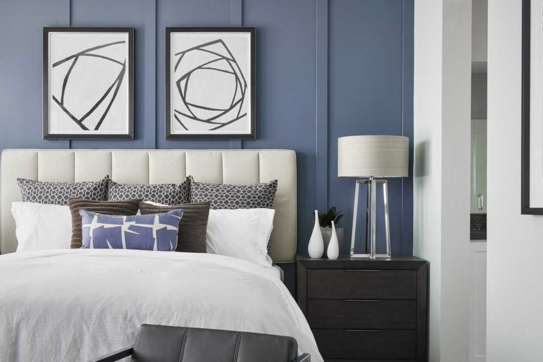
Little did the team at Pantone know what lay ahead of our global community in 2020 and just how much we all could benefit from a world that’s more peaceful and predictable during these challenging months. Our team is seeing more blue hues crop up in interior design this year. With connotations of calmness and creativity, blue tones are universally well-liked and oscillate from light to dark and warm to cool. In color psychology, common associations around blue are reliability, trust, and security (that’s why so many banking and financial institutions incorporate blue in their branding!). Noted for its versatility, blue can be bright and bold or soft and understated, traversing the design spectrum from statement making to accent, depending on the tone and how it’s used. And because it has evolved into a neutral, it pairs well with many color palettes and can be seamlessly incorporated throughout a space. With all of these benefits, who wouldn’t want more blue in their home!
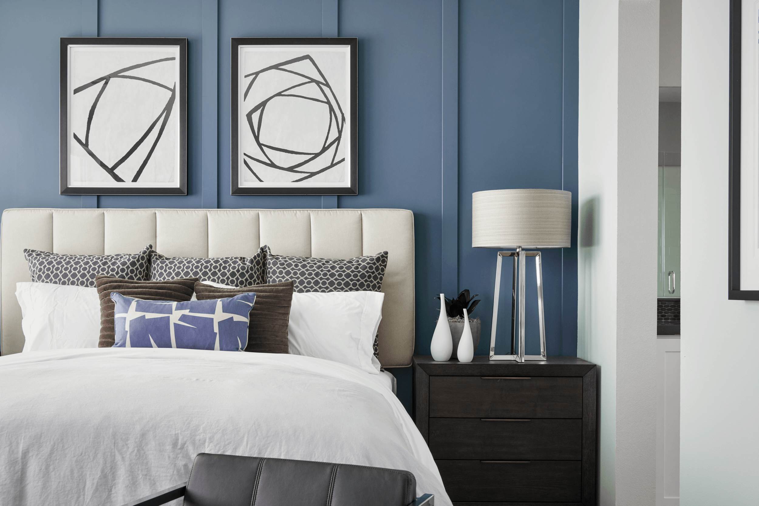
Photo Credit: Chameleon Design
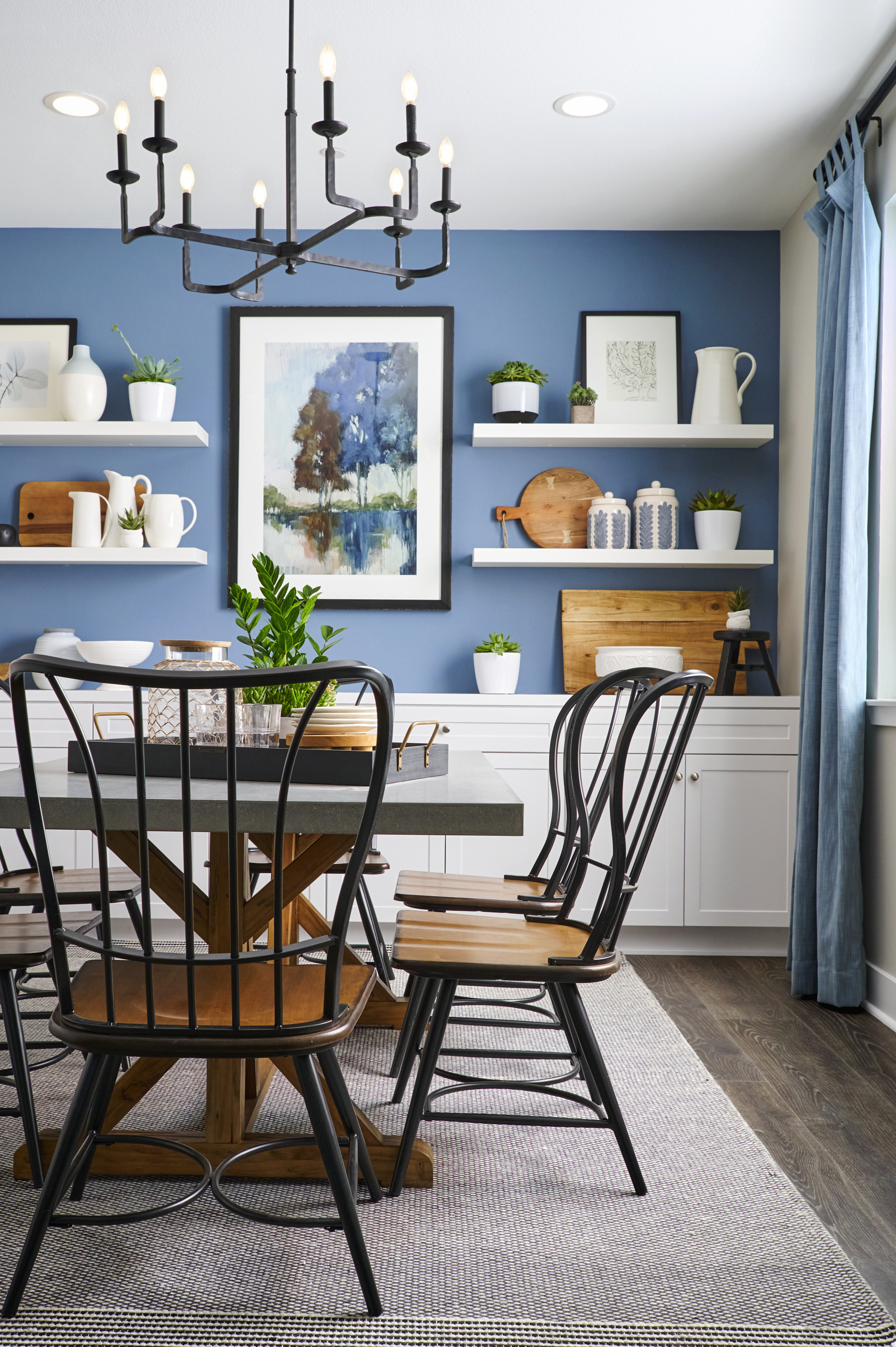
Photo Credit: Chameleon Design
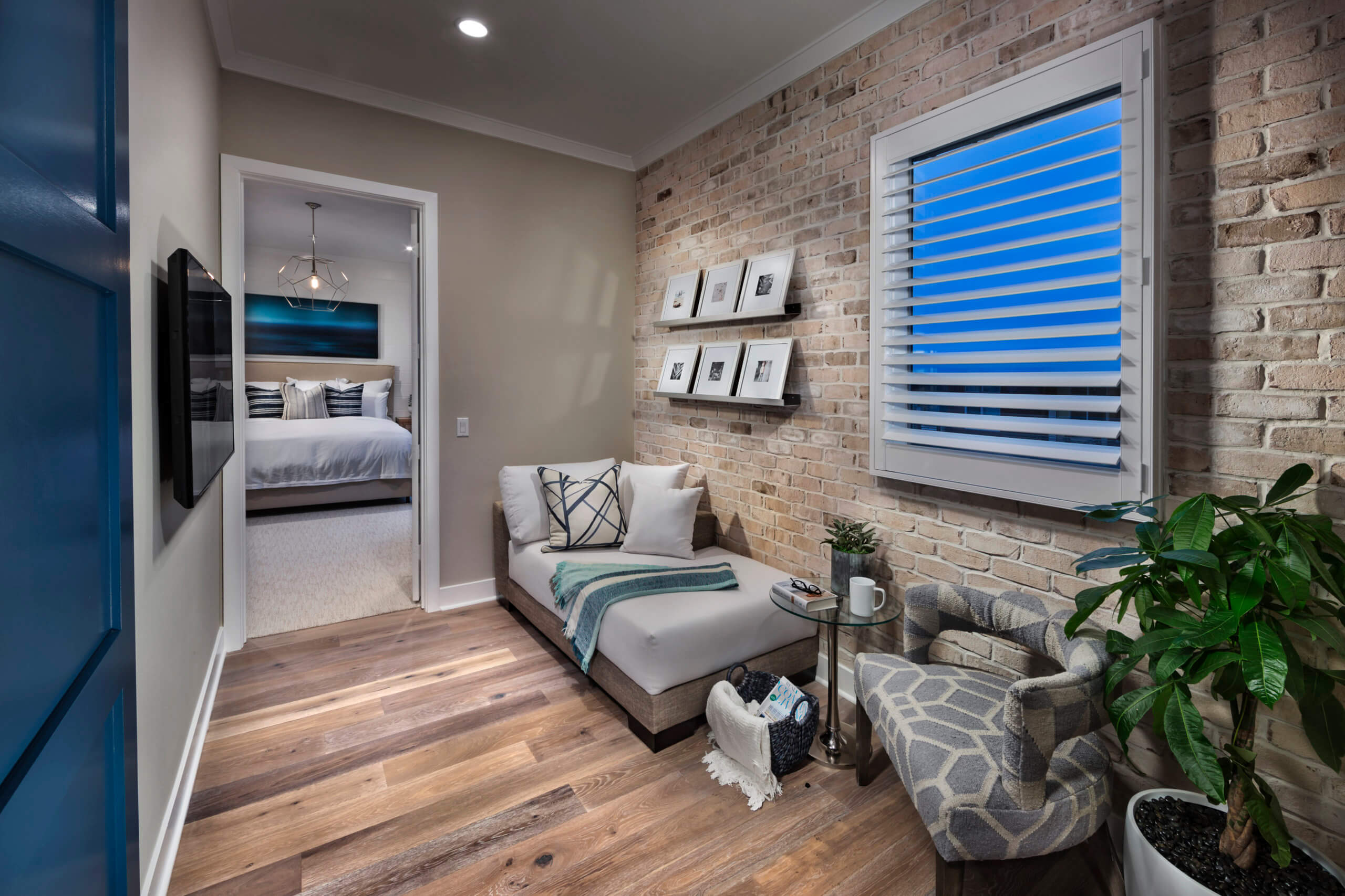
Photo Credit: Chameleon Design
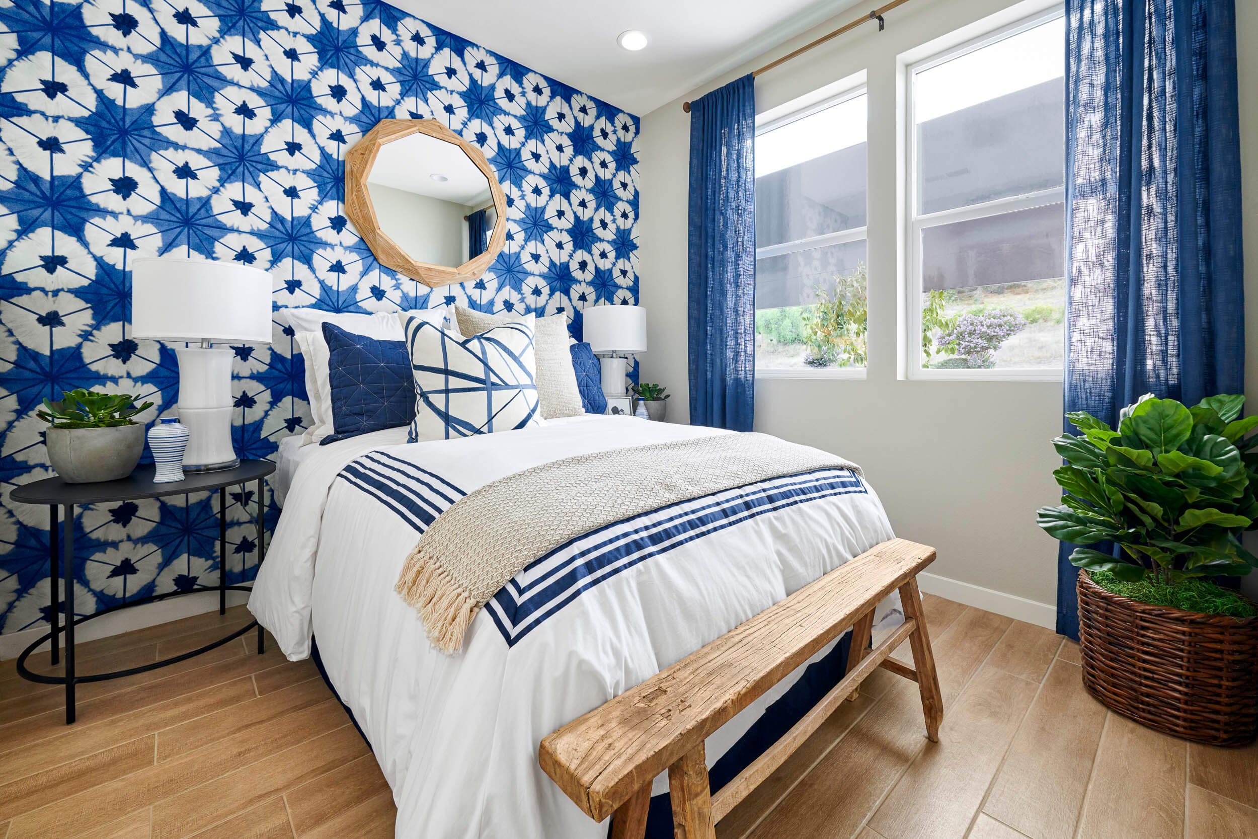
Photo Credit: Chameleon Design
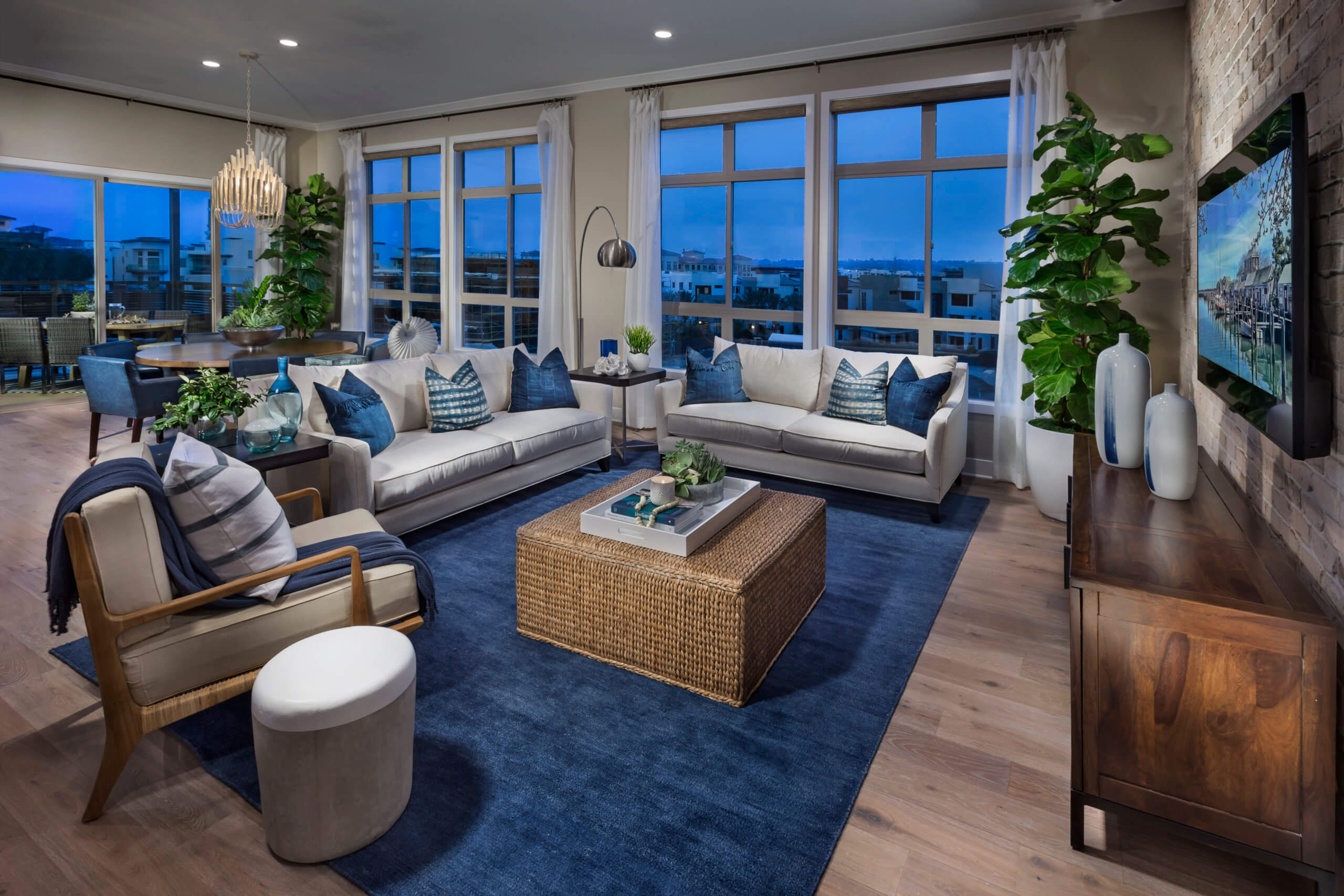
Photo Credit: Chameleon Design
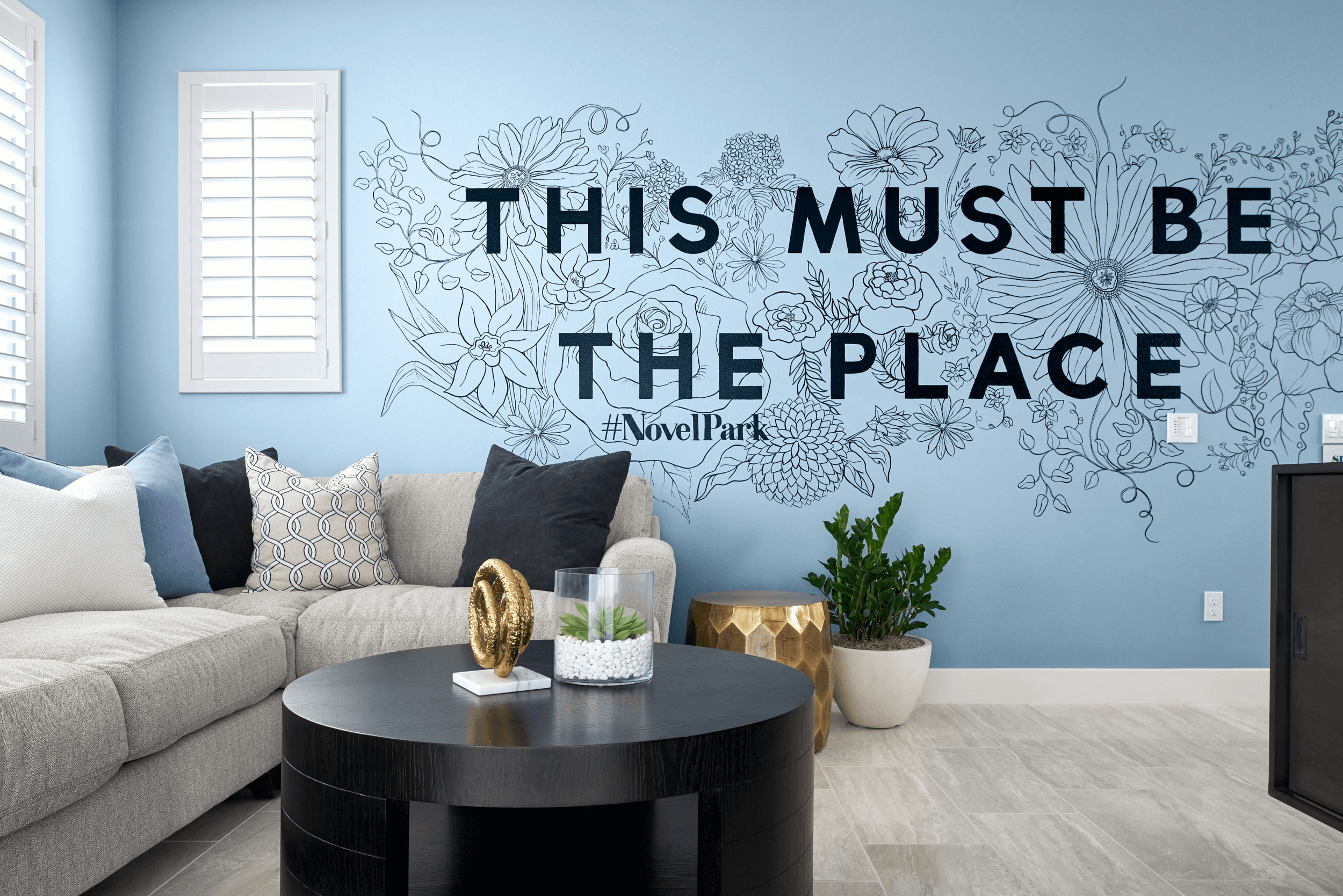
Photo Credit: Chameleon Design
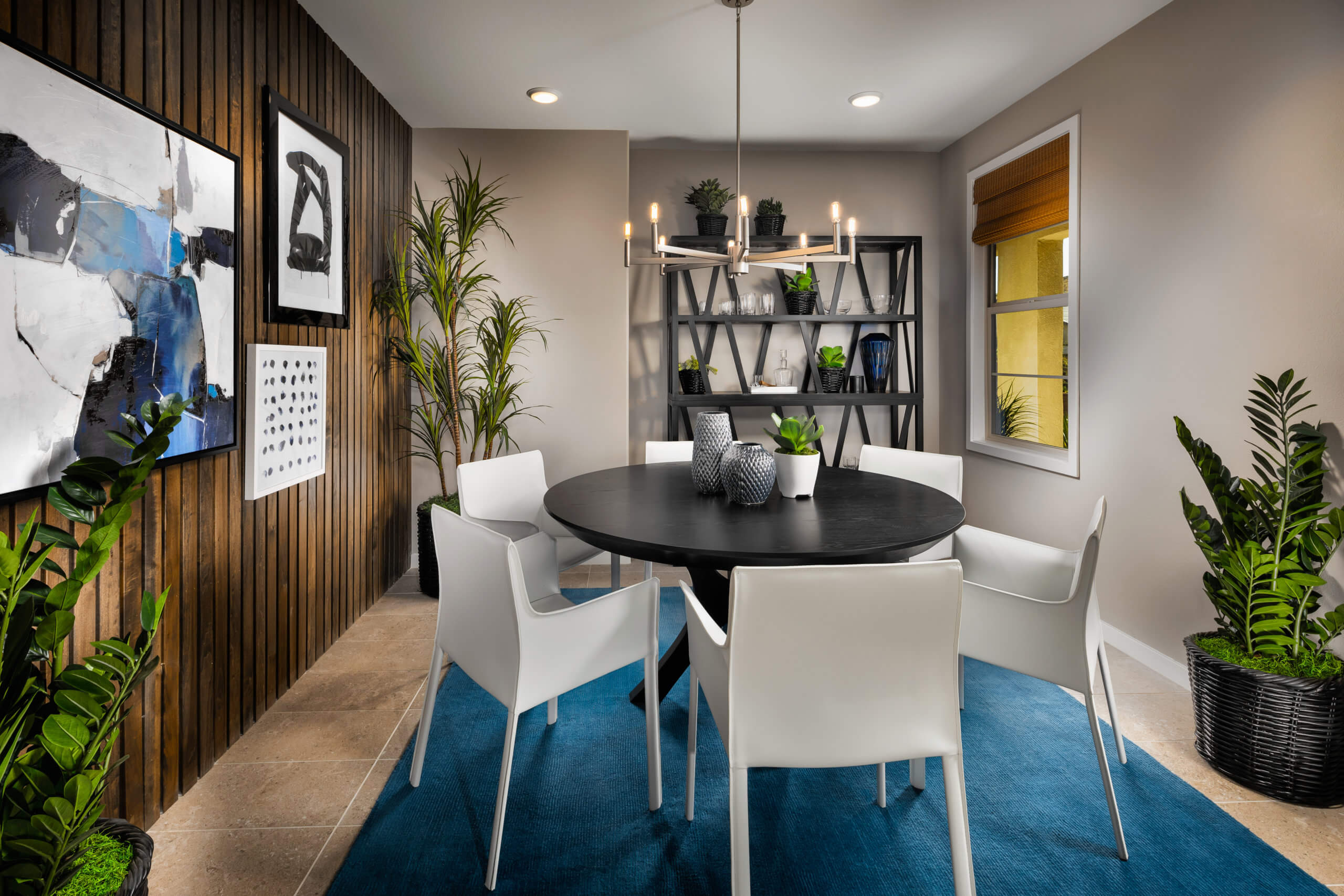
Photo Credit: Chameleon Design
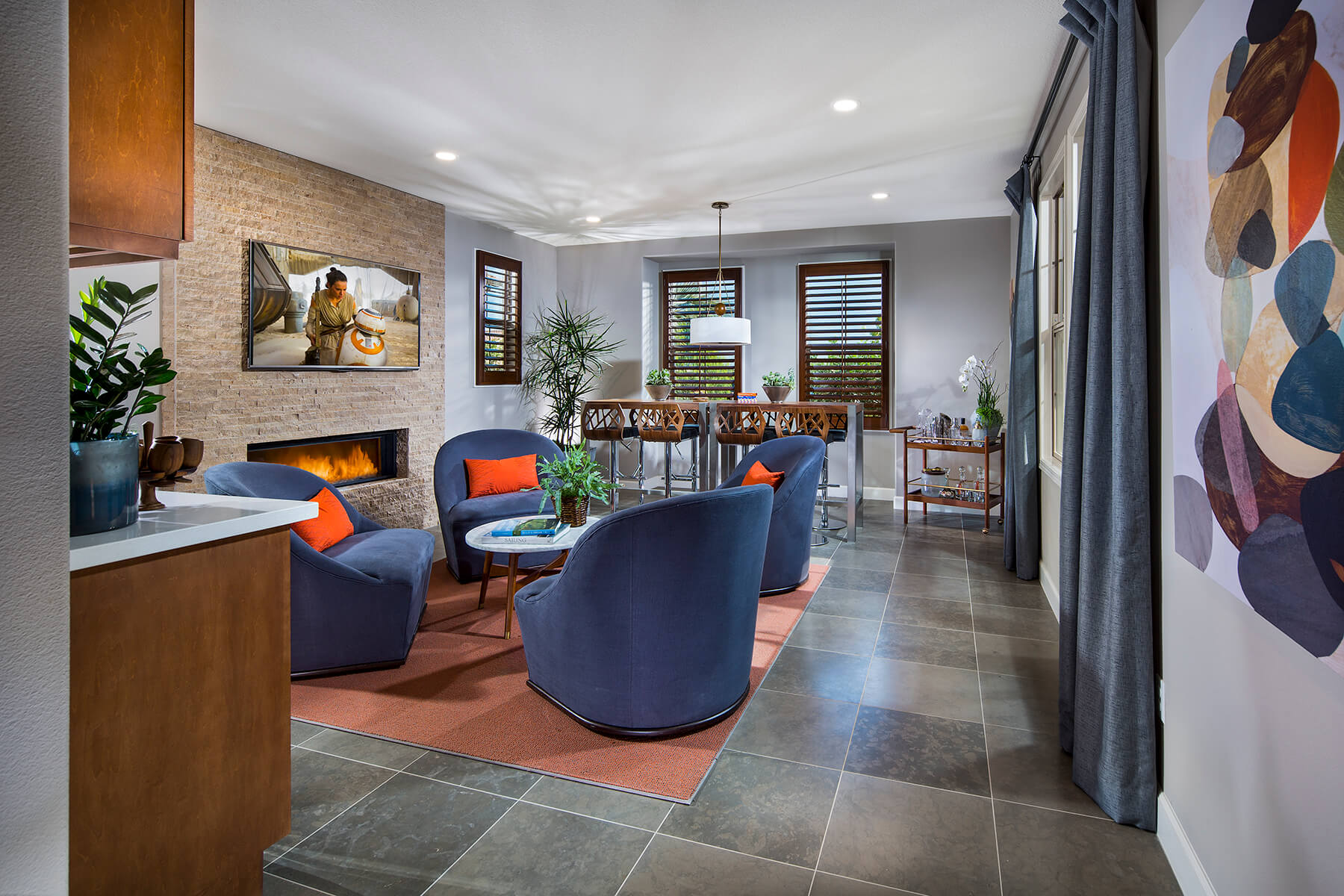
Photo Credit: Chameleon Design

Photo Credit: Chameleon Design
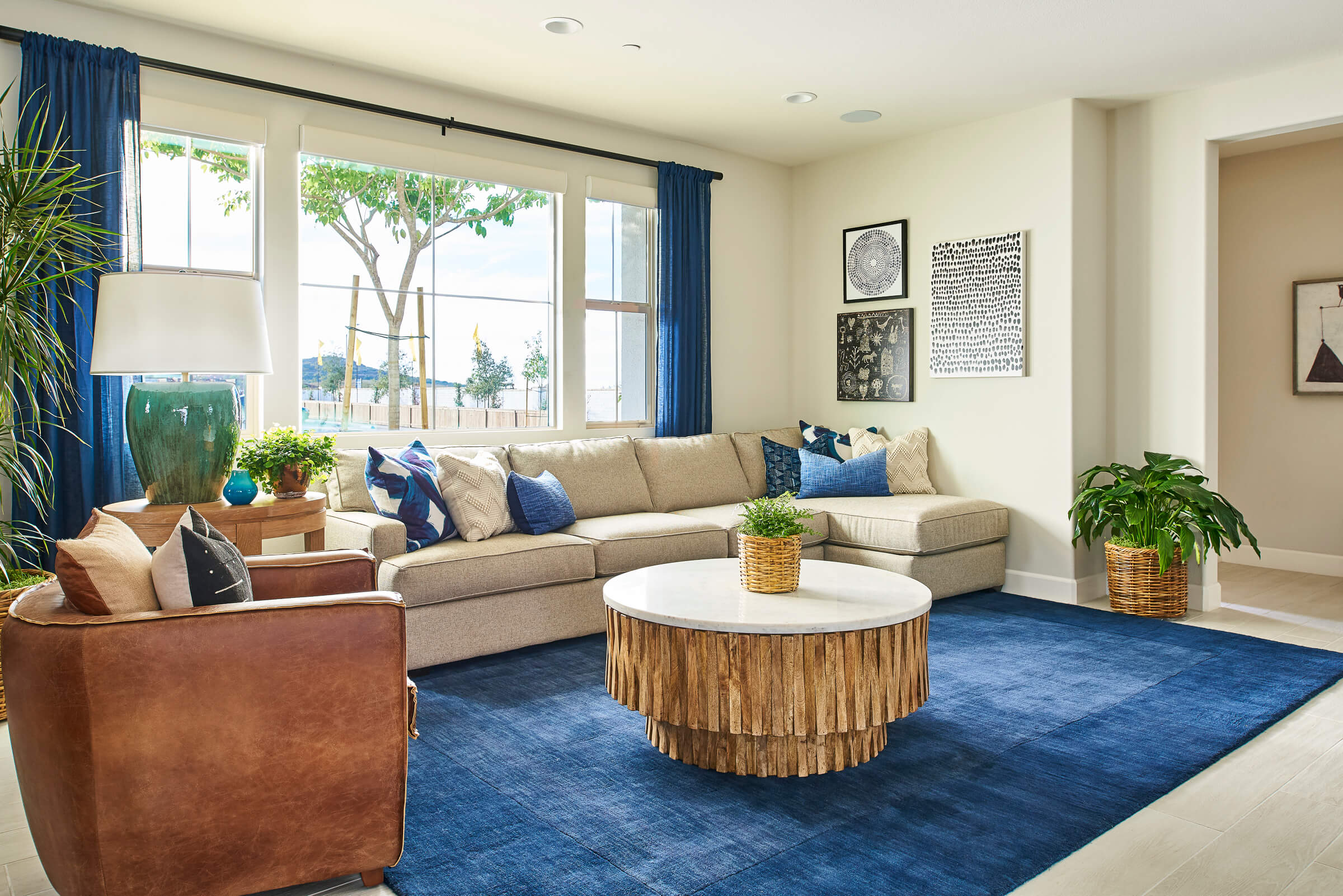
Photo Credit: Chameleon Design
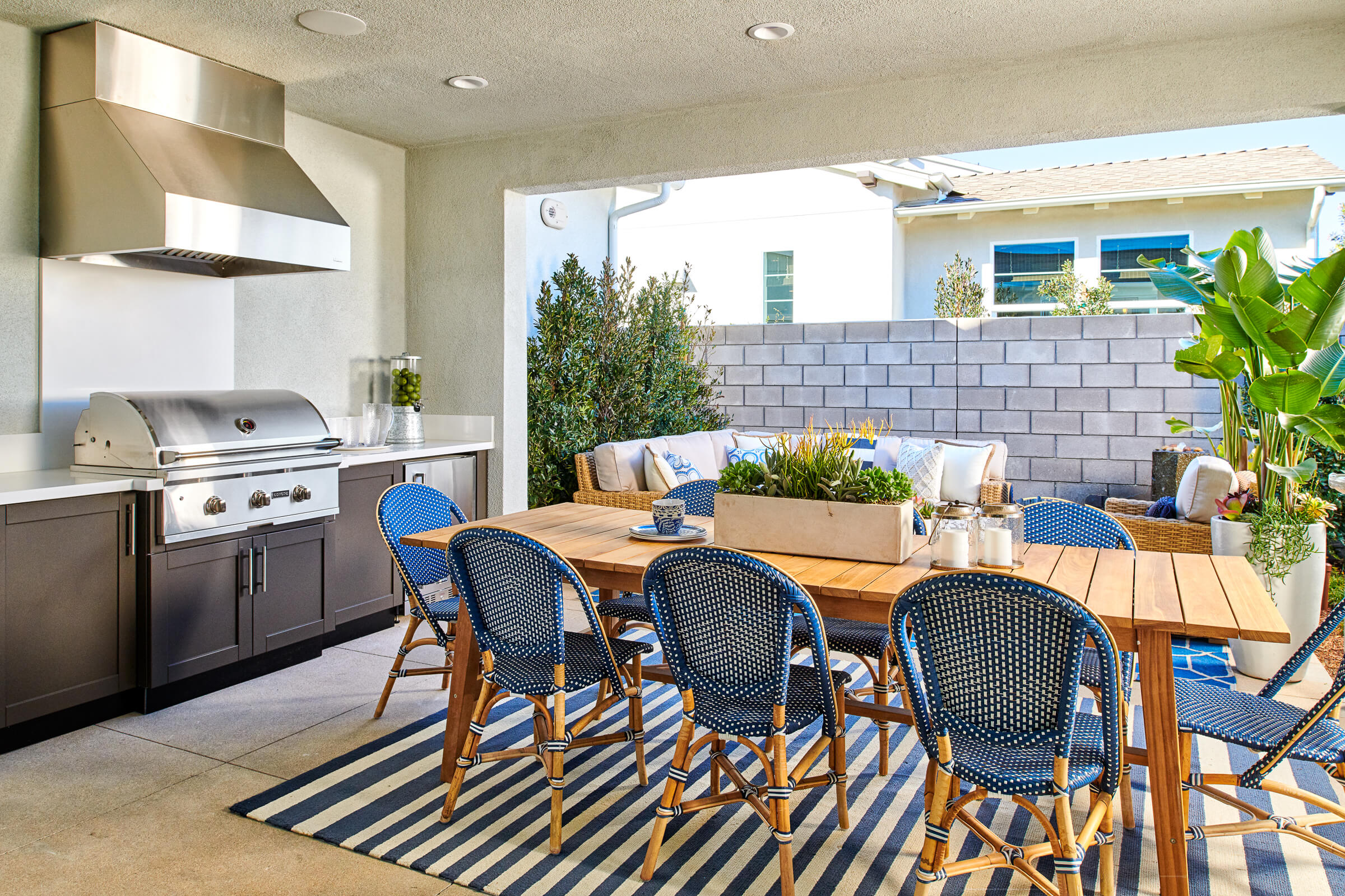
Photo Credit: Chameleon Design
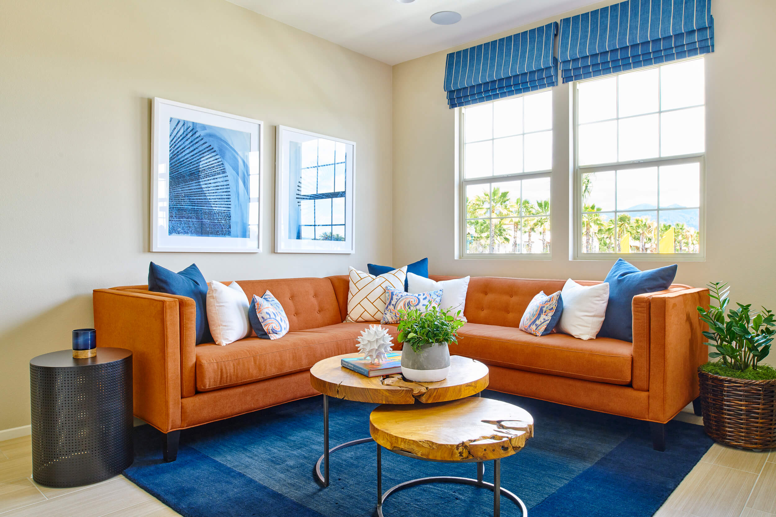
Photo Credit: Chameleon Design
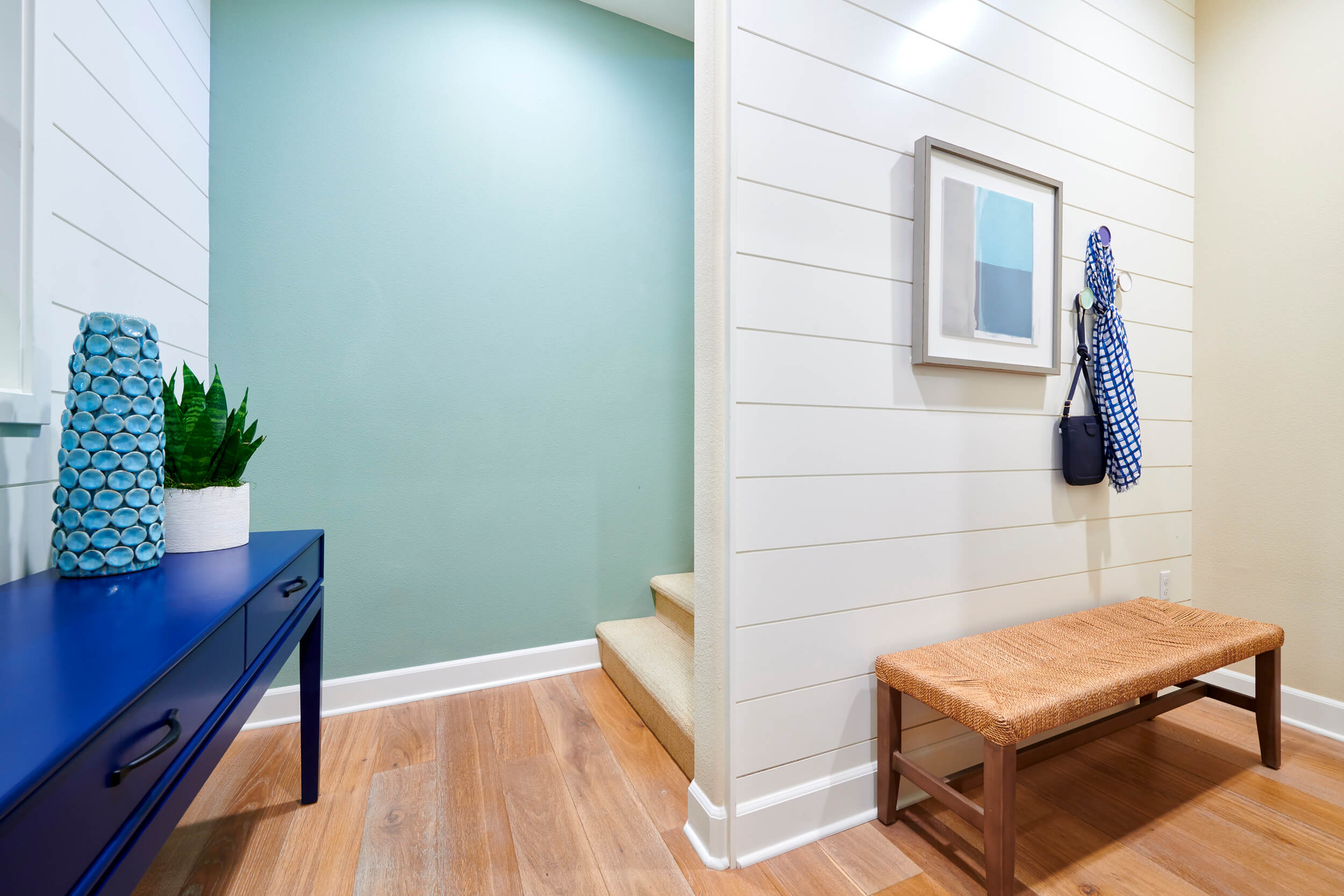
Photo Credit: Chameleon Design
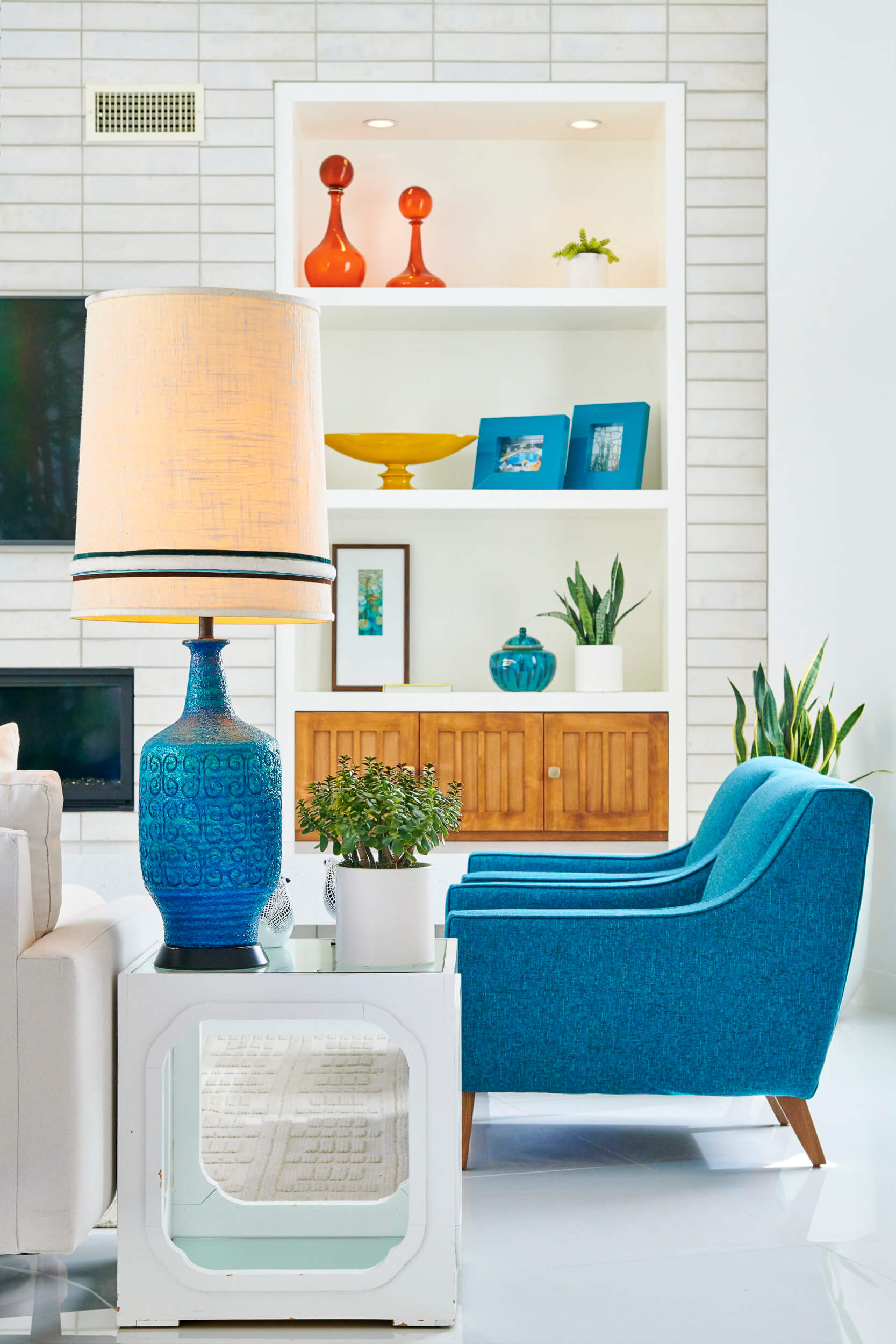
Photo Credit: Chameleon Design
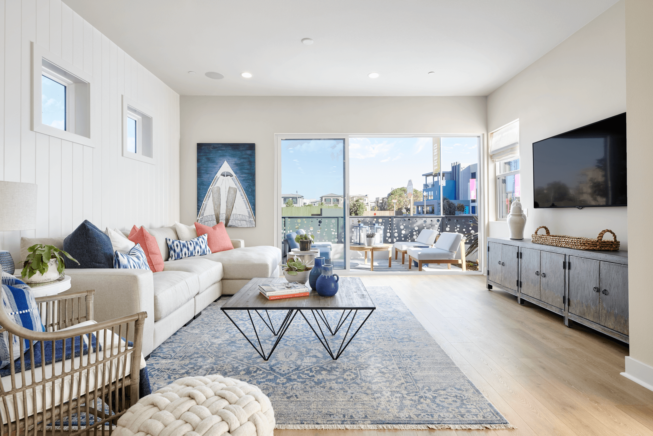
Photo Credit: Chameleon Design
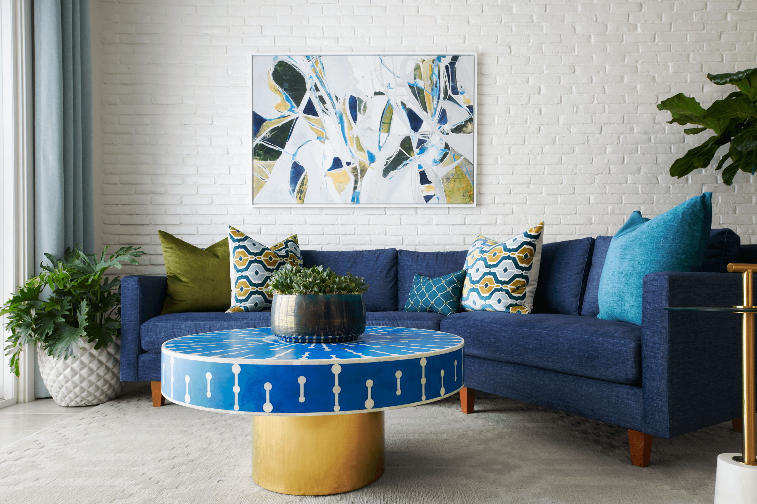
Photo Credit: Chameleon Design

Photo Credit: Chameleon Design